Consultation Notification


For the notification screen, I focused on keeping the layout simple and user-friendly, especially for first-time users. I prioritized key alerts like upcoming appointments and new messages by using clear titles, relevant icons, and timestamps for easy scanning. I chose a vertical list layout to ensure users can scroll through updates effortlessly, and each notification card includes only essential information to avoid clutter. The design supports quick access by allowing users to tap a notification and view details, which fits the needs of a consultation app where timely updates are important.
Reviews
1 review

The Figma file isn’t public yet, Shivani, it’s locked 😮 hoping I can play with the prototype next time.
I wonder if you’d like to explore these ideas to strengthen hierarchy, convey the message better, and make it easier to scan naturally:
• for the text hierarchy in the notification card, the current treatment feels almost like a long article title. What if you **only** put emphasis on the time itself, e.g., “17 April, 12:00 PM”? We usually look for the date first for important occasions, then follow with the description.
• since you’re already using filled icons for the notification card, what if you switched to hairline icons for the timestamp “🕔 2 hours ago”? Right now, the icon is small and the clock hands are almost indistinguishable.
• I think you could also tighten up the notification icons a bit, they look slightly oversized. It’s subtle, but I think it would make a big difference.
Obviously, take these suggestions with a grain of salt, explore further and see what really sticks!
You might also like
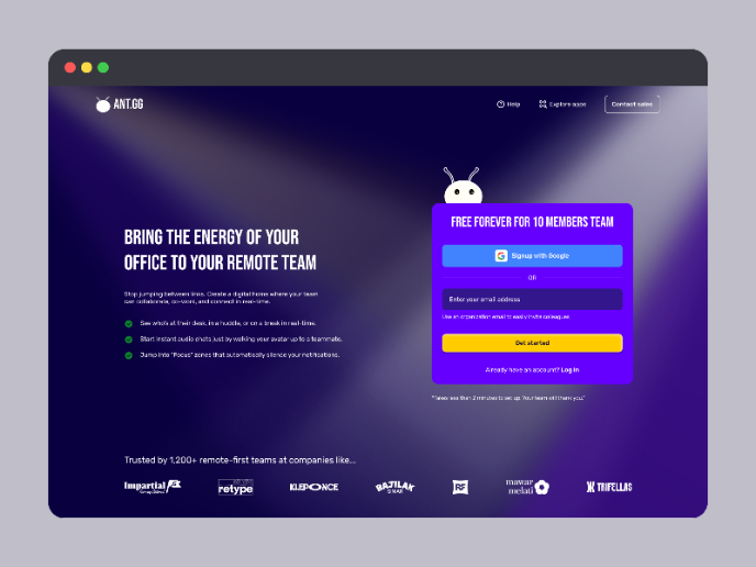
SaaS Signup Design

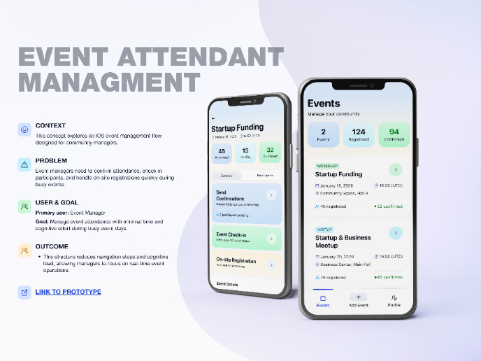
Events Managment App

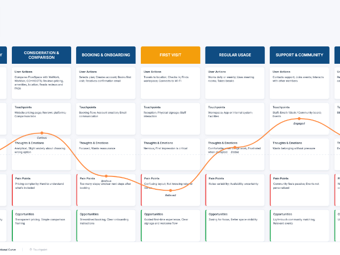
Customer Journey Map — Offsite Co-Working Experience

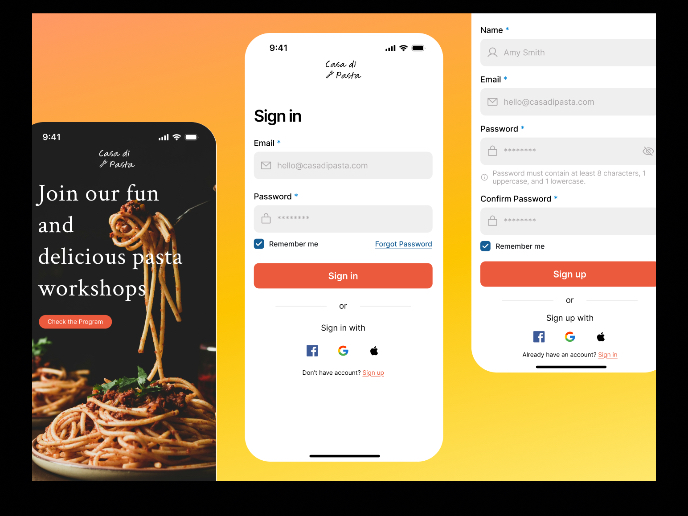
Mobile Onboarding: Casa di Pasta

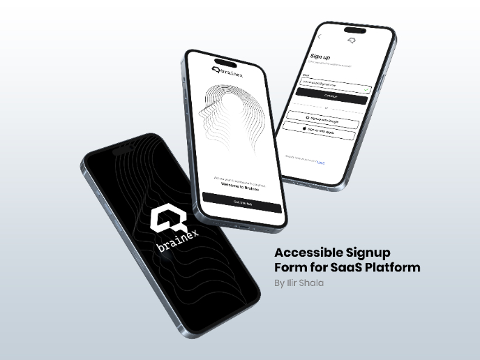
Accessible Signup & Login Experience — Brainex

Accessible Signup Form

Popular Courses

Common Design Patterns


UX Design Foundations

Introduction to Figma