Color System Notion Use case

These slides are created for a quick design brief on colors.
Execution time: 60 minutes

Reviews
1 review
I think it's a great start. However, the color system could use some additional refinement. It would be wonderful to see an explanation of your color choices and why you believe Notion would benefit from these updates. Additionally, providing evidence of WCAG compliance by showing the contrast values of text against the background would be very helpful. Demonstrating how these colors would appear in the interface would further support your reasoning.
3 Claps
Average 3.0 by 1 person
You might also like

Project
Customer Journey Map for a Co-Working Space

In this project, I made a Customer Journey Map (CJM) for a co-working space. The goal of this project is to understand how customers feel an

Project
Reimagining Asana's Color System

I created a color system based on Asana's current project management tool. Accessibility and the emotions the colors evoke were the primary

Project
Latios - Free Portfolio Template for UX/UI Designers

Overview I built Latios because I kept seeing the same problem: designers with solid experience getting stuck trying to launch their portfol

Project
Workspace Booking Flow - UI/UX Design


Project
Responsive Main Screen

Project
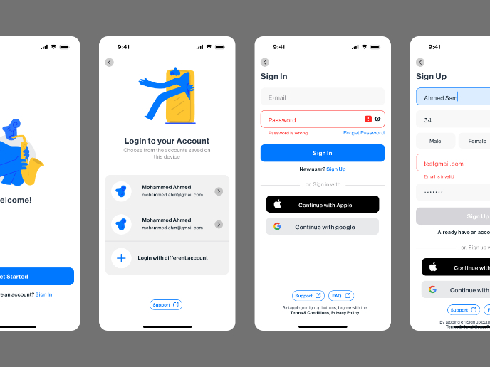
Login/Sign up Form

Features: Clear focus state Built-in autofill support Instant validation/feedback Smart register/sign-in switching* Social/guest access opti
Visual Design Courses

Course
UX Design Foundations

Learn the essentials of UX design to build a strong foundation in core principles. Gain practical skills to support product development and create better user experiences.

Course
Introduction to Figma
Learn essential Figma tools like layers, styling, typography, and images. Master the basics to create clean, user-friendly designs

Course
Design Terminology

Learn UX terminology and key UX/UI terms that boost collaboration between designers, developers, and stakeholders for smoother, clearer communication.