Color System: Management Productivity Tool

Introduction
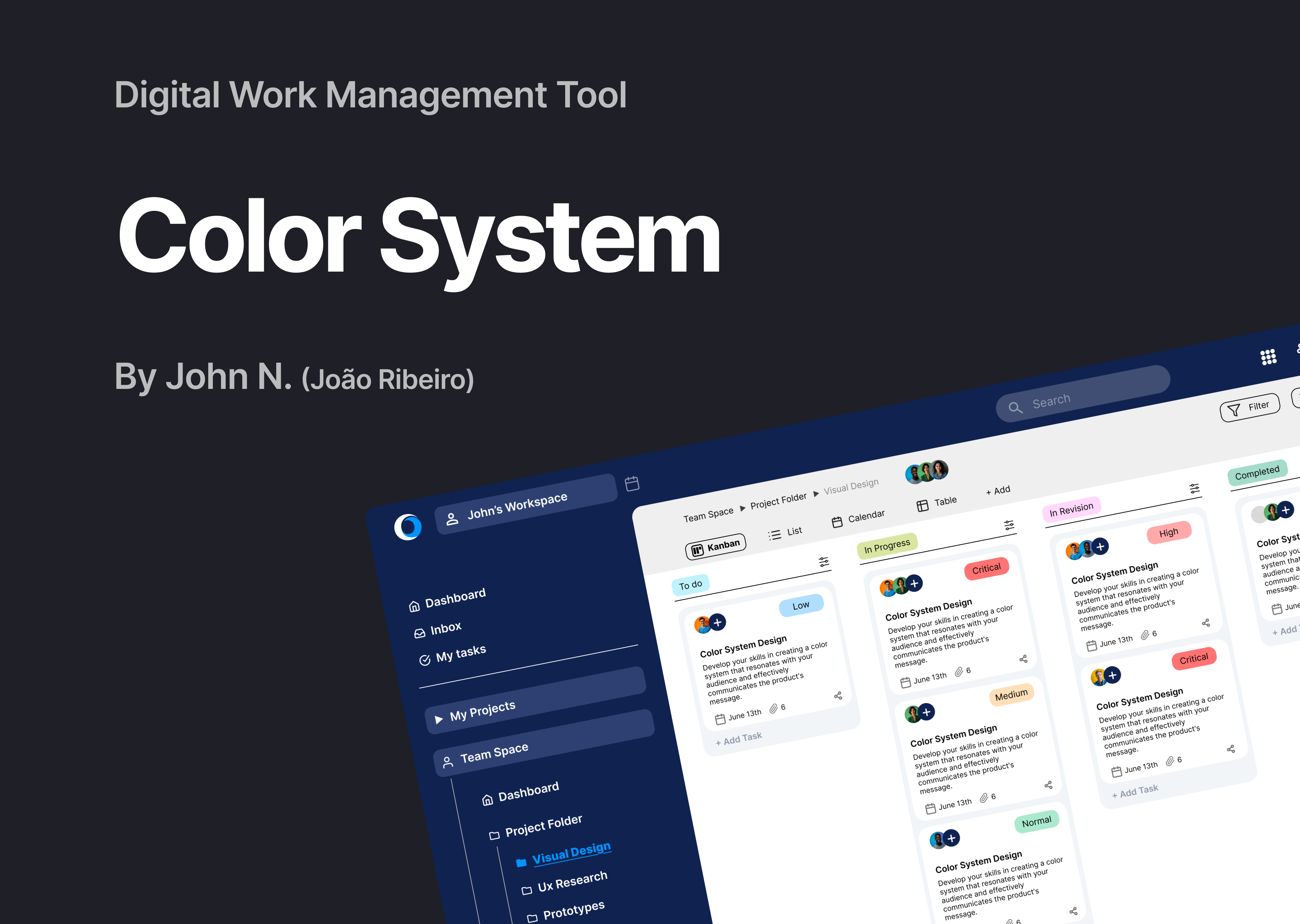
For this project, I developed a color palette system for a fictional digital work management tool. The goal was to push my UI design skills and explore visual hierarchy, accessibility, and branding. I designed a light-mode user interface for a web platform as the foundation for this system.
After researching the platform's concept and analyzing competitors such as Asana, ClickUp, Trello, and Izyplan, I gained insights into how these tools apply color to enhance clarity and usability. I applied what I learned to build a system that balances focus, aesthetics, and functionality.
Each color was intentionally chosen for its psychological impact. I worked primarily with soft tints and pastel hues to avoid overwhelming the user with highly saturated tones, while still establishing a clear and intuitive visual hierarchy.
The system is structured as follows:
Primary colors – Reflect the brand identity and are used for key interface elements like CTAs and active links.
Secondary colors – Support complementary UI components, adding variety without distraction.
Tertiary color – Used for priority indicators, such as task tags, to help users quickly identify and classify different task types.
Neutral colors – Segment content and structure the layout into clear, readable blocks.
System colors – Represent system feedback (e.g., success, warning, error). These are the only fully saturated colors aside from brand tones, designed to immediately catch attention for critical interactions like confirmation or danger actions.
Thank You!

Reviews
2 reviews

Really solid Color System for a Productivity Tool! The palette feels functional and well-organized, with a good mix of neutrals and accent tones. It’s clear you’ve thought about hierarchy and usability. Would be great to see how the colors apply across real components like buttons or alerts—but overall, clean and purposeful work!

Hi João,
I really enjoyed reading through your rationale and find your use of system colors intuitive - very well thought through! I believe the final UI examples show that you've carefully considered both the big picture (in choosing soft pastels) and the purpose of each chosen hue.
I'm only starting out in UI/UX and so I'm a bit wary of providing constructive feedback but I'll give it a try with a main idea and a 'nitpick':
* I wonder whether spending a few more minutes on the visual identity as applied to the final UI might take your project from awesome to legendary; to be more specific, have a think about how you might give this product its own personality with the colors you've already chosen.
* (unrelated to the color system) have a quick look at your vertical menu, second item, as well as the horizontal alignment of the 'views'.
All the best going forward!
You might also like

edX Sign-Up Page Redesign


Beautify Login page WCAG principles


Design Prioritization Workshop


Sanyahawa - Landing page Design


Notion Login Page Accessibility Optimization


Healthy Dashboard

Visual Design Courses

UX Design Foundations


Introduction to Figma

Design Terminology
