Color System for Toggl Track
Rethinking a color system for Toggl Track made me think about the meaning of the colors for applications and how enhance calmness, trust and happiness in the same time aand not be boring.
I started with a powerfull blue as a primary color, which brings assurance and trust, two themes really important for a time tracking application. Then I continue my process with a color that I particularly love : orange/yellow. It brings me joy and dynamism, two qualities very important to me when I work. Also, it's complementary with blue. I didn't chose plain colors, I prefered to add a bibt of mystery for the blue ans choose a deep one. As for the orange, I choose one with a bit of yellow in it, to echoes with the blue tones. Then I added a bit of brown to bring cozyness and confort.
When you are tracking your working time it's really important, for me, to have a place that brings you : calm, joy and dynamism. That's why I choose this color system.
For the neutral tones, as tertiary color system, I choose some blue/grey tones to ensure consistency with the primary color system.
Then, for the po up modals when there is an info, alert or something not usual, there is a more traditional color system with hues of primary colors that matches the colors system of the app.
All the colors work harmoniously otgether and are user-friendly according to the WCAG.
Thank you & enjoy !
Tools used
From brief
Topics
Share
Reviews
2 reviews
I enjoyed going through your presentation, learning the rationale for your picks
Huge kudos for the willingness to recreate toggl's interface to apply your color system, and the logo explorations.
As for the example application, I would have used a shade of the primary (or tertiary in your system, since you made it really as a blend of neutral and primary) for the gridlines and main content gradient. That way, the interface elements that use the secondary color (the chunk of time logged, current day marker, time range selector, view segmented toggle, etc.) would have much more emphasis.
Do resist the urge of coloring everything, be strategic when applying color. Think of it like this: the more you use, the less effective it becomes.
Keep up the good work!
Hey, Alice! I love the colors you chose. Coincidently, 2 years ago I chose similar colors for a rebranding project I worked on. This is a powerful combination.
I couldn't access the full project link. It says I need to request access. but I could evaluate by the cover image ou posted and description. When possible, please make the link open and let me know so I can take a look.
You might also like
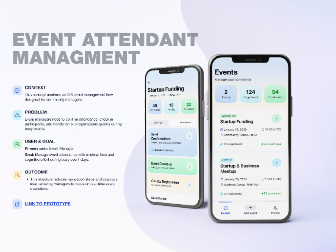
Events Managment App
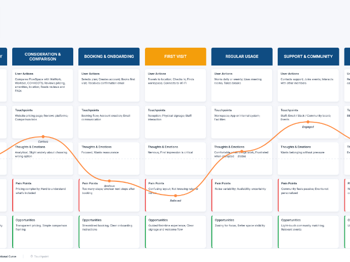
Customer Journey Map — Offsite Co-Working Experience
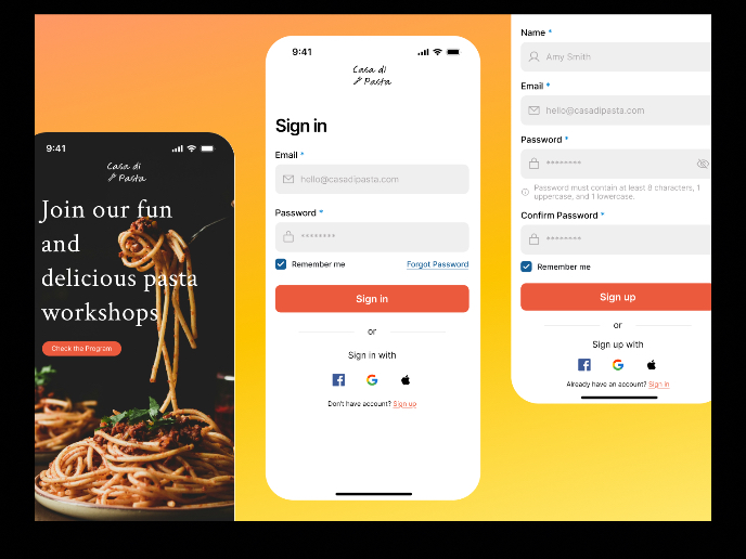
Mobile Onboarding: Casa di Pasta
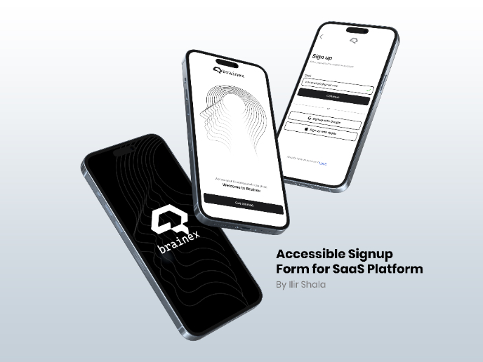
Accessible Signup & Login Experience — Brainex
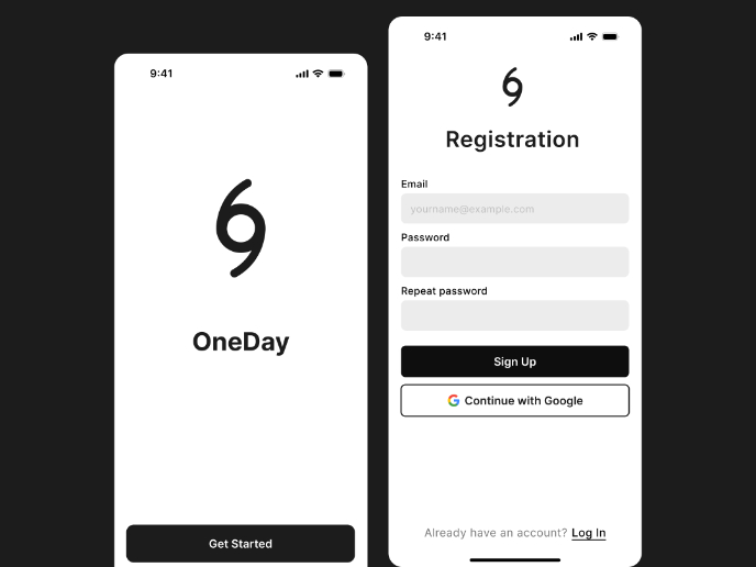
Accessible Signup Form
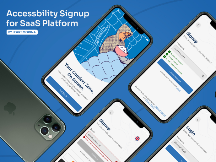
Accessible Signup Form
Visual Design Courses

UX Design Foundations

Introduction to Figma

