Color System for Productivity Tool

Tools used
From brief

Topics
Share
Reviews
1 review

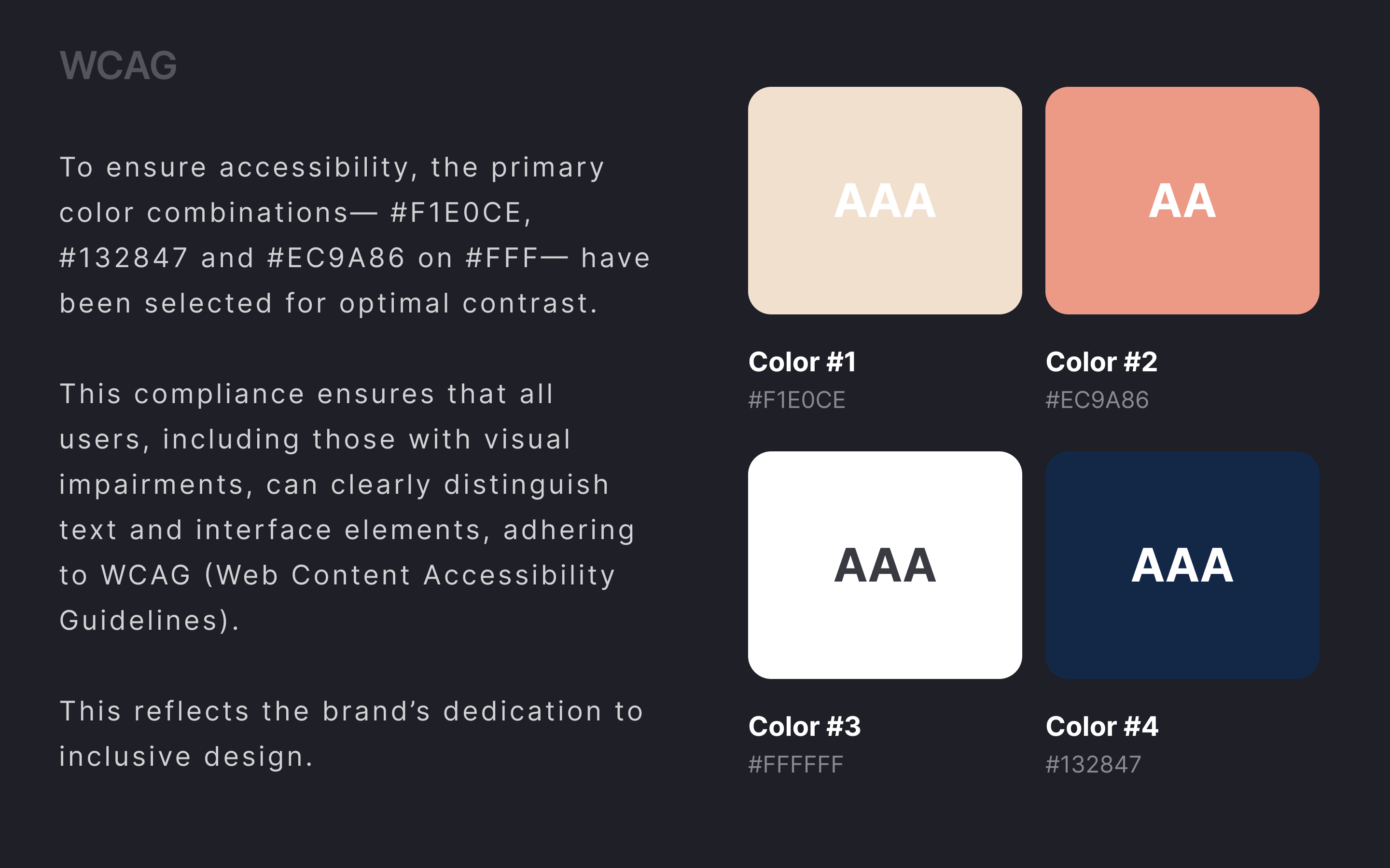
Great work! I like how you explained your design decisions and the emotions behind the colors. The categorization is clear and well-explained. However, you might want to check your WCAG rating. I ran tests for Color 1 and Color 2, and both failed accessibility standards.
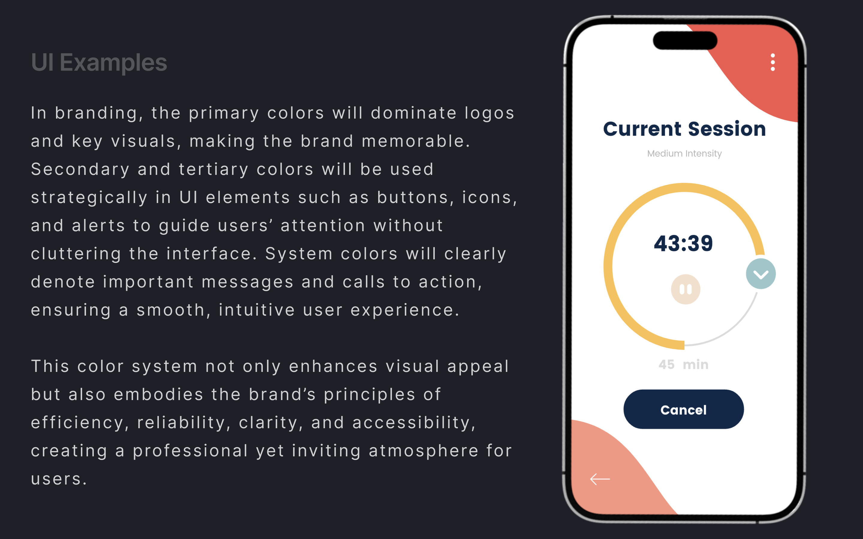
I would love to see more examples in the UI screens, more real branding elements (logos, icons, etc.), and how the colors work across different layouts. Also, review your system colors and consider adding more colors suitable for alerts. Warmer colors are typically used for error or warning states, while blue is less effective for conveying issues or errors.
(edited)
4 Claps
Average 4.0 by 1 person
You might also like

Project
Pebble Accessible SAAS Signup Flow

Pebble Pebble is a mental health SaaS concept designed as part of the UXCEL UX Design career path. The brief was to design an accessible s
Project
QuickScan Onboarding

A mobile onboarding flow for a Nutrition Scanner app designed to deliver instant value by enabling users to scan a product and receive a cle

Project
Nestra from homepage to checkout process

Checkout Flow Design – Decision-Making Process & Rationale1. Platform & Device ChoiceFor this project, I chose a desktop e-commerce experien

Project
Create a UX Research Survey

The grocery delivery app industry on smartphones (iOS/Android) is highly competitive and emphasizes convenience and speed.

Project
Islamic E-Learning Platfrom Dashboard

Visual Language & Color I wanted the interface to feel like a quiet room you'd actually want to sit in and study. The warm neutrals - off-wh

Project
Pulse — Music Streaming App with Accessible Light & Dark Mode

Platform & DeviceFor this project, I designed Pulse, a mobile music streaming application for iOS devices (using the provided mobile templat
Visual Design Courses

Course
UX Design Foundations

Learn UX design fundamentals and principles that create better products. Build foundational knowledge in design concepts, visual fundamentals, and workflows.

Course
Introduction to Figma
Learn essential Figma tools like layers, styling, typography, and images. Master the basics to create clean, user-friendly designs

Course
Design Terminology

Learn UX terminology and key UX/UI terms that boost collaboration between designers, developers, and stakeholders for smoother, clearer communication.