Color system for Productive

This project is a reimagining of Productive.io's color system with a focus on brand consistency, visual clarity, and UX functionality.
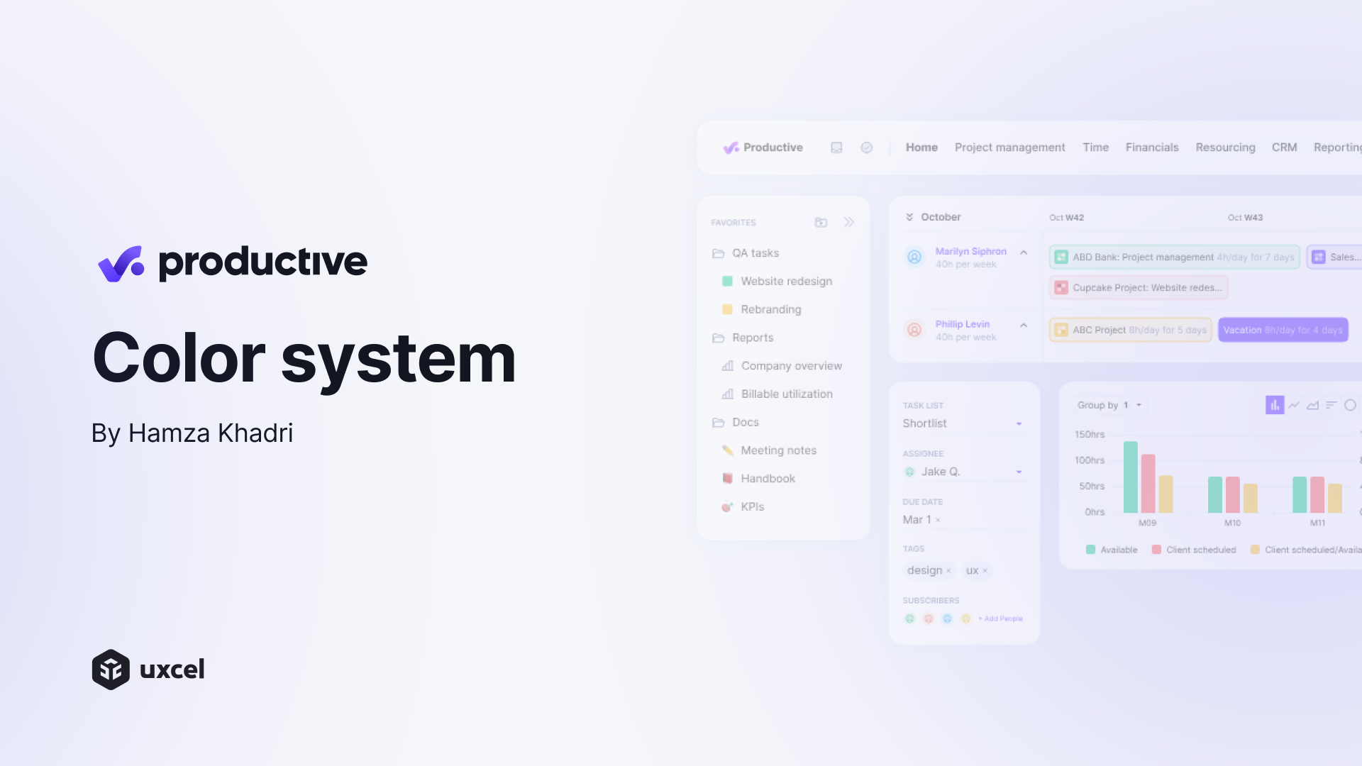
I chose violet (#7b5bff) as the primary brand color, inspired directly by the platform’s logo and identity, and aimed to propose a softer, more balanced alternative to Productive's original color scheme.
The palette is structured using the 60-30-10 rule:
- light neutrals dominate the background,
- medium grays support content structure,
- and the accent violet brings focus and energy.
Functional colors were chosen for clarity and modern tone, departing from generic defaults while remaining accessible.Special care was given to hover states and text contrast to enhance interaction feedback.
The result is a clean, modern color system that balances brand personality and usability.Every tone was tested across buttons, cards, surfaces, and text hierarchies.
It was an opportunity to harmonize branding, UI logic, and color theory. Hope you enjoy the result!
Tools used
From brief

Topics
Share
Reviews
2 reviews

Great work Hamza, I really like your approach and it’s actually the same i use, Keep pushing this direction, it’s a solid foundation for scalable UI systems

Hamza, the palette feels clean and well-structured 👌—maybe push the accent contrast a touch stronger for hierarchy, but overall you nailed a solid, modern system!
You might also like

Ubani Design System


CJM for Co-Working Space - WeWork


Accessible Signup Form for SaaS Platform

Loginino


Notification microcopy - Project


El Mandoub-GovTech App

Visual Design Courses

UX Design Foundations


Introduction to Figma

Design Terminology
