Color System for Park Preapred

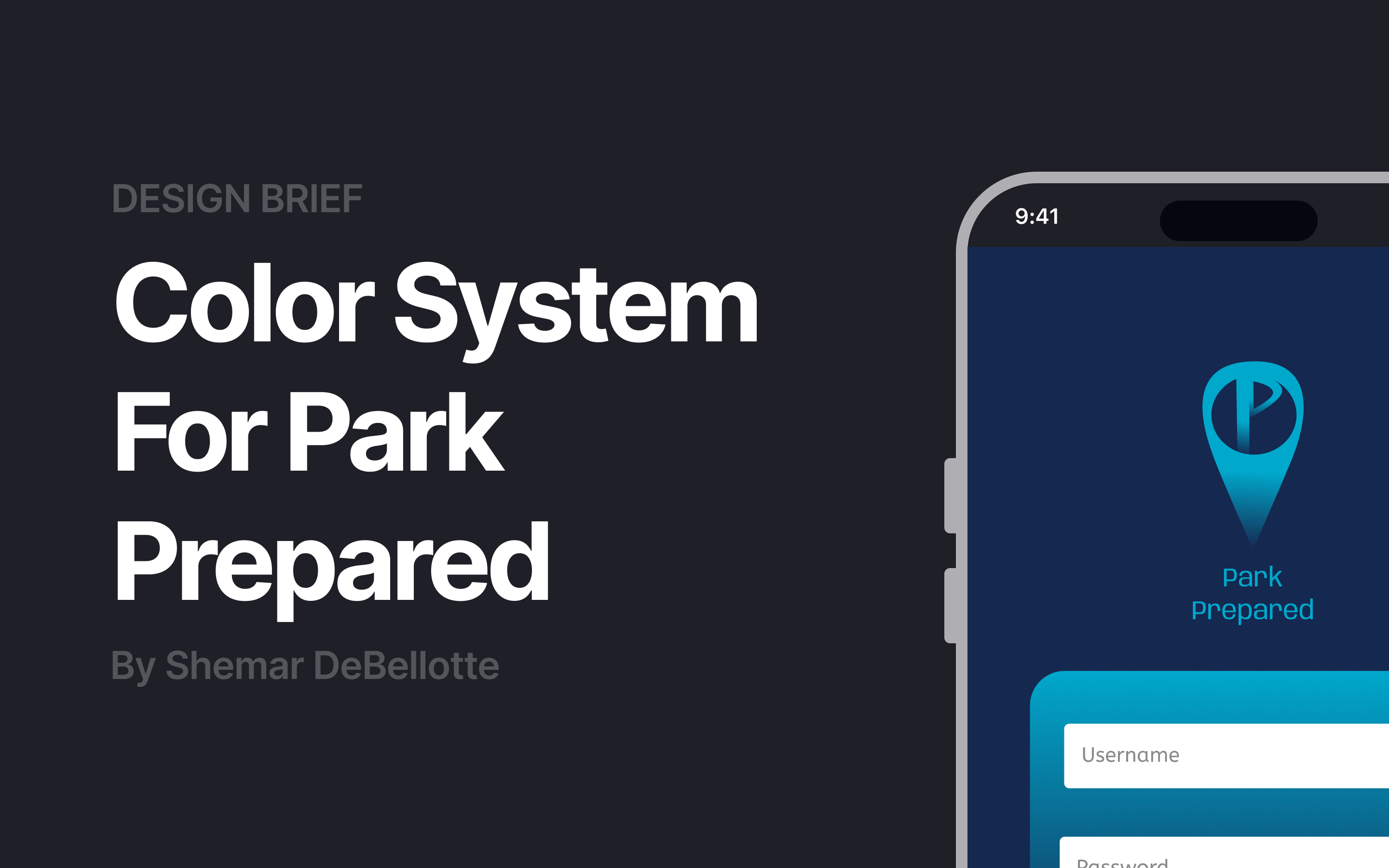
Hello! This is my color system for my existing case study Park Prepared, a parking assistance app.
I developed the high-fidelity wireframe and decided to utilize the color palette from that prototype. At that moment, I didn't know about color systems. So going back and utilizing what I learned into this study was inspiring!

Reviews
2 reviews

Hey Shemar! I can see you’ve put a lot of thought into choosing the colours for the app, however we can improve how they're applied.
Here’s how I usually approach picking a colour palette for an app:
There are three types of colours to think about to create balance and good usability.
Neutrals:
- These are your base colours for backgrounds, text and overlays. For example, Instagram uses an off-white or off-black background depending on light or dark mode. You’d then use the opposite neutral for your text so the contrast is strong and easy to read.
1–2 Brand colours:
- These show up in buttons, icons and places where you want a bit of personality.
Supporting colours:
- These are used to draw attention or communicate meaning, like green for success, red for errors, or yellow for warnings.
Incorporation this approach will make a huge difference to the feel and usability of your app, hope this helps!

Hey Shemar,
You chose too many similar shades and, as we can see on your UI example, your system ends up being too flat and does not contribute to the usability or to create an emotional response from a user.
Here's a simple practical way I would recommend you to get to a starting system.
- Pick up a good neutral color, which should account for 60% of your UI
- Choose your primary color, which in your case is a blue shade meant to inspire trust (good choice!). Then define which parts of your UI need to reflect trust (eg: is it the CTAs, the names of the parking place, the number of spots available?) and apply it to your UI. Stick to a 30% of your UI using your primary shades.
- Choose a good secondary color distinguishable from your primary color and give it a specific meaning. It could be another emotional response or it could just be creating a highlight or accent on a specific piece of information, something you would use to bring attention to something out of the ordinary in your UI (eg: a special discount on a parking place, low availability of spots?) and implement that. Aim to 10% max of your UI
From there, you can evolve your system little by little adding more primary and secondary shades (as needed, do not throw more colors for the sake of it), and functional system colors (again, if needed).
Practice this, and creating color systems will become super easy!
Thanks for sharing your work.
Keep working on your craft 🙌
You might also like
Accessible Signup Form

Auction
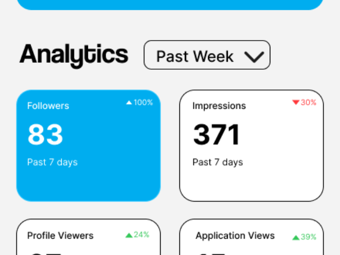
Entrant - Analytical Dashboard

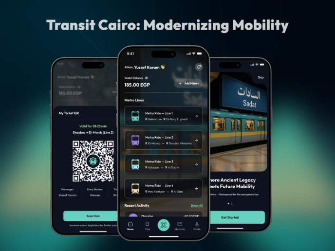
Transit Cairo — Digital Mobility Redefined

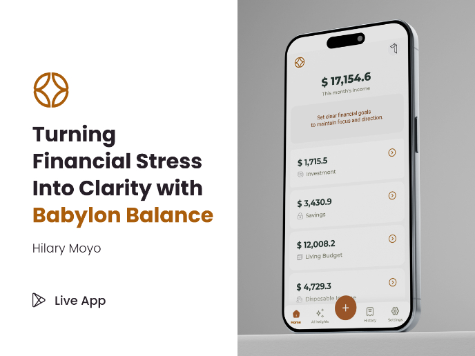
Babylon Balance - Designing Financial Clarity Through Constraint

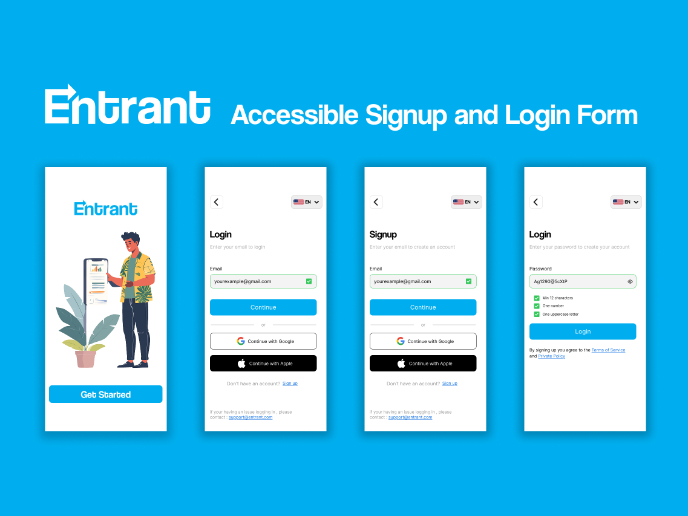
Entrant Accessible Signup and Login Forms
Visual Design Courses

UX Design Foundations


Introduction to Figma

Design Terminology
