Color system for Nuclear Star Fish
The goal of this design task was to create a cohesive color system for an art and animation studio website. I selected a work management platform, focusing on optimizing the user experience across various device types while ensuring aesthetic appeal.
Reviews
5 reviews
Great choice of colors! They also meet the WCAG requirements, which is essential. To make this case study even better, it'd be helpful to see more details about the brand for which you are creating the palette. It would be helpful if you could explain why you believe these colors will contribute to this specific brand, rather than just providing a traditional explanation of color meanings.
Great job on the Nuclear Star Fish color system! The cohesive palette beautifully balances usability and style, perfect for an art and animation studio.
It's a nicely done presentation!
I agree with the comments below, the information about the Nuclear starfish is missing, but overall, it's a good job. 👏
In the design you used just a tiny portion of the chosen UI colors, this is fine.
I may be wrong but I would start with less colors. There were colors with different luminosity/saturation next to each other in the presentation, I am not sure they would be easy to design with once you want to want to use them together in the UI
I liked your color choices and how you presented the UI example. It looks great. However, I would have liked to see a more detailed explanation of your color choices and how they would improve Nuclear Starfish's new color system.
You might also like
Accessible Signup Form
Auction
Entrant - Analytical Dashboard

Transit Cairo — Digital Mobility Redefined
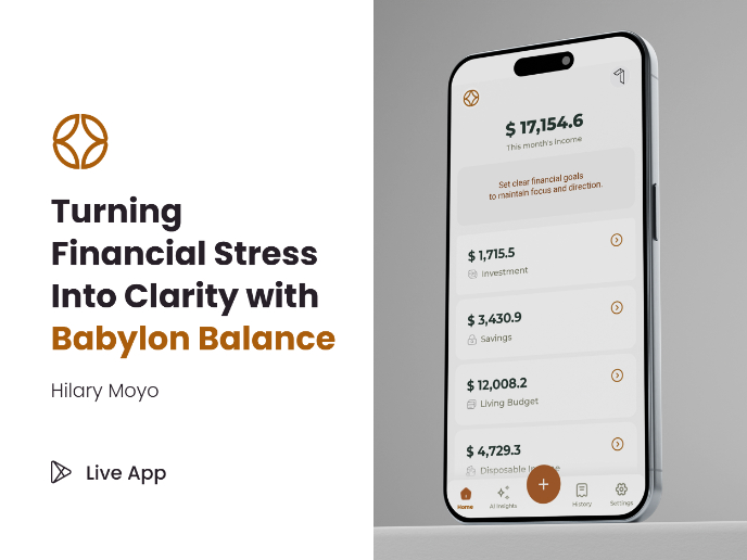
Babylon Balance - Designing Financial Clarity Through Constraint
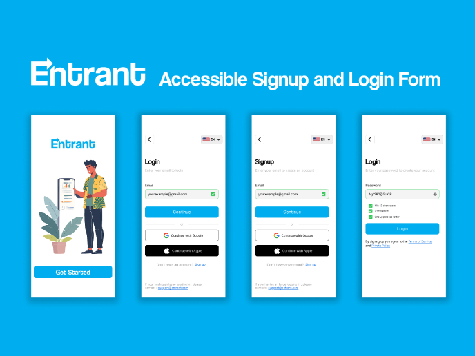
Entrant Accessible Signup and Login Forms
Visual Design Courses

UX Design Foundations

Introduction to Figma


