Color Palette - Luciano Aguzzi


A Color Palette project, with the goal of suggest a new color system to the co Desklog.io
Tools used
From brief

Topics
Share
Reviews
1 review

Hi Luciano!
From what’s visible on the Figma Slides page, the text blocks don’t seem to be finalized brand statements or your carefully crafted copy. At the beginning you've started how you redesigned the colors, and why it didn't work, then you started explaining about colors in general, They look more like placeholders, rough ideas, or internal notes—maybe even prompts for discussion rather than finished content. This is pretty common in early-stage design files, where the focus is on structure and flow rather than perfect wording.
Based on your description, the interface uses a dark background with yellow and blue accents for graphs and metrics. While this can look sleek, it’s notorious for tripping up accessibility—especially if the yellow is a lighter shade (think #ffe66d or similar) and the text or icons are small or thin. WCAG (Web Content Accessibility Guidelines) requires a minimum contrast ratio of 4.5:1 for normal text and 3:1 for large text or UI components to be considered accessible for most users, including those with visual impairments. Yellow on dark backgrounds is a classic offender: it often fails the contrast test, especially for smaller text or fine details. Blue can be better, but it depends on the exact shade. If you want to check specific color values, you can use tools like the WebAIM Contrast Checker or Colour Contrast Checker to plug in the hex codes and see if they pass.
You might also like

Customer Journey Map for a Co-Working Space


Workspace Booking Flow - UI/UX Design


Talenvo Website - Web and Mobile


L I N E A - Minimalist Fashion Brand


Medivet - Responsive Landing Page

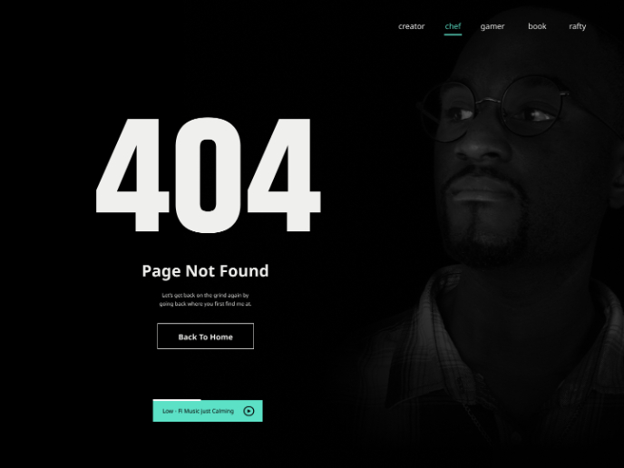
404 for Personal Website

Visual Design Courses

UX Design Foundations


Introduction to Figma

Design Terminology
