


Reviews
2 reviews

Hi there,
I recently explored your “Color Palette for Fictional Package Delivery Brand” project on Uxcel, and I want to commend you on the thoughtful approach you've taken in crafting a visual identity that resonates with both functionality and emotion.
What Stands Out:
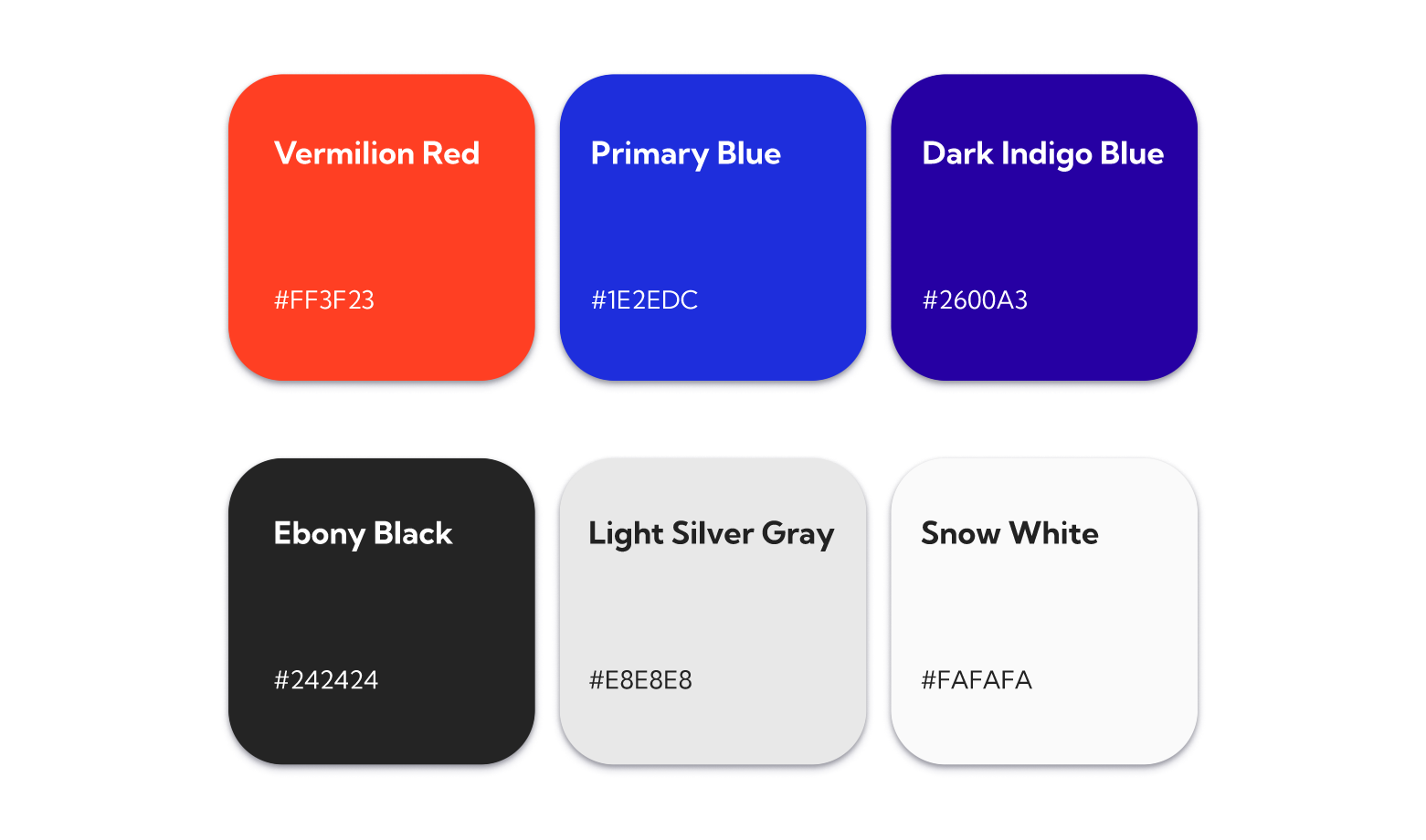
- Strategic Color Selection: Your choice of colors reflects a deep understanding of the brand's core values. The palette balances reliability with approachability, which is essential for a package delivery service aiming to build trust with its users.
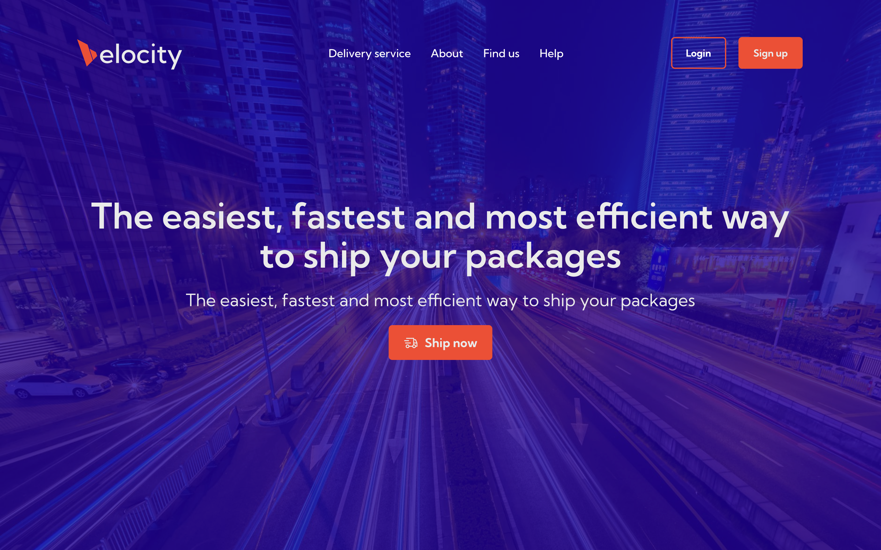
- Consistency Across Touchpoints: The application of the color palette across various brand elements—from the logo to the user interface—demonstrates a commitment to cohesive branding. This consistency helps in establishing a strong brand recognition.
- User-Centric Design: By considering how colors influence user perception, you've created a palette that not only looks appealing but also enhances usability. The contrast ratios and color combinations are well-thought-out, ensuring accessibility for a diverse user base.
Suggestions for Enhancement:
- Expanded Use Cases: Including more scenarios where the color palette is applied—such as in marketing materials, delivery vehicles, or packaging—could provide a more comprehensive view of the brand's visual identity in real-world contexts.
- User Feedback Integration: Gathering and incorporating feedback on the color choices from potential users or stakeholders might offer additional insights into how the palette is perceived, allowing for further refinement.
- Documentation of Color Guidelines: Developing a detailed style guide that outlines the usage of each color, including primary, secondary, and accent colors, along with their respective codes, can serve as a valuable resource for maintaining brand consistency across different platforms and teams.
Overall, your project showcases a strong understanding of how color influences brand perception and user experience. The palette you've developed is not only aesthetically pleasing but also strategically aligned with the brand's objectives.
Keep up the great work!

Nice selection of colors, Filippo!
It would be helpful to include the rationale behind the selected color palette, specifying the intended use cases per component. Additionally, providing detailed usage guidelines and ensuring WCAG-compliant contrast ratios would enhance both consistency and accessibility.
Overall, great job! Keep it up!
You might also like

SONZ - Entertainment platform


Camp & Travel Explorer - App Design


Solar system Dashboard Utility


Signup page for a SaaS website

Uxcel Halloween Icon Pack


PLANTIST

Visual Design Courses

UX Design Foundations


Introduction to Figma

Design Terminology
