ClickUp Colour Palette

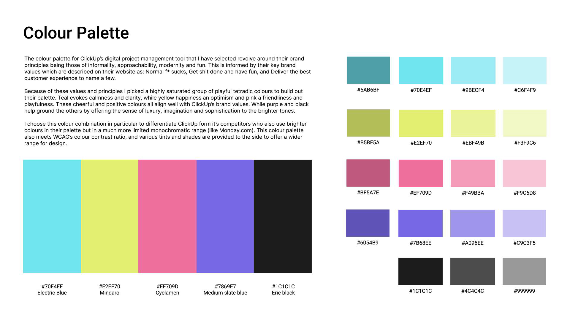
The colour palette for ClickUp’s digital project management tool that I have selected revolves around their brand principles being those of informality, approachability, modernity, and fun. This is informed by their key brand values which are described on their website as: Normal f* sucks, Get shit done and have fun, and Deliver the best customer experience to name a few.
Because of these values and principles, I picked a highly saturated group of playful tetradic colours to build out their palette. Teal evokes calmness and clarity, while yellow happiness and optimism and pink a friendliness and playfulness. These cheerful colours all align well with ClickUp’s brand values. While purple and black help ground the others by offering a sense of luxury, imagination, and sophistication to the brighter tones.
I choose this colour combination in particular to differentiate ClickUp from its competitors who also use brighter colours in their palette but in a much more limited monochromatic range (like Monday.com). This colour palette also meets WCAG’s colour contrast ratio, and various tints and shades are provided to the side to offer a wider range of designs.

Reviews
0 reviews
You might also like
QuickScan Onboarding


Nestra from homepage to checkout process


Islamic E-Learning Platfrom Dashboard


Pulse — Music Streaming App with Accessible Light & Dark Mode

SiteScope - Progress Tracking App


Mobile Button System

Visual Design Courses

UX Design Foundations


Introduction to Figma

Design Terminology
