Color System for Productivity Tool

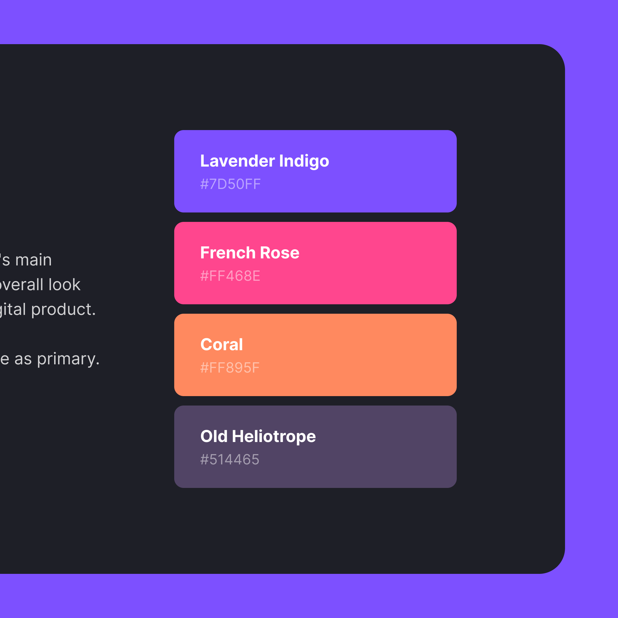
Proposal for a service that combines the traditional blue color with pink as an opportunity to evoke a sense of novelty and create a unique product experience.
Brand Value: Productivity, Collaboration, Joy, Warmth.
Brand Principle: We transform the work atmosphere into a positive and trusting one, and simplify administration so users can focus on solving tasks.
Tools used
From brief

Topics
Share
Reviews
1 review

First off, the colors are great and will work really well as part of a dark mode scheme. I love the fun, poppy, energetic palette and think you did a great job finding colors that work well together and explaining why you chose them.
My concerns are accessibility. The off-white text color may not pass accessibility to double-A standards at a small text type (16 px, reg). And the yellow system color has some issues when white is used on top of it. I would take some time to really decide the level of accessibility you're trying to cater to (standard is double-A) and make sure that each color—including the tricky yellow system color conform to that standard.
I would have liked to see more UI examples of the colors being used in context as well.
Good luck with your future design explorations!
You might also like
SiteScope - Progress Tracking App


FlexPay


Mobile Button System


CJM for Co-Working Space - WeWork


Ubani Design System


Accessible Signup Form for SaaS Platform
Visual Design Courses

UX Design Foundations


Introduction to Figma

Design Terminology
