Coin Saver- 404 Error Page

Scenario:
I am a UX designer at a finance organization which can include a bank, an investment firm, or a fintech company. My goal is to strike a balance in the finance platform’s interface and copy, blending respect and professionalism with friendliness and support.
Objective:
Select a platform and device type for your design, then create a helpful 404 error page tailored to that context. The page should be functional, providing users with a clear solution or next step while maintaining a visually appealing and user-friendly layout. Be sure to align the tone, style, and design elements with what would be expected from a finance organization’s brand voice.
1.) User Behavior Analysis
-Data Analysis: I reviewed the objective guidelines then compared them to my UXCEL module notes regarding accessibility, tone and opportunities for creativity regarding 404 pages
-Competitor Analysis: I reviewed the 404 pages of financial institutions and web applications to further grasp the concept.
2.) User Needs
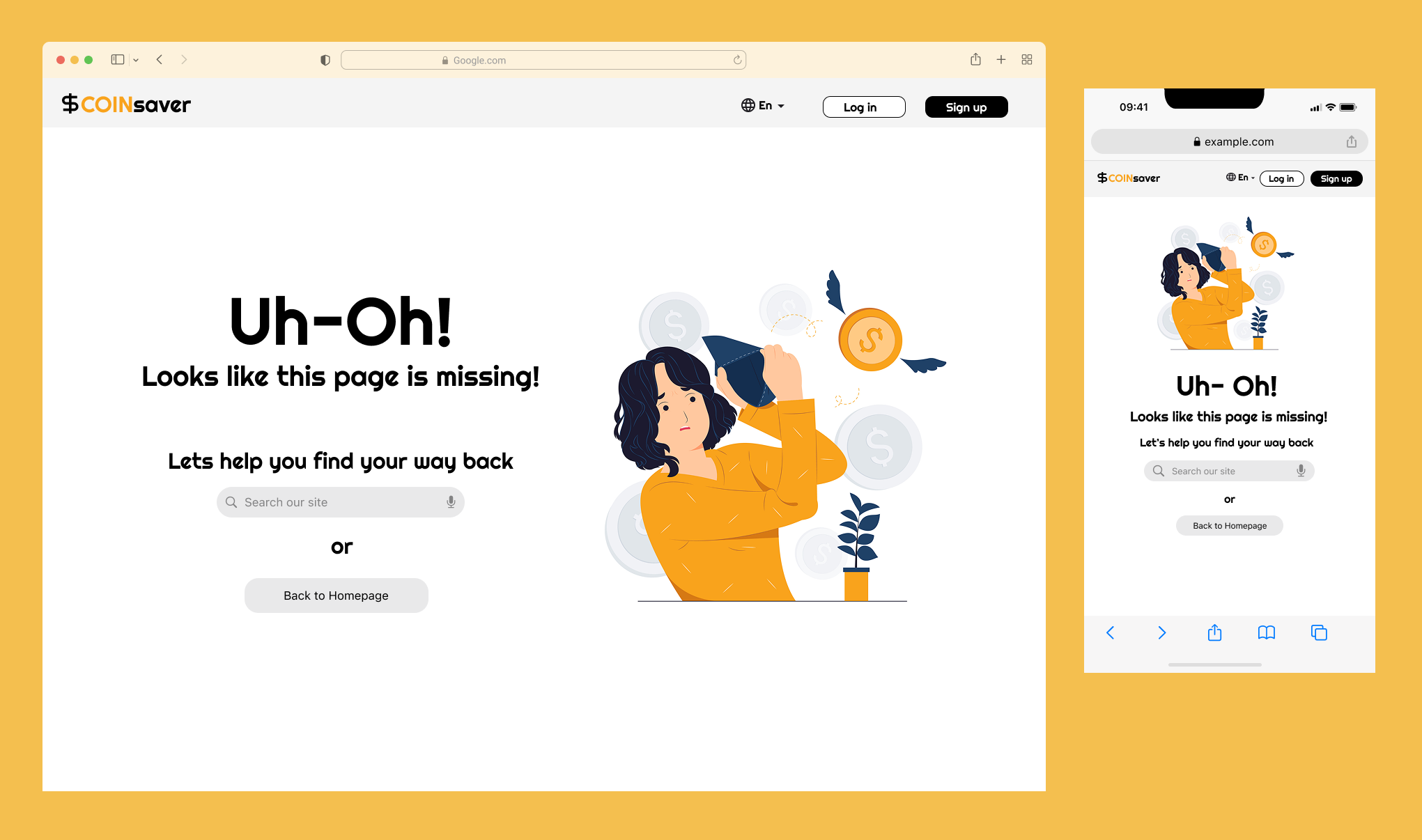
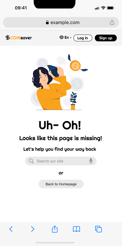
-Clarity: The text gives the user clear indication that the page doesn't exist and "Oops!" they have stumbled into the wrong place.
-Guidance: Navigation options are provided. Users can either choose to go back to the Homepage or type into the search bar what they are actually looking for. This provides the user with flexibility. "Let's find your way back" reassures the user that they are not stuck, they have options.
-Engagement: 'Log-in' and 'Sign-up' buttons are located at the upper right of the page for predictable navigation.
3.) Design Considerations
-Theme Consistency: For the page I chose to stick with grey, white, black and used yellow as the accent color
-Engaging Graphic: The graphic is of a girl with an empty wallet with a shocked expression. It remains on theme of searching for something, in this case money because this is a financial website. And discovering it not to be there, similar to the missing page.
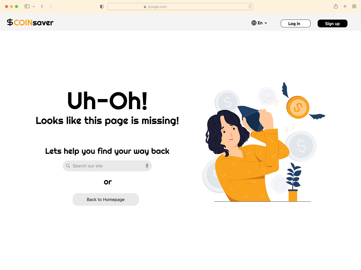
-Accessibility: I designed this assignment for both Desktop and mobile accessibility. The largest font is "Uh-oh!" followed by "Looks like this page is missing." to quickly communicate that this is an error page
Conclusion
This 404 page is meant to reduce user frustration and fatigue by giving a clear indication of the user's location on the website and providing options to navigate to the user's desired location. Engaging and clear visuals are used to empathize with and guide the user through the "CoinSaver" platform, lending credence to the trustworthiness of this financial institution.

Reviews
2 reviews

Good job, Shaffiat. It's clear you took the time to consider user needs and the basic requirements. Your page delivers a friendly, approachable tone and offers users clear options to recover from an error, such as going back to the homepage or using the search bar. Use of a clean layout and accent color helps maintain visual interest.
However, there is significant room for improvement to elevate the design and better align it with the professional standards of a financial brand. I encourage you to:
- Revisit your font choice and adopt a more modern and neutral typeface to support credibility and trust.
- Rethink the illustration, as an empty wallet can feel discouraging for users—consider a graphic that suggests searching, guidance, or positive direction.
- Pay closer attention to accessibility details, such as clearly labelled elements and robust colour contrast.
- Strengthen the overall polish and functionality of interactive elements, ensuring a seamless user experience.
With deeper refinement in these areas, your work can become more impactful and better meet the needs of both users and finance organizations. Keep iterating and focus on building trust and clarity in every design decision!

Uh-oh, I honestly feel bad for the girl 🥲 It’s the whole gesture and expression that can transcend through the screen and radiate to users. Nicely chosen, Shaffiat.
Since this is related to finance, which can be sensitive, I think you can help reduce the shock factor by not using a solid black for the text color. It’s subtle but can make a big difference. Ease their burden by not making the “uh-oh” situation too striking on the eyes.
Also, to help you avoid decision paralysis, you can just choose one direction: is it a design for a bank, an investment firm, or a fintech company? That way, you can focus your design and avoid falling into overly broad scopes.
You might also like

Lumen — Accessible Signup Form


SONZ - Entertainment platform


Camp & Travel Explorer - App Design

Uxcel Halloween Icon Pack


Solar system Dashboard Utility


Color System

Content Strategy Courses

UX Writing


Common UX/UI Design Patterns & Flows


Go-to-Market Strategy Fundamentals
