Clickup Redesign

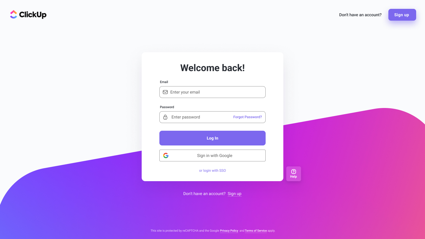
All non-text content has a text alternative.
Text and interactive elements have sufficient color contrast. The recommended contrast ratio is at least 4.5:1 for normal text and 3:1 for large text.
Everything is accessible via keyboard by pressing Tab key
Added "Help" for extra assistance
The form helps users avoid and correct mistakes through clear labels and instructions for form fields.

Reviews
2 reviews

Well done, Jaafar!
I like how this looks well designed but at the same time it's hard to tell if you actually made it since there are no further attachments. To clear such doubts maybe you could add some links and also consider putting some of the accessibility features mentioned in the description in actual designs or even better, a prototype.
Cheers!

worthy project
You might also like

Accessible Signup Form


Entrant - Analytical Dashboard


Transit Cairo — Digital Mobility Redefined


Babylon Balance - Designing Financial Clarity Through Constraint


Entrant Accessible Signup and Login Forms

CJM x Mindspace case study - Ester Cinelli

Visual Design Courses

UX Design Foundations


Introduction to Figma

Design Terminology
