CleanPath

As waste management practices continue to evolve, many individuals and small businesses struggle to find the most efficient and sustainable ways to manage their waste. Existing solutions are often fragmented and difficult to use, which leads to poor adoption of environmentally friendly disposal practices. Clean Path seeks to solve this by providing an easy-to-use app that makes waste management more transparent, organized, and eco-conscious.
Reviews
4 reviews

Love this 🔥🔥🔥
A really solid piece of design work

Hi Seun,
CleanPath’s design is bright, inviting, and very well-organized, making it easy for users to stay engaged. The clean visuals support the brand’s message perfectly. A little more visual hierarchy in the text sections could make the flow even smoother. Overall, a beautifully executed project—great job!

CleanPath is already solid. The concept is strong, the layout is clean, and the features hit real user needs. However, some details need tightening to make the app feel complete and polished.
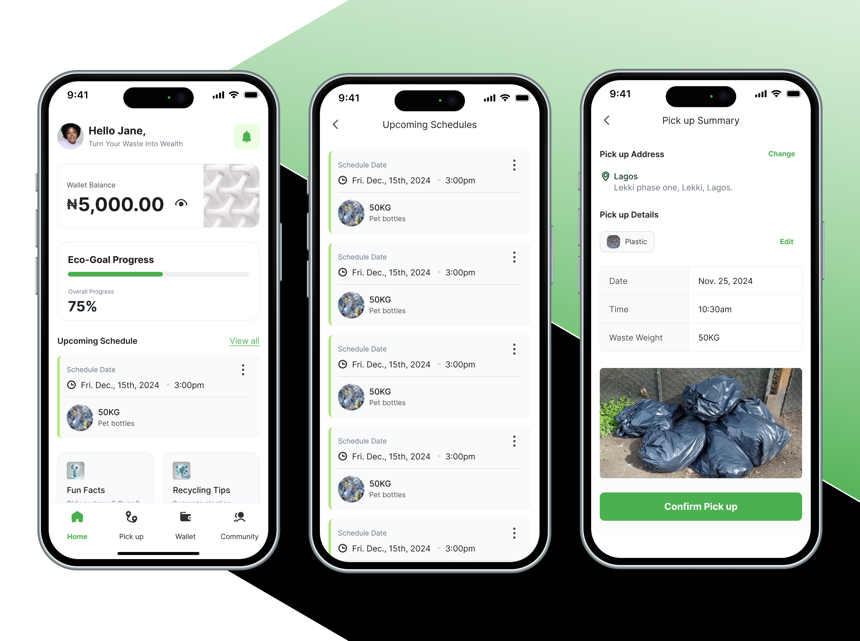
Let’s start with the wallet screen. The ₦ amount should stand out more. Right now, it looks like secondary info. Increase the font weight and size slightly. Status tags like "Pending", "Successful", "Cancelled" need color and icon support. Just text isn’t enough. Also, make each history item tappable for full breakdown — not just a chevron.
On the pick-up summary, the success message works, but it’s flat. Add something meaningful like "You just saved 2kg of CO₂" right after confirmation. And the trash image looks raw — give it a border radius to match the UI.
The waste tracker needs context around percentages. “25%” alone doesn’t mean much. Add a label like "In progress" or "Not started". Also, the calendar lacks interaction feedback. When you select a day, there’s no visible state change. Add a filled circle or a checkmark to confirm selection.
The community tab is missing interaction. Right now it’s just content. Let users like, reply, or react to posts. Add subtle icons below each post. And fix the vertical spacing — the posts feel too close. Add at least 16px padding between them.
On eco-goal progress, the bar is clean but static. Animate it slightly when it updates. Also, instead of just showing a percentage, show impact — like “10kg of plastic saved”.
Typography still needs alignment fixes. Example: “Fun Facts” and “Recycling Tips” aren’t lining up cleanly. Also, avoid repeating “Wallet Balance” in both the header and nav. Stick to a clear type scale — maybe 16px for regular content, 14px for secondary labels, and 24px+ for numbers.
A few more small things:
- After image upload, show a preview with a remove option.
- Onboarding needs one message per screen. Not just visuals — tell the story.
- Add active state to bottom nav tabs (e.g., green underline or filled icon).
Overall, this is a strong direction. Just polish the small things, and the whole product will feel tighter, smarter, and easier to trust. You're close. Push it a bit more.
It's really nice.
You might also like

Smartwatch Design for Messenger App


Bridge: UI/UX Rebrand of a Blockchain SCM Product


Pulse Music App - Light/Dark Mode


Monetization Strategy


Designing A Better Co-Working Experience Through CJM


Design a Settings Page for Mobile
Popular Courses

UX Design Foundations


Design Terminology


Core UI Components
