CleaningBuddies — Cleaning Service Landing Page Design
Hi everyone! 👋
Excited to share my latest UI/UX project — a modern and user-friendly landing page for CleanBuddies, a local cleaning service in Bali.
This design focuses on solving real pain points with a clean layout, clear services, and an easy booking experience for busy homeowners, offices, and rental managers.
✨ Objective: Design a landing page that’s clear, trustworthy, and optimized for conversions.
✨ Target Audience: Locals, expats, and small businesses in Bali looking for reliable cleaning services.
✨ Process:
- Researched user pain points & goals
- Designed a calm and friendly UI with a focus on hierarchy & readability
- Ensured mobile-responsiveness and clear calls-to-action tailored to the local audience
Thanks for checking out my project! Would love to hear your thoughts or feedback. 🌟
Reviews
4 reviews
Nice work on the CleaningBuddies Landing Page! The layout feels fresh and inviting—perfect for a cleaning service. The icons and illustrations add a friendly touch, and the content is well-structured. Maybe bumping up the CTA contrast a bit could help it stand out more, but overall, clean and approachable design! 🧼✨
This is a good start, and I can see the effort that has gone into the design.
There is a need to address the issues related to color contrast between text and background. For instance, the combination of background color #2252FB and text color #D2AF25 results in a contrast ratio of 2.7:1, which falls below the recommended levels according to the Web Content Accessibility Guidelines (WCAG). I also noticed similar contrast issues in other areas of the design—it’s worth reviewing these across the board to ensure readability and accessibility.
Additionally, it would be helpful to review the text weight in context with the background to ensure it remains legible and visually balanced.
Consider adding a bit more breathing space within larger paragraphs to enhance readability.
Lastly, a thorough review of the UI copy could further elevate the experience by ensuring clarity and consistency in messaging.
Addressing these points around accessibility will help refine the design and make it more inclusive. Looking forward to seeing the next iteration!
Bravo Yuni!
I really like it. Only the blue font in the hero is a bit distracting :)
You might also like
Portfolio website
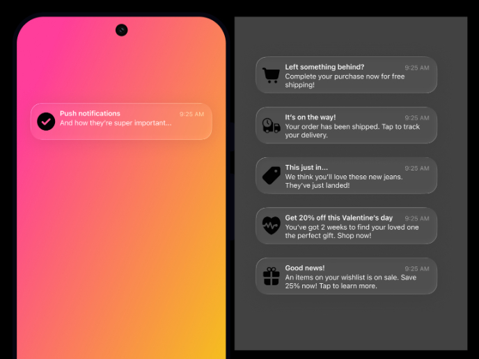
Notification microcopy - Project
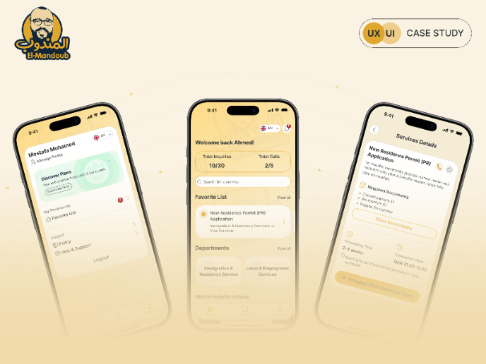
El Mandoub-GovTech App
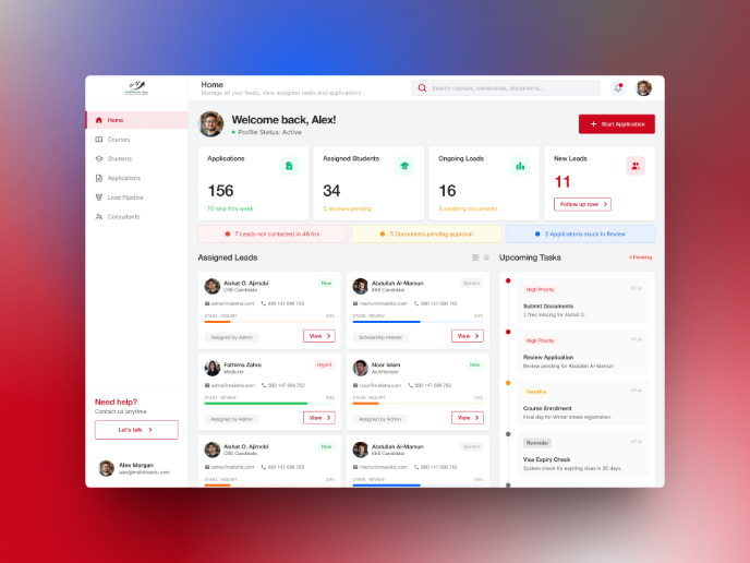
MalishaEdu Counselor Workspace
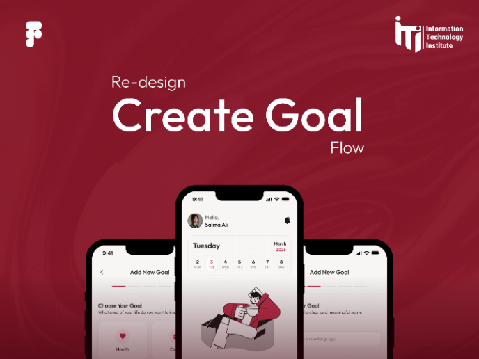
Goal Creation Flow
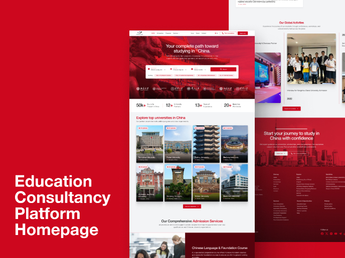
MalishaEdu - Website Design
Content Strategy Courses

UX Writing

Common Design Patterns

