Checkout UI

https://www.figma.com/proto/3WnqIprC7P4lD4s7goZYpe/UXCEL-Assignment?node-id=19-4&t=HfORIMwfgnVTz9wq-1&scaling=min-zoom&content-scaling=fixed&page-id=19%3A2&starting-point-node-id=19%3A4

Reviews
3 reviews

Hey! This Checkout UI project has some great ideas, but there’s definitely room to level up the execution, especially when it comes to the UI. Here’s a mix of what’s working and what could use some improvement:
What’s working:
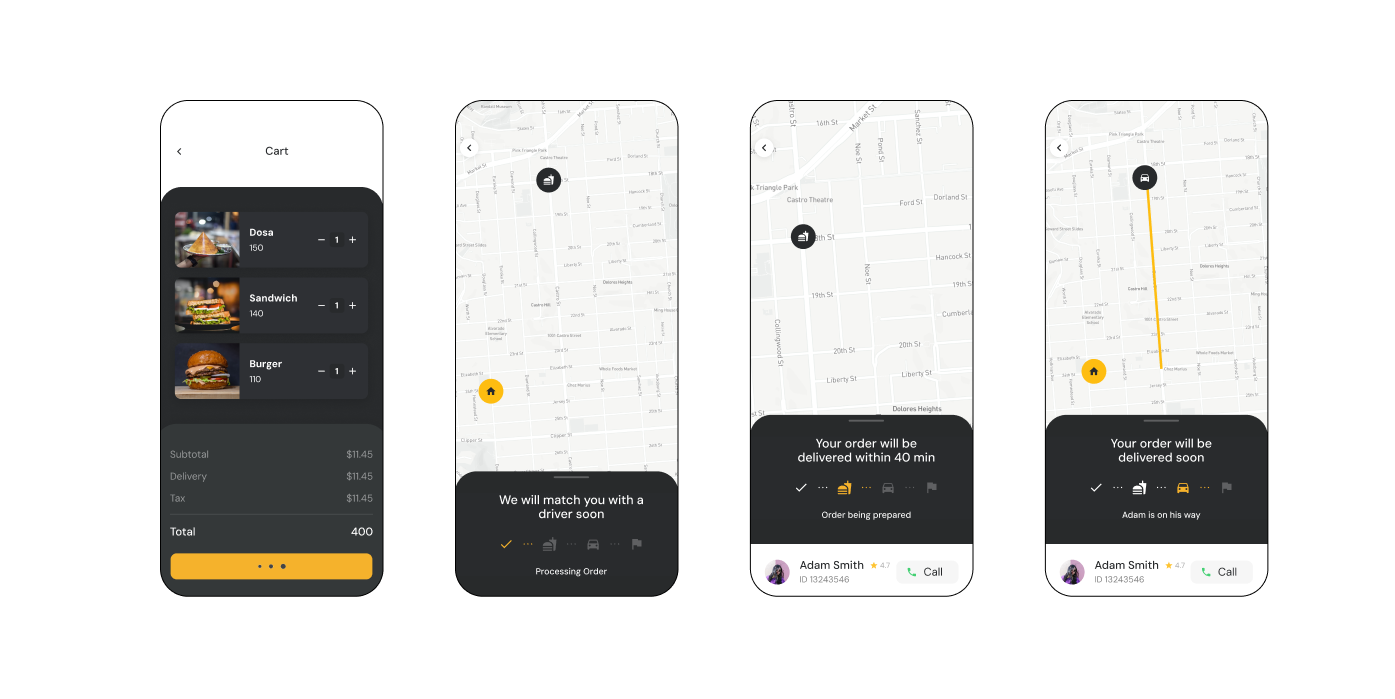
- Food Delivery App: The flow from cart to delivery tracking is clear, and I like the use of icons for tracking progress. Including driver details is a smart move to build trust.
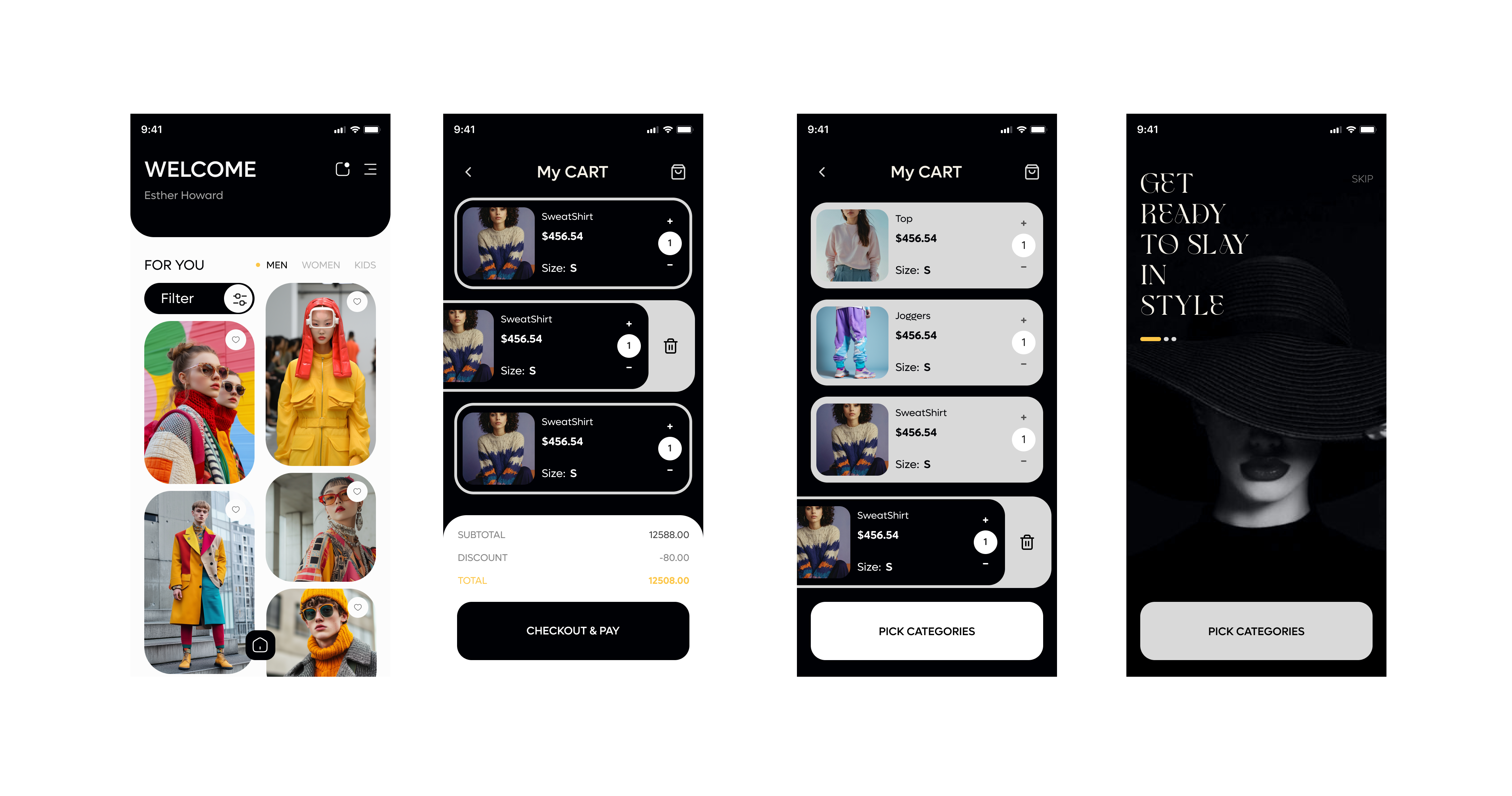
- Fashion App: The bold typography and premium feel of the welcome screen stand out. The filters and categories are easy to spot, which is a good start for navigation.
Where the UI needs improvement:
- In both apps, important details (like delivery time, total cost, and shipping fees) are buried or too subtle. These need to stand out more with better typography, contrast, or placement.
- Some text elements are too small, especially in the food app (like the cart details). Larger, more consistent font sizes would improve readability.
- The buttons could feel more clickable and polished. Add consistent sizing, better contrast, and maybe a press state to make them more engaging in the prototype.
- The layouts in both apps feel cramped in places. Adding consistent padding and aligning elements (e.g., product names and prices in the fashion app) will make the design cleaner and more professional.
- Both designs lack clear microcopy to guide users. Adding helpful text like "Secure checkout," "Tap to track your delivery," or "Free returns available" can reduce hesitation.
Suggestions to take it further:
- Use a consistent color scheme to evoke trust and highlight key actions (e.g., checkout buttons).
- Improve scannability by grouping related information together and using clear section headers.
- For the fashion app, product images look great, but adding more context like materials or reviews will elevate the experience.
- Add a cohesive design system so both apps feel consistent in typography, spacing, and button styles.
There’s potential here, but the UI needs refinement to make these designs truly shine. Keep going, you’re on the right path, and with some polishing, these will stand out! 💪

Ankita, I loved the style, it's clean and easy to scan, not cluttered.

This brief starts with the following scenario you're meant to solve: "Your team has noticed that there are a lot of cart abandonments that happen during the checkout."
It seems you forgot completely about the problem, because the prototype that you submitted does nothing about addressing cart abandonments.
Instead, it starts right at the point the user is ready to submit the order: as a tester you can click directly on "checkout" and then see/follow your order. By the way, please check how you linked the initial frames as it is somewhat broken (you need to click a couple times on "checkout" to make it progress, and there's some visual glitches all along).
So it is really hard to judge your submission against the brief. 🥲
But since you made the effort, let me give you a couple of feedbacks since there's also quite a few UI and UX issues with your designs.
As an example, let's review together the second "My CART" screen:
- If there's a logic for why some product cards are black and some white, it's not clear to me as a user
- The number of items badge (white) is not accessible against the top 3 product cards background (light gray)
- I assume there's a swipe interaction to reveal the remove button but there's no hint that the user can do that (plus it's very unintuitive to imagine that a left swipe would also move the underlying card to the right as well)
- I can't imagine what a "Pick categories" CTA would actually do on a cart screen, and as a CTA the color choice doesn't work as it's not giving that button the proper emphasis (you have a very good counterexample in the yellow CTA you used on the other checkout screen)
So, TLDR, never forget that design is not about making pretty screens or prototyping cool interactions, it is about solving problems 👋
Please don't be discouraged, take it one step at a time!
And thanks for sharing your work! Keep at it!!!
You might also like

Smartwatch Design for Messenger App


Bridge: UI/UX Rebrand of a Blockchain SCM Product


Pulse Music App - Light/Dark Mode


Monetization Strategy


Designing A Better Co-Working Experience Through CJM


Design a Settings Page for Mobile
Interaction Design Courses

UX Design Foundations


Introduction to Figma

Design Terminology
