Chat Seller

Chat Seller
Share
Reviews
5 reviews

Love this, clear, functional design that solves problems
Great work, Agri ❤️

Greate work!

Hello Agri Fina,
The designs are clear and visually appealing, and the flow is very easy to follow. I have a few suggestions that might help improve them even further:
- The "Back" button text appears larger than the main page header, which disrupts the visual hierarchy. If you make the header more prominent and larger than the back text, you'll achieve a better hierarchy.
- There's too much white space below the header. You can reduce it to one of these standard values: 16px, 24px, or 32px.
- In general, typography colors and contrast need improvement. I recommend checking out this typography basics course: https://app.uxcel.com/courses/typography-basics. It will definitely change the way you approach typography.
- Regarding the CTA button, it would be more user-friendly to place the "Detail" button on the right side instead of the left. On mobile, the right side is easier for users to reach with their thumb, and it's also a common best practice.
- In bottom sheets, the cancel icon should be placed on the right side, not the left. As I mentioned in point 4, having it on the right is more ergonomic and aligns with UX best practices.
Keep going — you're on the right path! I wish you lots of success!

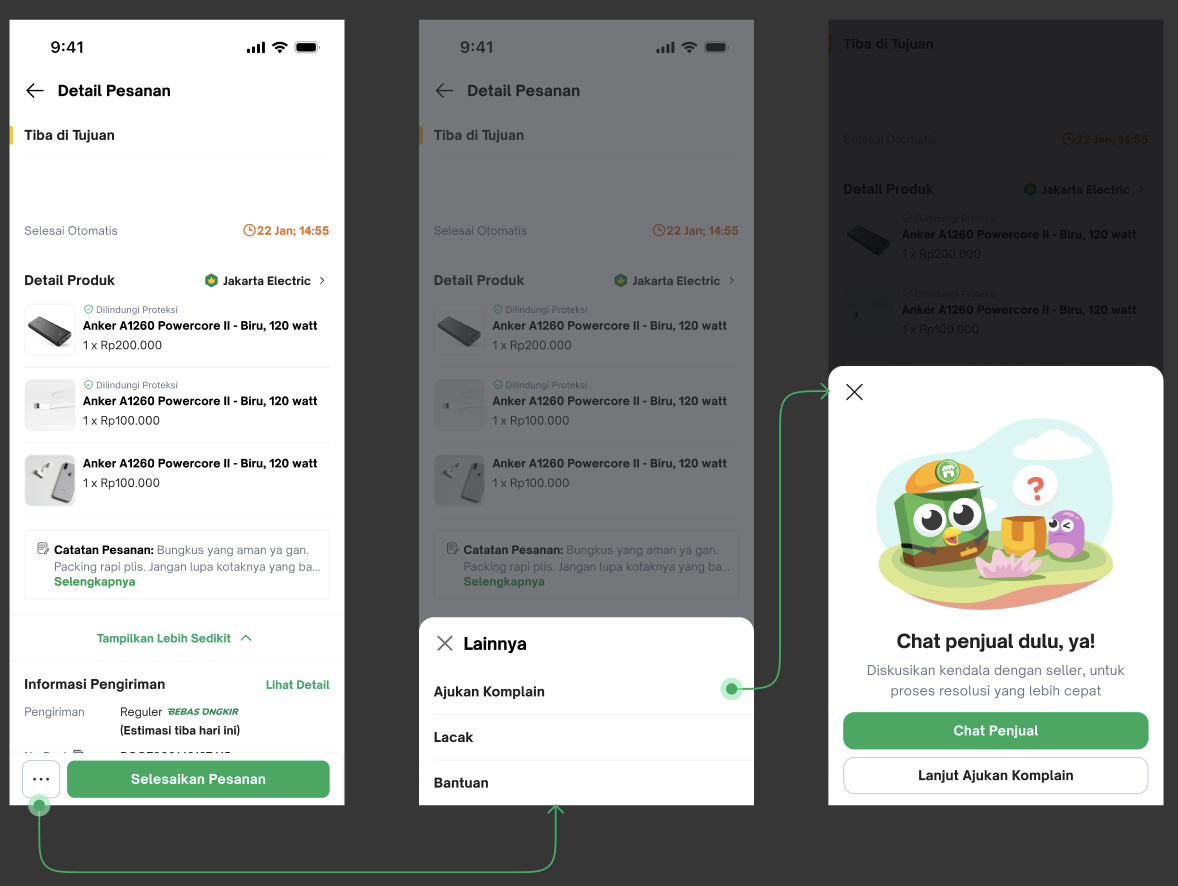
This is a detailed and thoughtful project, focused on a critical point in the e-commerce user journey: post-purchase support and communication with the seller. Demonstrating the full flow, including decision points, is excellent work!

Awesome job!
24 Claps
Average 4.8 by 5 people
You might also like

Project
eWallet App Development Project

✨ Experience the future of digital payments with our innovative eWallet App design! Our concept combines powerful fintech capabilities with

Project
🖥 Desktop Checkout Flow Design

Designing a friction-free checkout experience to reduce cart abandonment 1️⃣ Project ContextAs part of the product design team for an e-comm

Project
Website CRM Dashboard

When designing the DataPollex CRM dashboard, the core question I kept asking was: what does a person actually need to do in the first 60 sec

Project
Helpful 404 Error Page for a Fintech Mobile App

Project ContextError pages are often overlooked in product design, yet they play an important role in maintaining trust and guiding users wh
Project
TaskFlow Authentication Flow

This project presents an accessible authentication flow designed for a SaaS platform called TaskFlow. The interface was designed with WCAG 2

Project
Pebble Accessible SAAS Signup Flow

Pebble Pebble is a mental health SaaS concept designed as part of the UXCEL UX Design career path. The brief was to design an accessible s
Popular Courses

Course
UX Design Foundations

Learn UX design fundamentals and principles that create better products. Build foundational knowledge in design concepts, visual fundamentals, and workflows.

Course
Introduction to Figma
Learn essential Figma tools like layers, styling, typography, and images. Master the basics to create clean, user-friendly designs

Course
Design Terminology

Learn UX terminology and key UX/UI terms that boost collaboration between designers, developers, and stakeholders for smoother, clearer communication.