Reviews
2 reviews
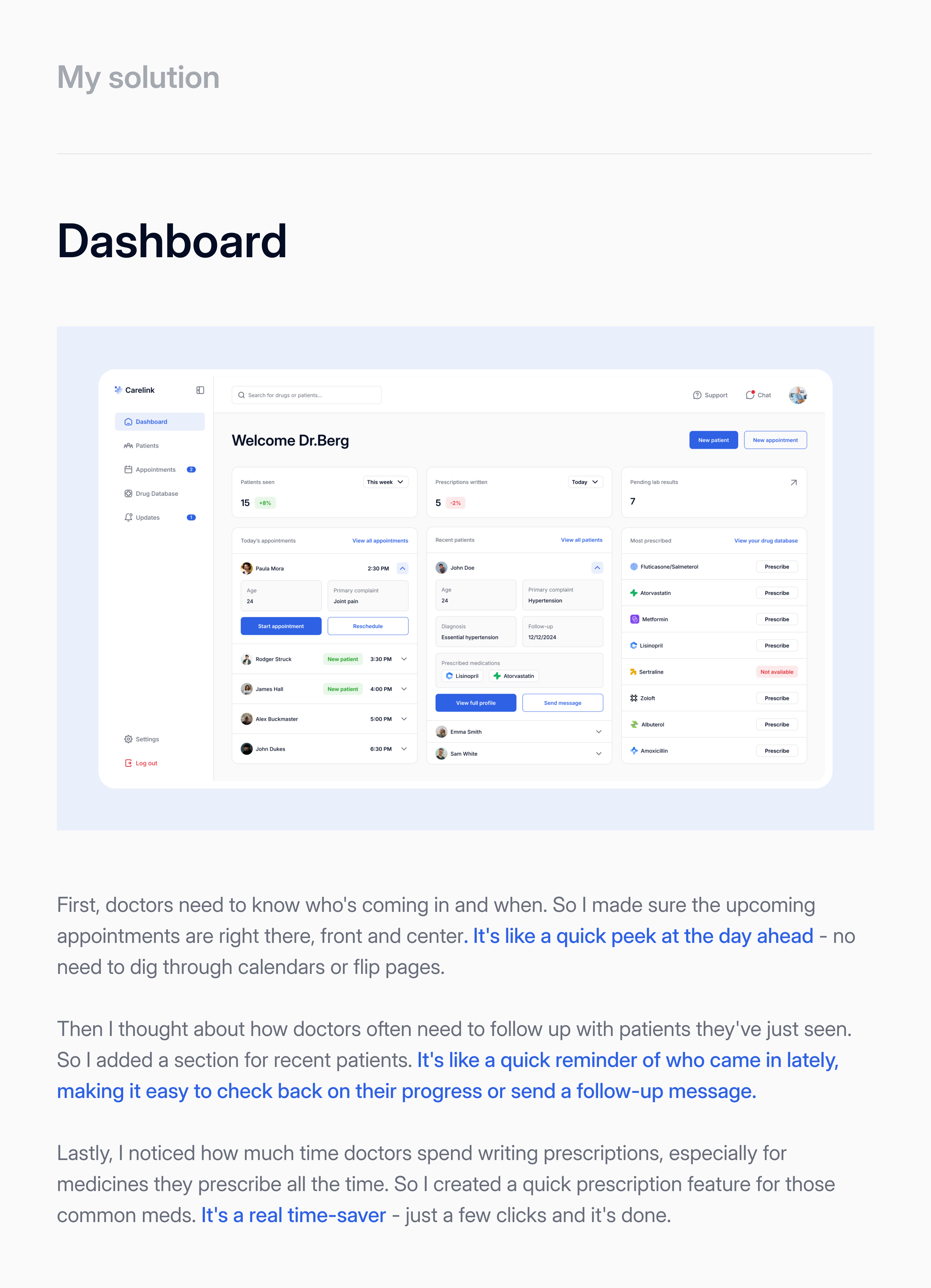
You design has a clear goal to help doctors improve their work efficiency and quality. Brilliant!
The features you design into the app are considerate of doctor's work content and task flow. The UI colors are pleasant, yet taking into considerations of WCAG. The layout matches with modern digital users' mental model. Perfect work!
The issue you described is so real, and a software of this kind would certainly be essential in streamlining doctors' work and accelerating the digitalization process. I appreciate the minimalist design and the use of soft colors, which are crucial for someone who will be looking at a screen all day. The app’s core features, such as not only viewing upcoming appointments but also recommending follow-up messages for recent patients, are highly valuable. The quick prescription feature is excellent—arguably the most useful in my opinion—and the drug database is indispensable for doctors, eliminating the need to remember often unpronounceable names, their purposes, and uses.
A minor improvement from a UI perspective would be to provide better hierarchy and, consequently, more prominence to the features on the dashboard. For example, the 'Today's Appointments' and 'Recent Patients' sections are quite similar, with the titles resembling captions. I would differentiate these two sections more clearly, highlighting the one that is more urgent. Additionally, the cards often contain small amount of data but take up a lot of empty space. While padding is important, I believe that if a card takes up a third of the screen, the data inside should occupy more than just 15% of it.
Also, pay attention to the details. App pages change, but the tab in the sidebar does not.
Hey Fedir,
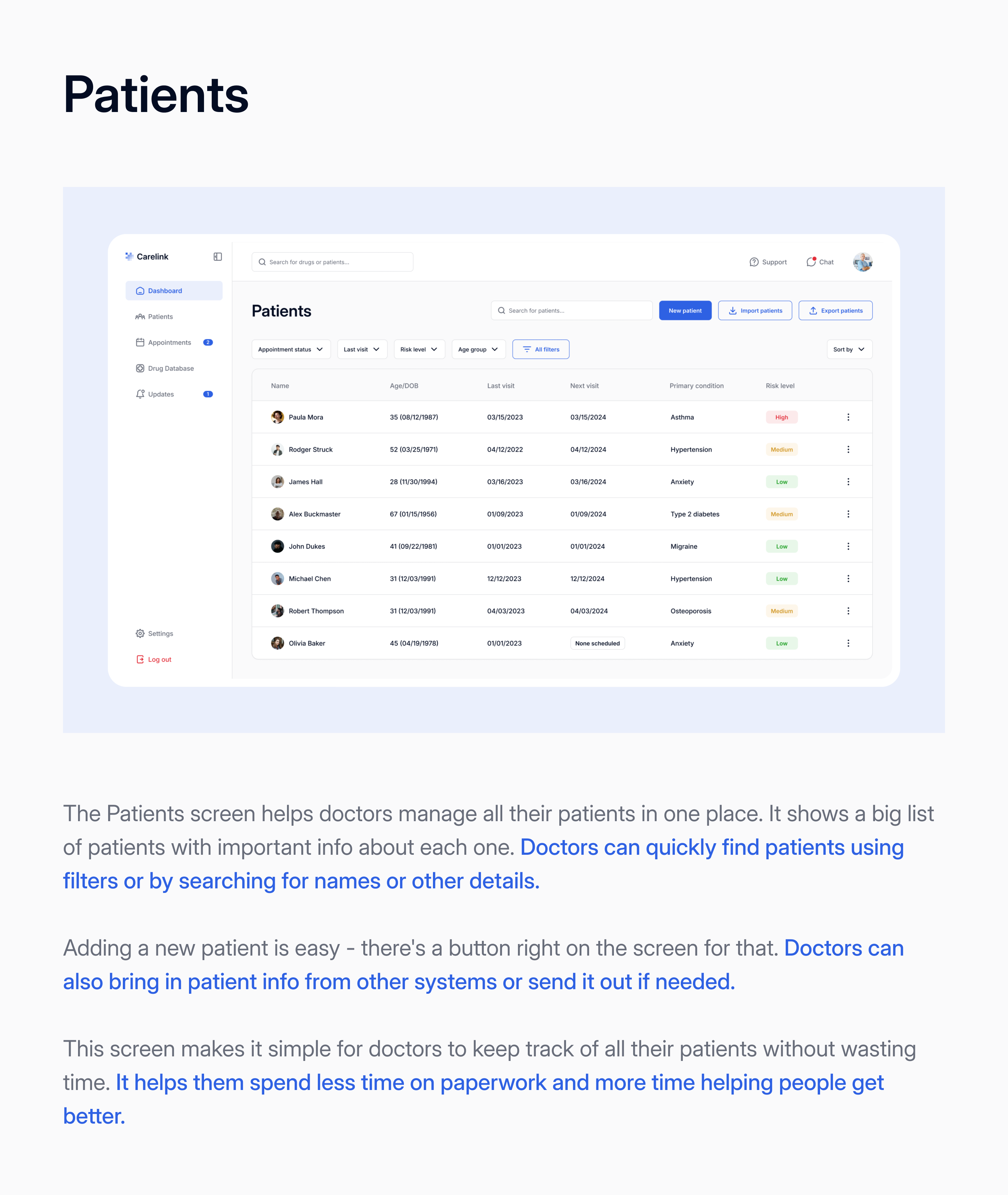
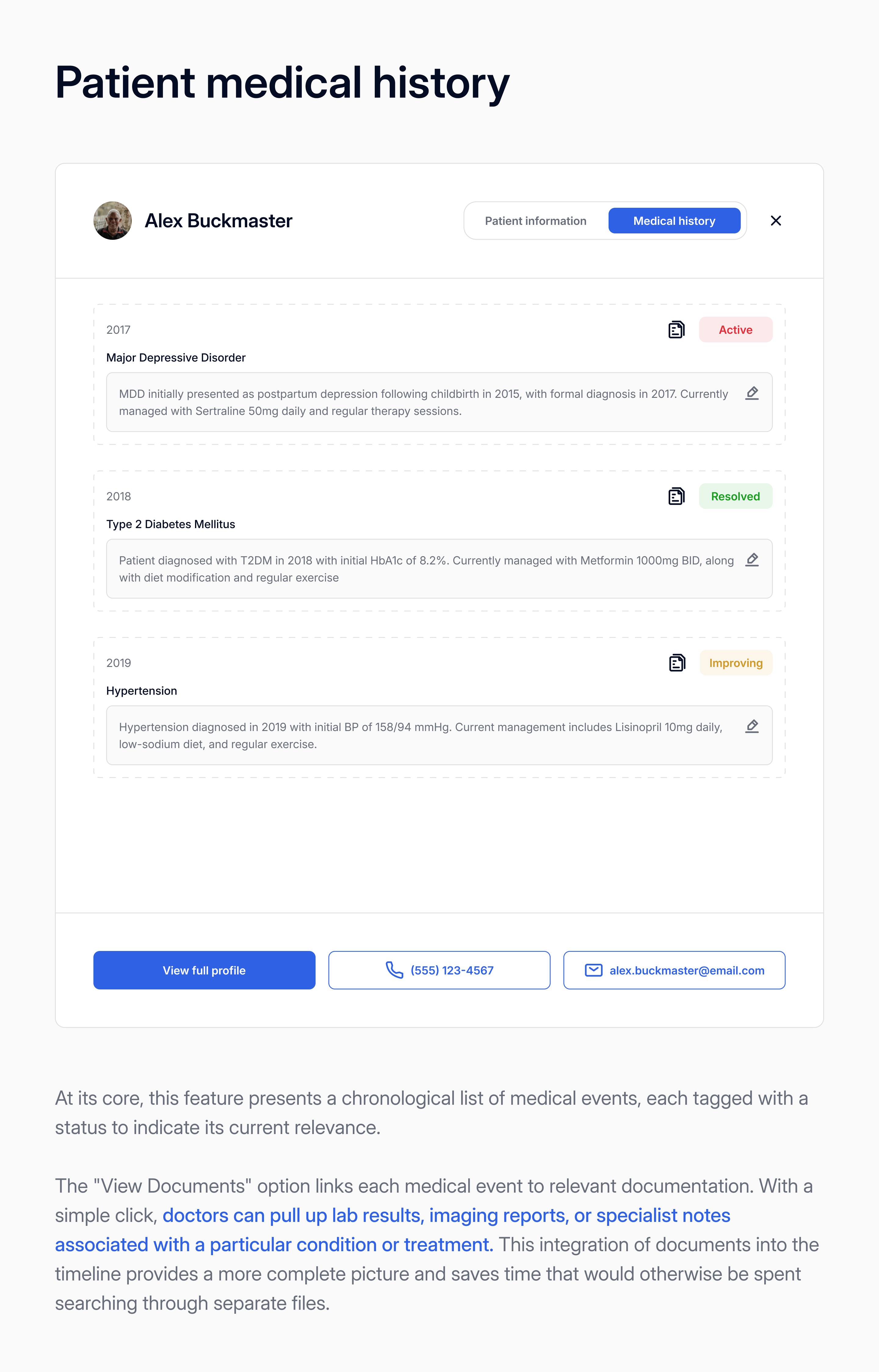
I like the approach you took with this project and how clearly you explained your design decisions. The dashboard is well-organized, with well-placed advanced filters, and the use of secondary and tertiary colors makes important UI elements stand out. I like how you offered doctors a clear way to manage appointments and patients.
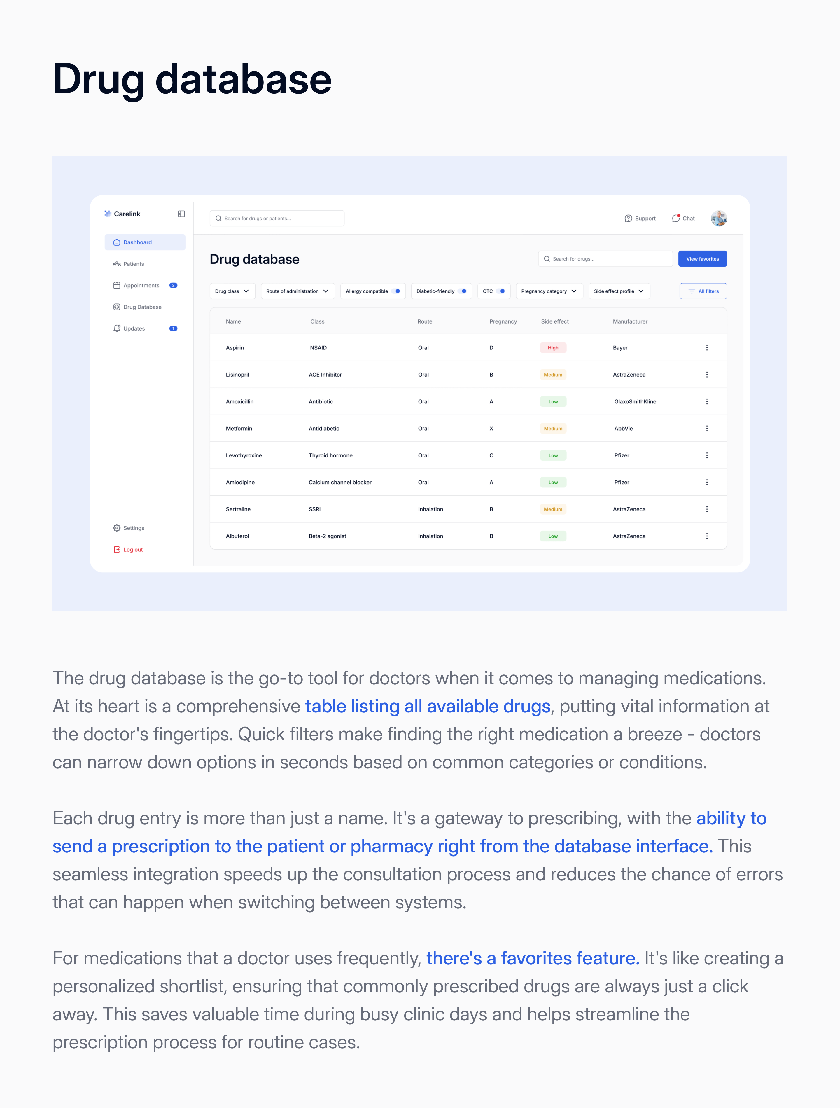
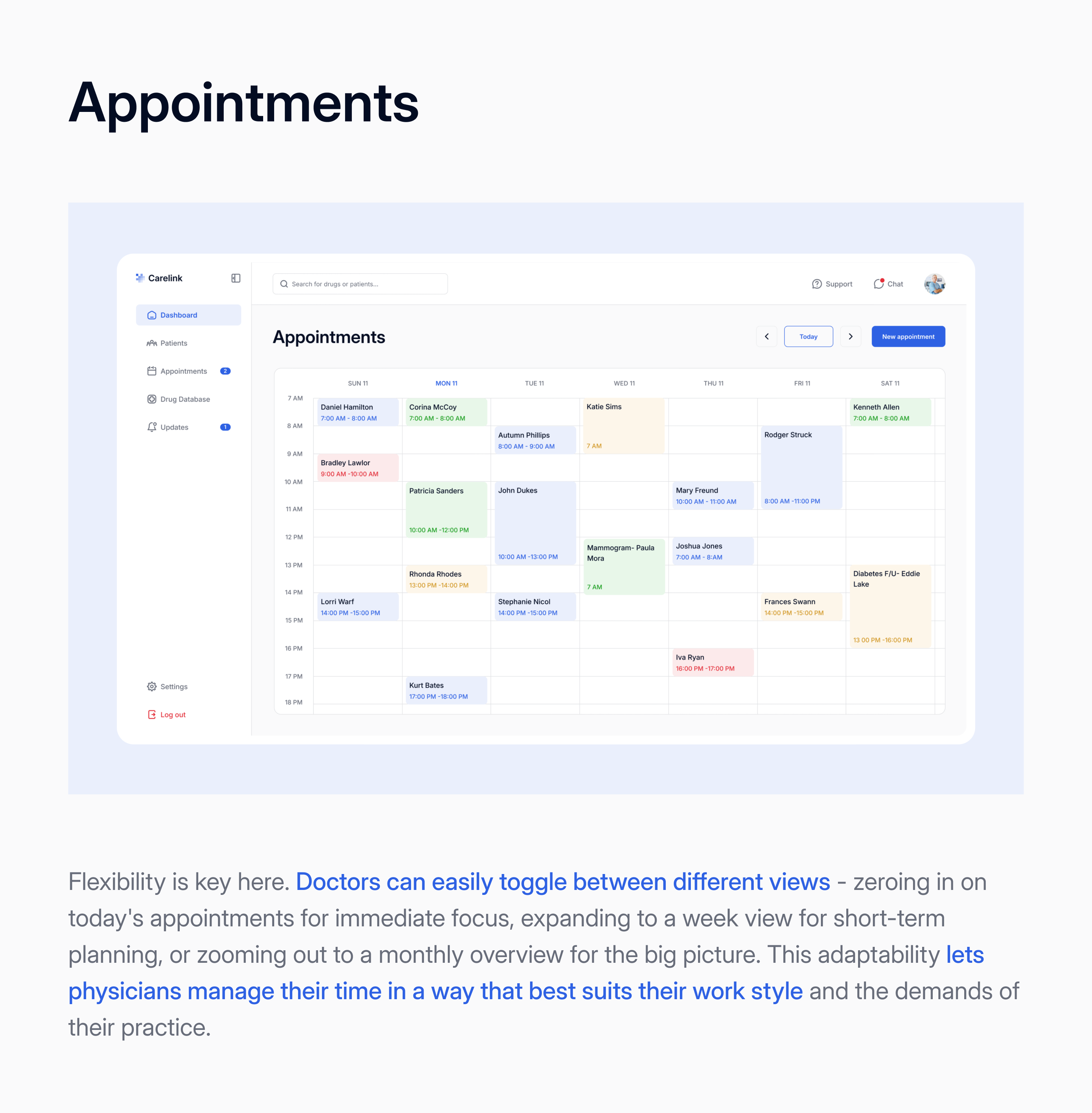
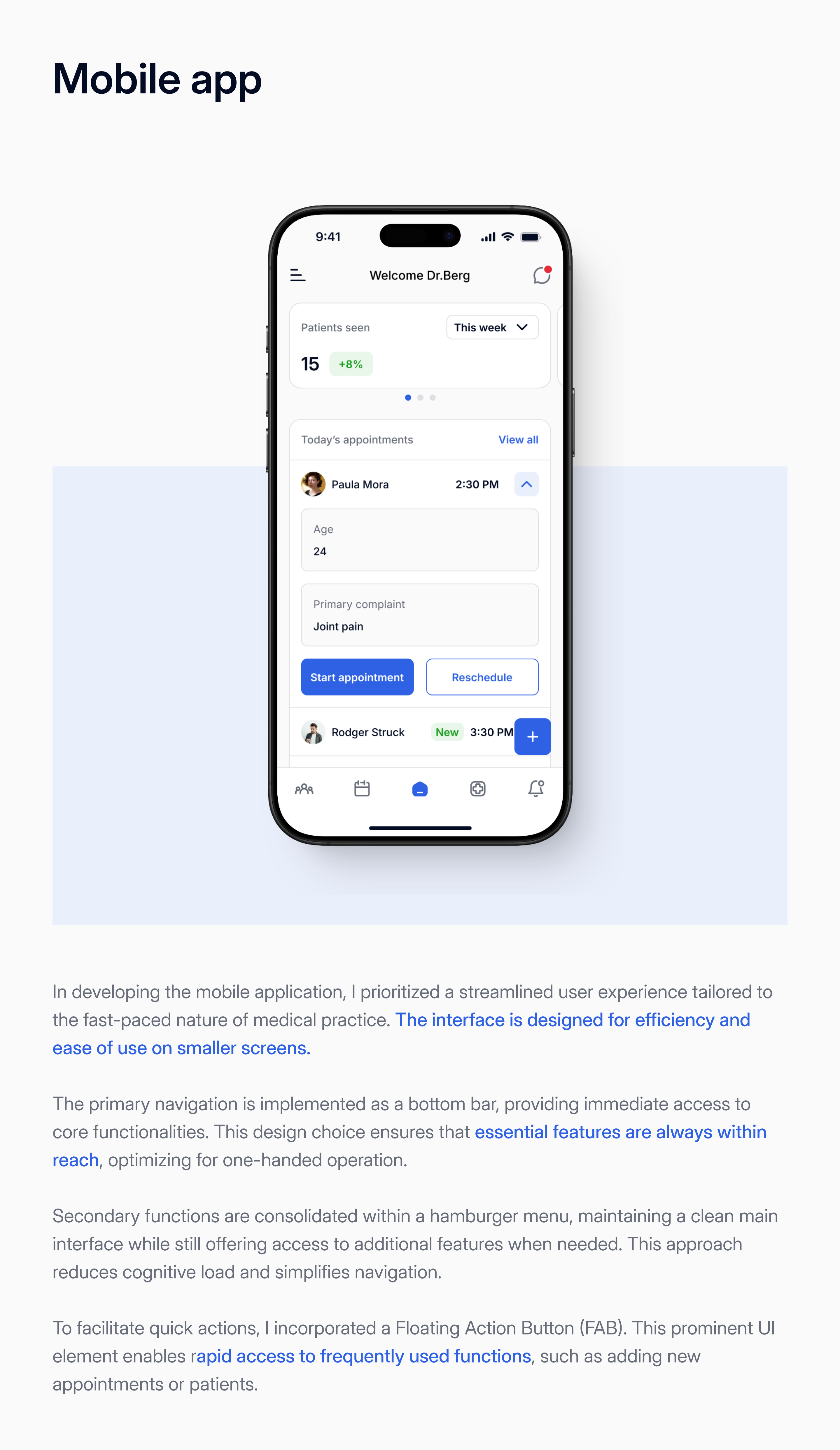
Some improvements can be made. For example, moving the profile access you have in the top right corner to the sidebar might use the space more efficiently, you can put info like user name and user role. The drug database and other tabular data could benefit from bulk action options for greater flexibility. In the calendar, the color coding is a nice touch, but it's not immediately clear what each color represents. Would love to know if you planned to add some filtering options here to help with appointment management. On mobile, while it’s responsive, it would be helpful to have the option to collapse long lists of items and groups.
Lastly, there’s a technical issue in the Figma prototype it defaults to an iPhone X frame, and it’s not possible to change it. Overall a well thought-out design that covers UX problems for doctors, good job Fedir.
You might also like

Improving Dating App Onboarding: A/B Test Design

FORM Checkout Flow - Mobile

A/B Test for Hinge's Onboarding Flow

Accessibility Asse

The Fitness Growth Engine
Uxcel Halloween Icon Pack
Popular Courses

UX Design Foundations

Introduction to Figma


