Button System Design


Buttons are a core component of any user interface, responsible for guiding user interactions and facilitating smooth workflows. Therefore, designing a system that ensures consistency, accessibility, and adaptability across various use cases is crucial.
Before beginning the design, I conducted research on best practices in button design, including guidelines from established design systems like Material Design, Apple’s Human Interface Guidelines, and IBM’s Carbon Design System. I analyzed how different platforms implement button states and variations, ensuring my approach aligns with industry standards while addressing specific user needs.
My design goals for the button system were:
- Consistency: A cohesive look and feel across the entire UI.
- Accessibility: Buttons must be easily distinguishable and usable by all users.
- Scalability: The system should be flexible enough to accommodate different states and use cases without redundancy.
- Visual Hierarchy: Buttons should communicate priority through styling, making primary actions clear.
Since the button system needed to be scalable, I defined reusable styles and components using design tokens, including:
- Color Tokens: Defined primary, secondary, error, success and warning colors.
- Typography: Established consistent font styles and sizes.
- Spacing & Sizing: Standardized padding, margins, and button sizes for different screen densities, following the multiples of 8 design rule.
Button Variations
To ensure flexibility, I designed different types of buttons based on their role in the interface:
- Primary Button: Used for the most important actions. It stands out with a strong color and prominent size.
- Secondary Button: A less emphasized action.
- Tertiary Button: A minimal button with text color only.
Button States
Each button had different states to reflect user interaction and system feedback:
- Default State – The primary appearance of the button when inactive.
- Hover State – Slight visual changes to indicate interactivity (e.g color shift).
- Disabled State – Reduced opacity or grayed-out appearance to indicate inaction.
- Focused State – A visible outline or glow to indicate keyboard navigation or accessibility focus.
- Error State- Used for critical actions like deleting or canceling, usually in red to signal caution.
- Success State- Used for success actions like completing a task, usually in green to signal successful state.
- Warning State
Dark and Light Mode Considerations
Since users often switch between light and dark modes, I designed buttons to adapt seamlessly by:
- Ensuring Proper Contrast: Colors were adjusted to maintain legibility in both modes while meeting WCAG guidelines.
- Hover and Focus Adjustments: Hover states were fine-tuned to work well in both themes, ensuring buttons remain distinguishable and interactive.
Responsive Design and Auto Layout Implementation
To ensure the button system adapts across different screen sizes and text variations, I implemented auto layout principles:
- Dynamic Resizing: Buttons automatically expand or contract based on content length while maintaining consistent padding.
- Flexible Alignment: Buttons stay properly aligned within containers and grids, ensuring responsiveness in different layouts.
- Adaptive Spacing: Margins and paddings adjust dynamically for different viewport sizes, preventing overflow or misalignment.
I also ensured that the buttons adhered to WCAG accessibility guidelines, ensuring sufficient color contrast and keyboard navigability.
Based on plugin testing, I iterated on color contrasts, hover effects, and spacing to refine usability and visual appeal. I documented the button system in a style guide, ensuring consistency and easy implementation across future designs.

Reviews
2 reviews

Looks Great with the Button System Design, Typograph and Spacing, Colors, and Accessibility, it's very concise and consistent.

This is a great start to a button system.
One thing to think about is the use cases for the "error", "success" and "warning" variants of buttons. You might find those naming conventions might be better suited to feedback patterns like messages and not buttons. This will help keep your tokens clear and not having too many to choose from.
One question, to think about is: "As a user by pressing a button am I causing an error?" You might find other naming conventions better - Destructive, danger, risk depending on your application and the domain it is used in.
There are some minor inconsistencies which you could improve upon or change if you stay as is, the "warning" colour in light mode would be very hard to get right in a visual hierarchy, maybe a brighter yellow with orange hues. Oranges can be very hard for accessibility reasons to get right.
The "success" colours between text and icon variants are different.
Some things to think about which will help consistency and brand.
Good work though!
You might also like
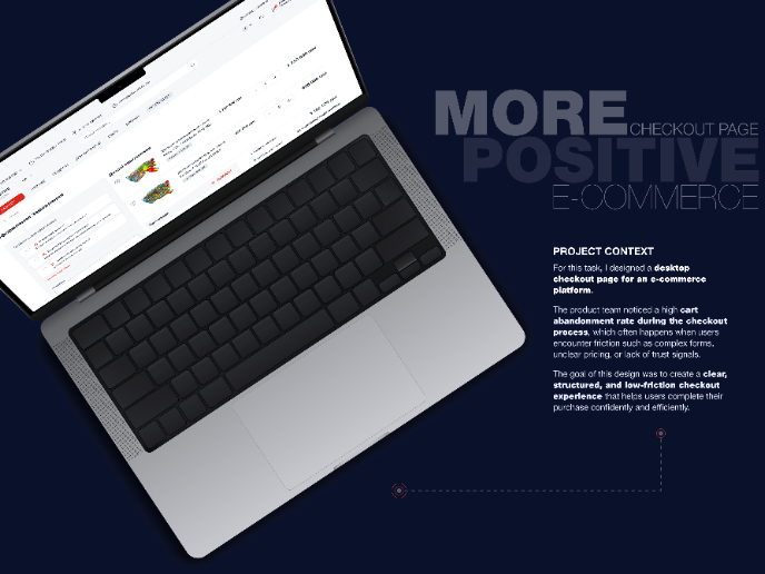
🖥 Desktop Checkout Flow Design

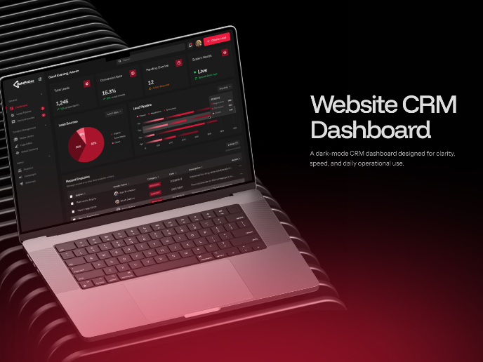
Website CRM Dashboard

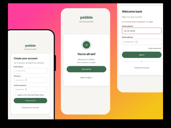
Pebble Accessible SAAS Signup Flow

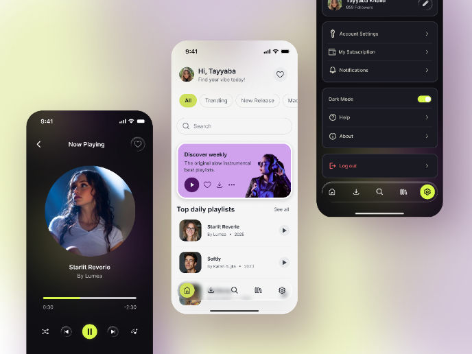
Music Player UI - Light & Dark Mode

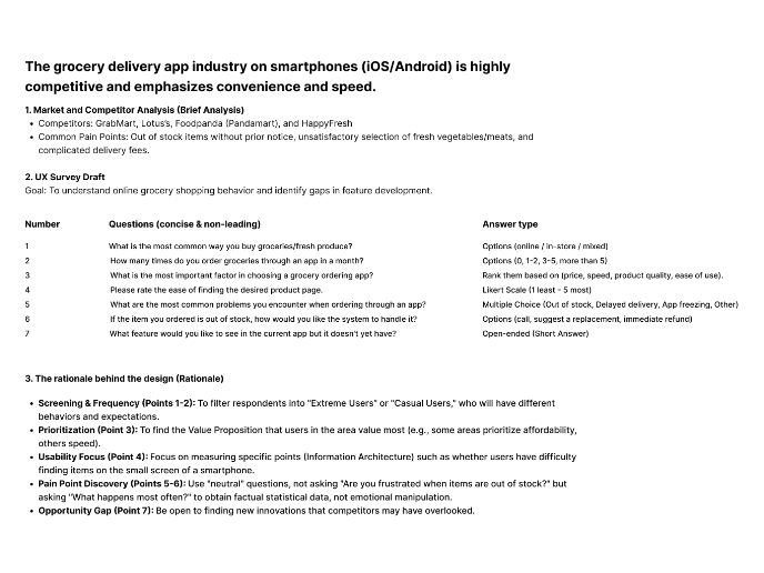
Create a UX Research Survey

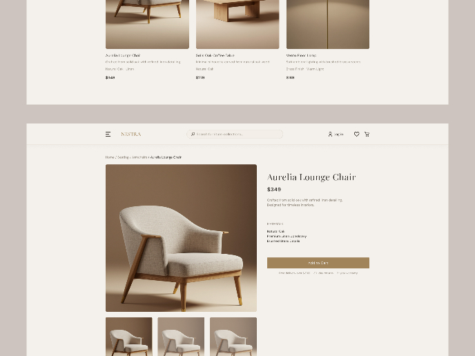
Nestra from homepage to checkout process

Visual Design Courses

UX Design Foundations


Introduction to Figma

Design Terminology
