Button System Design

This button system is designed for an e-learning platform optimized for mobile devices. It establishes a clear action hierarchy, adheres to accessibility standards, and prioritizes ease of use.
The chosen color palettes #2CE9FF, #A744FF, and #511FF - are vibrant and modern, ensuring strong contrast and user engagement while maintaining visual clarity. The sharp edges reflect a sense of structure and professionalism, aligning with the organized nature of educational platforms.
Button sizes and states, including default, hover, active, focus, and disabled, are designed to enhance usability and ensure intuitive interaction across diverse touchpoints.

Reviews
1 review

Good button system design! Comprehensive and well-organized for a tech platform. Great work!
You might also like
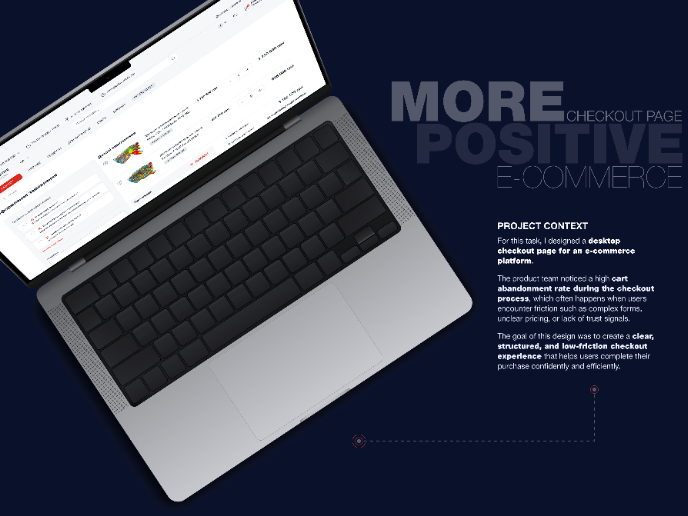
🖥 Desktop Checkout Flow Design


Website CRM Dashboard

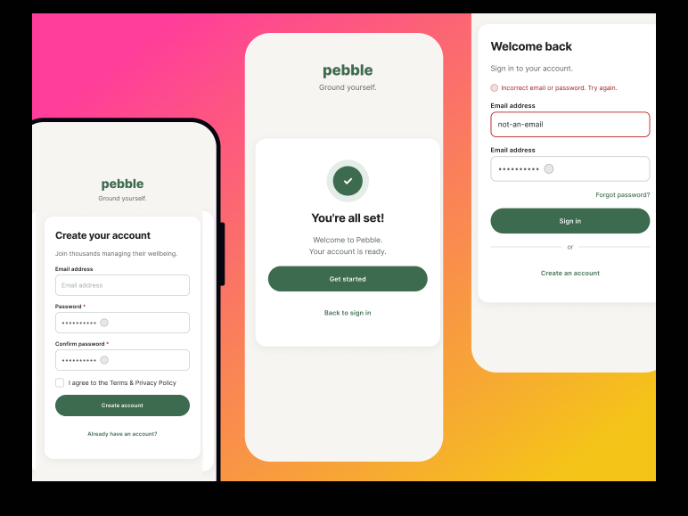
Pebble Accessible SAAS Signup Flow

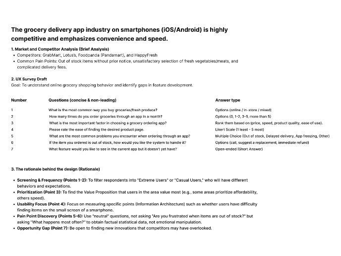
Create a UX Research Survey

Nestra from homepage to checkout process


QuickScan Onboarding

Visual Design Courses

UX Design Foundations


Introduction to Figma

Design Terminology
