Booking content audit
About the project
This project is a content audit of the desktop version of Booking.com. It focused on two key screens: the homepage and the flight results page. The goal was to assess how information is presented, how clear the messaging is for users, and how the content is structured to support decision making.
The work was done with support from GPT-4, which helped structure the findings and speed up the analysis. Tasks included visual review, text evaluation, and proposing content improvements.
Approach
The audit focused on two key screens:
Homepage: Combines search tools, promotions, and quick links. The evaluation centered on the clarity of the main message, visual hierarchy, and content accessibility.
Flight results page: Contains a high density of information such as prices, layovers, filters, and buttons. The analysis focused on how easily users can scan the content and whether it supports quick and confident decision-making.
Key findings
On the homepage, the tone is warm and friendly, and the layout is visually structured. However, the main search button doesn’t stand out enough, and several elements compete for attention. Some accessibility issues were also noted, such as low contrast and missing descriptive labels.
In the flight results page, the amount of filters and elements feels overwhelming. While the filters work well, they could be grouped or ordered more intuitively. The page lacks contextual guidance to help users choose faster—such as time-limited offers or personalized suggestions.
Recommendations
- Improve the visual prominence of the search button on the homepage.
- Reorganize filters on the results page to reduce visual and cognitive load.
- Add contextual microcopy to guide users (e.g., “Only 3 seats left” or “Recommended based on your preferences”).
- Address accessibility issues by improving contrast, headings, and descriptive text.
Reviews
4 reviews
William, this is a really clear and practical audit 👏 — adding a few annotated visuals would make your points even stronger, but overall you’ve done a thoughtful job tying insights back to usability and clarity.
Really solid work on the Booking Content Audit! The structure is clear, and the insights are practical and well-organized. It’s great how you tied each observation back to usability and content clarity. Maybe adding a few visuals or annotated screenshots could make the points even more impactful—but overall, super thoughtful and helpful analysis! ✅🔎
Great
Great breakdown of the audit. Clear focus on usability, structure, and clarity across both screens. The use of GPT-4 for analysis support is a smart move. The recommendations are practical, especially around visual hierarchy, filter organization, and accessibility.
You might also like
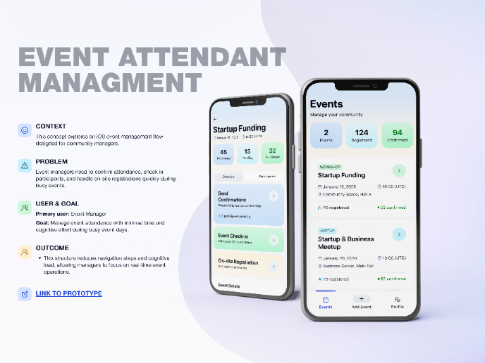
Events Managment App
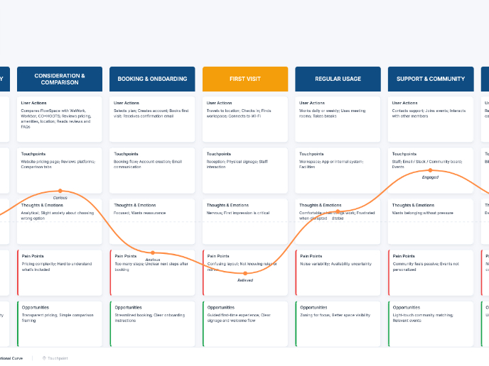
Customer Journey Map — Offsite Co-Working Experience
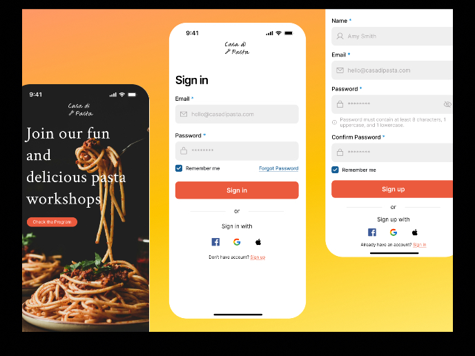
Mobile Onboarding: Casa di Pasta
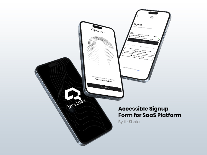
Accessible Signup & Login Experience — Brainex
Accessible Signup Form

Accessible Signup Form
User Research Courses

Ethical & Responsible Product Design

Introduction to Product Management


