Boho in You | Landing Page for Fashion Service

Boho in You is a mobile-first retail brand designed to celebrate the free-spirited woman. From flowing skirts to bohemian dresses, statement bags to casual tees, we bring all your wardrobe essentials together in one place. Our platform offers a seamless, user-friendly experience, ensuring that your dream outfit is just a click away—because we believe fashion should feel as effortless as it looks.

Reviews
2 reviews

Ozgun,
Thank you for submitting your project. I appreciate the effort you've put into this work. Here's some constructive feedback to help you improve your design:
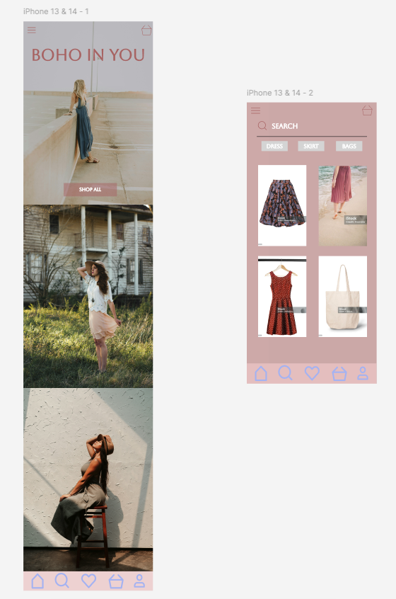
- Project Brief Alignment: The brief specified creating a landing page for a fashion brand. Your current design appears to be more of an application interface. Please refocus your design to align with the landing page concept.
- Visual Design: The contrast between the blue icons/text and the background is low, affecting readability. Additionally, the purple and blue color combination doesn't seem to harmonize well. Consider increasing the contrast for better visibility and reconsidering your color palette.
- Content Development: The current design relies heavily on images with watermarks (try use Unsplash). Develop more diverse content, including pricing information, call-to-action (CTA) elements, an "About" section, and other relevant fashion brand content.
Recommendations for Further Learning:
To enhance your skills, I recommend exploring the following Uxcel courses:
- Color Psychology
- Design Composition
- Information Architecture
These courses should provide valuable insights to address the points mentioned above.
I hope this feedback helps you refine your project. Keep up the good work, and don't hesitate to reach out if you have any questions!

Good effort but this feels more like an app UI than a landing page. For a fashion service landing page, you’d typically want a clear, focused layout that highlights the value proposition right away. This could include a bold hero image, a headline that immediately captures what makes the service unique, and strong CTAs like "Shop Now." Additionally, include sections for featured products or collections, social proof like testimonials or reviews, and clear benefits like free shipping or a style guide. A simplified navigation, eye-catching visuals, and a section on any loyalty or membership benefits would also help users easily understand and engage with the service!
You might also like

edX Sign-Up Page Redesign


Beautify Login page WCAG principles


Design Prioritization Workshop


Sanyahawa - Landing page Design


Notion Login Page Accessibility Optimization


Healthy Dashboard

Content Strategy Courses

UX Writing


Common UX/UI Design Patterns & Flows


Building Content Design Systems
