Bello App - ecommerce accesible
My process:
To generate the app screens I gave information about the app: what is it, what it does, for how is it, what color, fonts, style, icons to use, what functionalities to integrate, what is the user flow for screens.
E.g. : Bello is a fashion ecommerce app for women, men, and kids, plus jewelry, accessories, and shoes. Offers an accessible, modern, minimal shopping experience with advanced discovery (text/voice/visual search), personalized stylist guidance, fast 1‑click checkout, fit visualization, easy tracking, and simplified returns. Primary for: blind/low‑vision shoppers, people with ADHD, and users with limited mobility; also caregivers/parents and mainstream shoppers who want speed and clarity. Colors: Turquoise #13BBAF (primary), Orange #FF7A0F (promo/attention), White, Dark Blue #01406D and Blue‑Gray #666F88 (elements), Light background, Dark Gray #3D4251 (text). Typography: Futura (clear hierarchy, generous line height). Style: modern, minimalist with Glassmorphism accents (subtle, frosted panels for pop‑ups/overlays). Icons: bold line style (high contrast, clear labels). Accessibility defaults: alt text, captions/transcripts, screen‑reader semantics and focus order, 44px+ targets, adjustable text, high contrast and reduce‑motion modes, keyboard/voice/switch support, color‑blind‑safe swatches with labels.
Key functionalities to integrate
- Massive catalog with advanced filters; personalized recommendations and AI stylist.
- Text, voice, and visual search with error recovery.
- Size confidence: size guides, “See It On Your Model,” virtual try‑on (with accessible fallback), fabric/care details.
- 1‑click checkout; multiple payment methods (wallets/BNPL/UPI); smart autofill.
- Reviews with AI summaries; wishlist; social sharing.
- Loyalty, flash sales, auto‑apply best promo, rewards earn/burn.
- Order tracking, notifications, simplified returns/exchanges.
- Infinite scroll feed; localized deals; assistive‑tech compatibility across mobile/desktop.
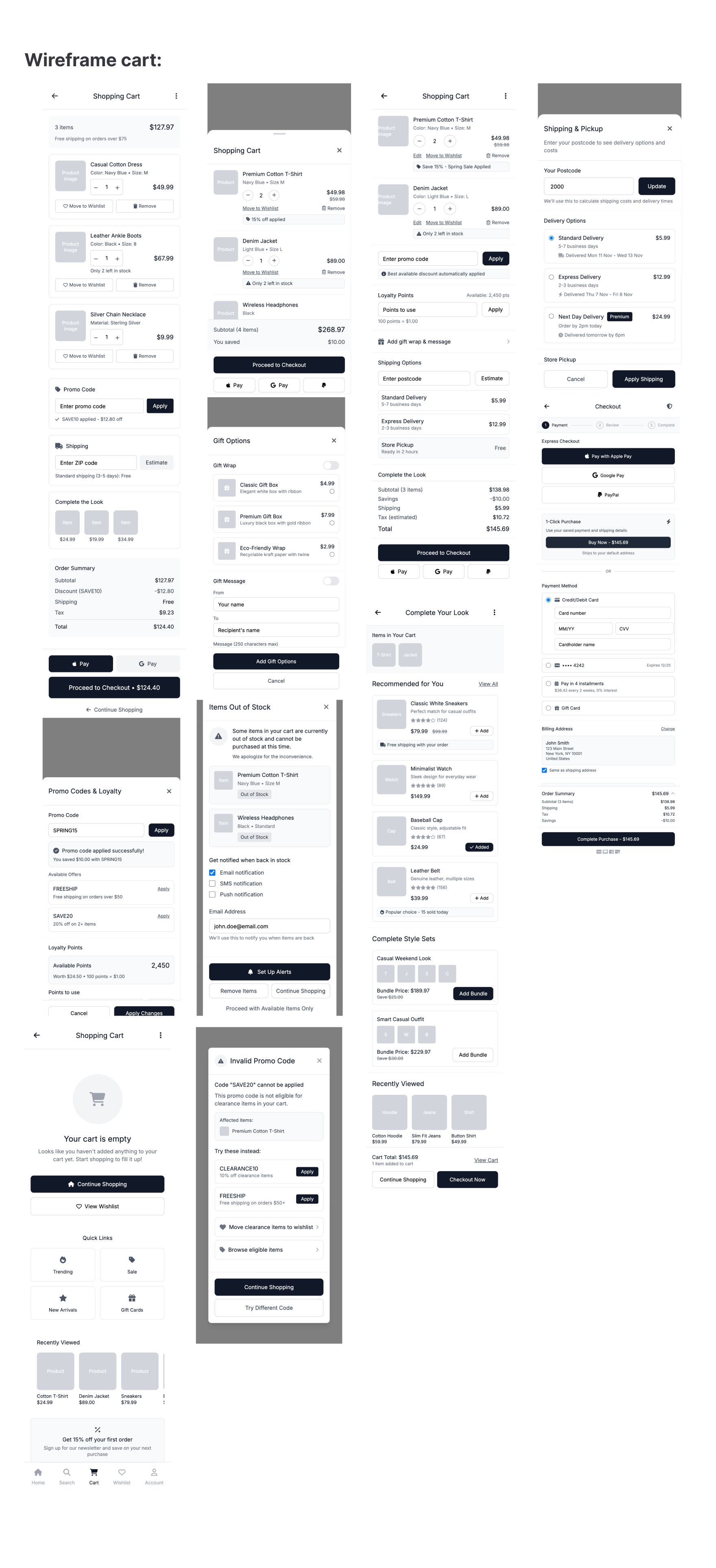
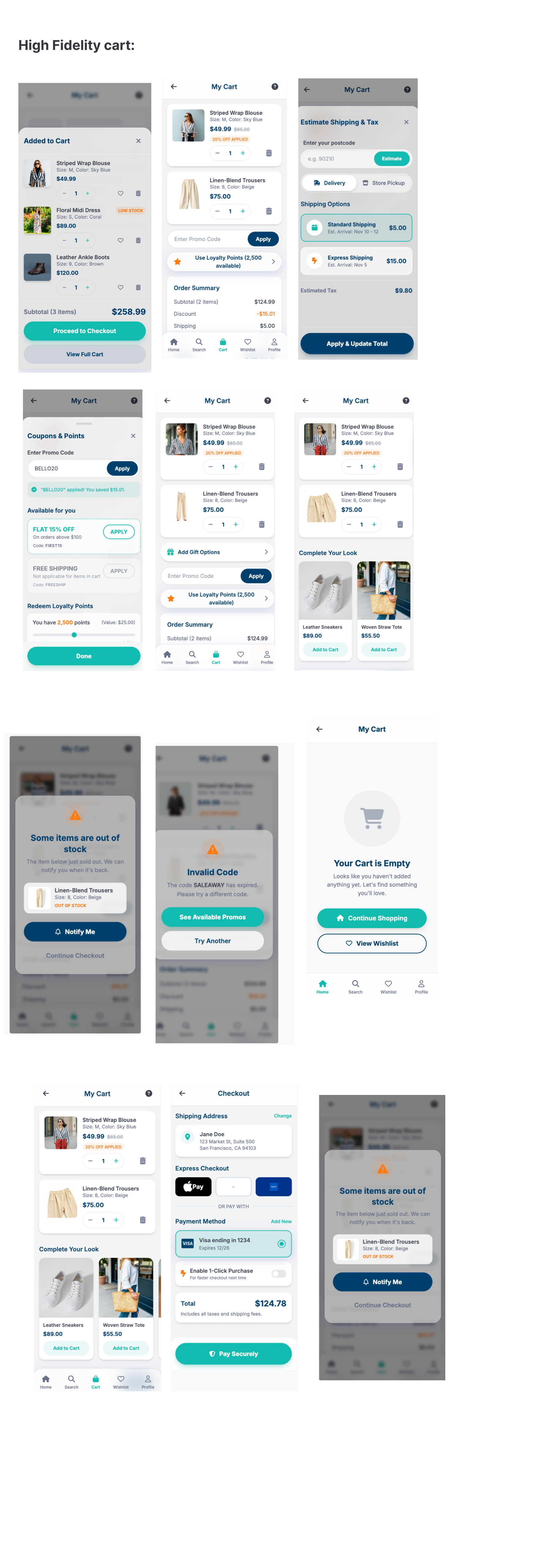
User flow — Cart (screens and states)
- Mini‑cart (drawer/sheet)
- Shows latest items, subtotal, low‑stock flags; actions: edit qty, remove, move to wishlist, checkout.
- Live region announcements for changes; large controls.
- Cart page
- Line items (image, title, color/size, price, promos applied), edit size/color, qty, remove.
- Promo code entry + auto‑apply best offer; loyalty apply/redeem; gift wrap/message.
- Shipping estimator (postcode) with ETA/cost; pickup option; tax preview.
- Cross‑sells (complete the look); proceed to checkout; express wallets; 1‑click if enabled.
- Edge states: OOS on checkout (offer back‑in‑stock alert), invalid promo (reason shown), limited stock.
- Modals/sheets
- Apply promo/loyalty; shipping estimator; gift options.
- Accessibility
- Semantic table/list structure, labeled buttons, focus retention on edits, live region for price/stock updates, swipe/keyboard operable.
- Errors/empty
- Clear reasons and recovery (e.g., “Promo not eligible for clearance items.”); empty cart with shortcuts to wishlist/home.
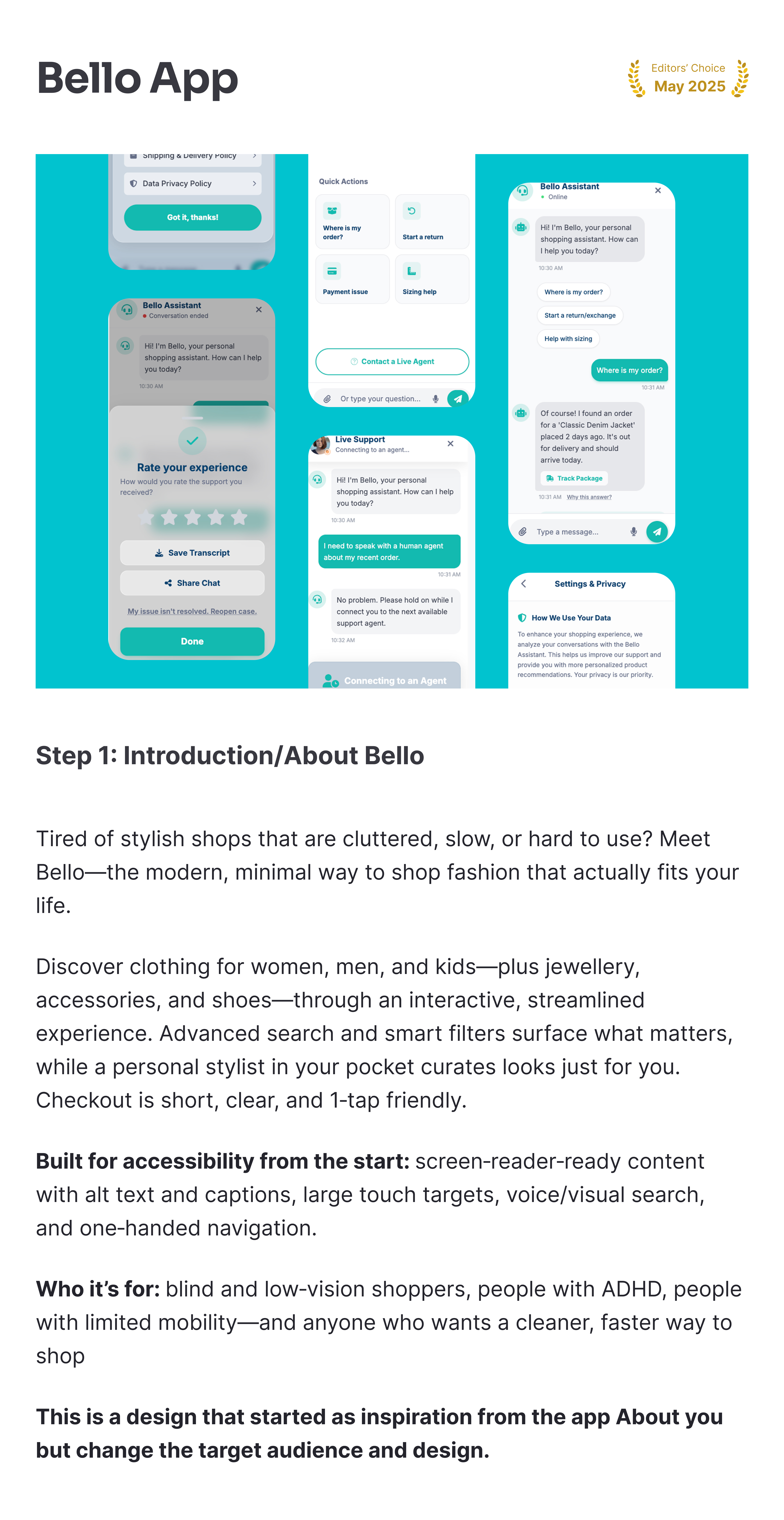
User flow — Help assistant (screens and states)
- Entry
- From support icon, PDP, order detail, or “Need help?” sticky; opens assistant sheet/chat.
- Intent picker
- Quick actions: Where is my order? Start a return/exchange; Apply promo; Sizing help; Payment issue; Contact agent.
- Conversation thread
- Text and voice input with live transcript; attach photos/videos; links trigger in‑app actions (track order, create return).
- Explainability: “Why this answer?” with policy links.
- Human handoff
- Queue status/SLA visible; maintain conversation history and attachments; accessibility maintained.
- Transcript & rating
- Save/export chat; rate experience; reopen case.
- Settings/privacy
- Data use notice, delete conversation, opt‑in/out of using chat data to improve recs.
- Accessibility
- Screen‑reader friendly, large tap targets, keyboard/switch support, reduced motion, captions for voice notes.
User flow — Follow an order (tracking, returns/exchanges)
- Orders list
- Recent orders with status badges (Confirmed, Packed, Shipped, Out for delivery, Delivered); search/filter by date/status.
- Order detail
- Timeline with plain‑language updates; items summary; totals; delivery ETA; loyalty earned; actions: track package, delivery instructions, invoice.
- Carrier tracking
- Embedded map/webview; options to reschedule, add safe‑place notes.
- Start return/exchange
- Select items; reason; photos (optional); options: refund, store credit, instant exchange (reserve new size).
- Choose drop‑off/pickup/label‑less; show refund timing; confirmation and tracker.
- Issues
- Report missing/damaged; upload evidence; auto‑route to support; ticket status visible.
- Notifications
- Opt‑in push/SMS/email for status changes; clear unsubscribe.
- Accessibility
- Announced status changes, accessible maps fallback (text timeline), printer‑less QR, voice input for instructions.
Define success metrics:
- WCAG 2.2 AA pass rate; alt text/captions coverage (% of PDPs with both); assistive‑tech task success rate (add‑to‑cart, checkout) ≥90%; conversion parity ratio for low‑vision/ADHD/limited‑mobility vs baseline ≥0.9; accessibility bug density and time‑to‑fix; touch target compliance ≥98%; screen‑reader announcement accuracy; voice/keyboard/switch operability audits.
- Time to first relevant product view (median); zero‑results rate; search‑to‑add‑to‑cart rate; filter usage and saved filter reuse; recs CTR and add‑to‑cart uplift vs control; AI stylist engagement and revenue share; visual/voice search adoption and success (ASR accuracy, match precision).
- Checkout completion time (median); step drop‑off by stage; 1‑click/express wallet share of orders; payment success rate; cart abandonment; 3‑D Secure failure/timeout rate; error rate per 1,000 checkouts.
- Size recommender usage; “See It On Your Model”/AR try‑on usage; return rate due to fit; instant exchange rate vs refunds; PDP size guide engagement; post‑purchase fit CSAT; fit‑related negative review share.
- Overall conversion rate; add‑to‑cart rate; AOV; revenue per session; new‑customer conversion; discount dependency (share of orders with promos); cohort CLV.
- 30/90‑day repeat purchase rate; loyalty enrollment and points earn/burn rates; wishlist‑to‑purchase conversion; back‑in‑stock/price‑drop conversion; notification opt‑in and attributed revenue; churn (inactive 90‑day).
- Crash‑free sessions; ANR rate; LCP/TTI on PLP/PDP; API error/latency; image CDN hit rate; offline/low‑bandwidth success; help center self‑serve resolution rate; first response time; CSAT/NPS; on‑time delivery rate.
- Passkey/biometric adoption; consent opt‑in rates (personalization, notifications); data export/delete SLA; fraud/chargeback rate; security incidents (target: zero); privacy complaints.
Clearly state objectives:
- Deliver an inclusive, accessible experience
- Make discovery fast and relevant
- Short, simple checkout (1‑click by default)
- Build fit confidence and cut returns
- Grow conversion and revenue efficiently
- Retain and reward customers
- Performance, reliability, and support
- Privacy, security, and trust
Objective of the app
- Fashion ecommerce for women, men, and kids, plus jewelry, accessories, and shoes.
- Modern, minimal, highly accessible UI with short, easy flows and a “personal stylist in your pocket.”
- Primary focus on shoppers who are blind/low‑vision, have ADHD, or have limited mobility—without excluding mainstream users.
Reviews
1 review
Great project! Especially impressed by the research part. The design could use a few improvements, though.
Hey Andrea, I really like the concept of your project, and you did a great job with the research part, it’s clear you understand the goal and the user needs. Just a few small points that could really improve your work:
be careful with the blur effect, it can create friction and make the design feel less minimal, so try to use it only where it really adds value. I noticed the shadows are used in some places but missing in others in a minimal layout, it’s better to keep them just for buttons or key interactions.
Pay attention to color consistency too, because different button colors can make the interface look less clean; use one main color for primary actions and keep the rest neutral. Try to make a small design system so you can reuse components like cards and buttons to keep everything consistent.
Keep the copy short and clear, use familiar terms from similar apps, and make sure your main and secondary buttons follow the same logic even in modals. Also, reduce the number of actions per screen so everything feels easier and faster to scan. Look at competitor apps to understand why they made certain design choices it can help you refine your own patterns. Limit your user personas to two or three so you stay focused. Overall, your base is really strong, if you work a bit more on consistency, colors, and simplicity, the project will feel much more balanced and polished. Great job! 👏
You might also like

Islamic E-Learning Platfrom Dashboard

Pulse — Music Streaming App with Accessible Light & Dark Mode
SiteScope - Progress Tracking App

Mobile Button System

FlexPay
May.Da.Ma Candles & more
Popular Courses

UX Design Foundations

Introduction to Figma


