Aura Button System

Overview
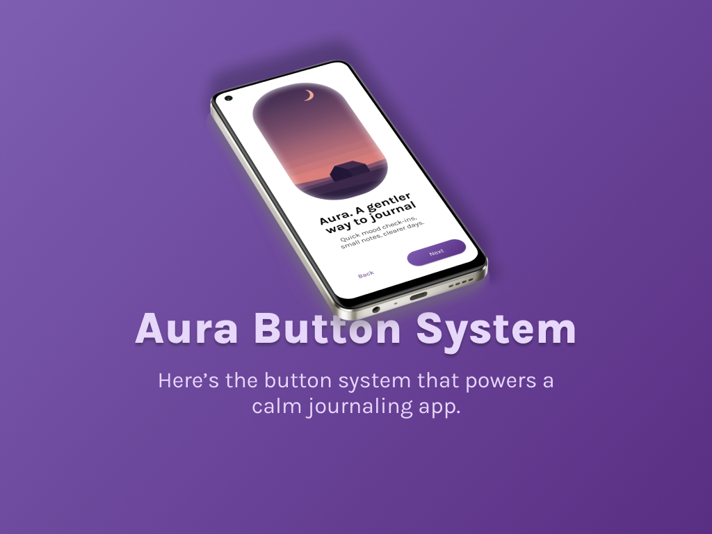
Aura is a calm mood journal. Buttons should feel gentle, clear, and fast. The system stays quiet most of the time and becomes obvious when it matters.
Look and feel
Purple to lavender feels reflective and safe. Pill shapes reduce visual aggression. Primary is bold. Secondary is soft. Tertiary stays in the background. Destructive uses red and appears only for risky actions.
Sizes
Large 56 for key CTAs. Medium 40 for forms. Small 32 for dense areas. Widths are fluid. Touch targets meet 44 px on mobile.
States
One model everywhere. Default, hover, pressed, focus, disabled, loading, success. Pressed gives a slight darken and tiny scale. Focus uses a 2 px ring with 2 px offset.
Accessibility
Labels pass AA. Focus is visible on white and tinted surfaces. Keyboard and screen reader friendly. Icon-only buttons have accessible names.
Content rules
Short action verbs. Sentence case. Leading icons for object actions. Trailing icons for progression.
Use in product
Log mood. Start breathing. Turn on reminders. Confirm delete. Each scene shows clear hierarchy.
Handoff
Everything is tokenized. Fewer decisions. Faster shipping.
Tools used
From brief

Topics
Share
Reviews
5 reviews
Your Aura button system design is awesome. You state well reasons why you select the colors. They are valid regarding the App's value proposition. The button shapes and layouts are well structured.
And, the design would be more polished if considering to make the saturations of different state more prominent. Additionally, the disabled state could be a bit dimmer.
All in all, you have created an impressive button system. Well done.

I really like the thought you’ve put into this project! You’ve applied colour theory and best practices nicely to create a button system that works perfectly for a mood journal app. Awesome job, Panchali!

Nice efforts on this one!

Awosome Panchali, This is a perfect Button System Keep Moving

Nice work, i really love the colours they bring out the personality of the product quite well
You might also like

Improving Dating App Onboarding: A/B Test Design

FORM Checkout Flow - Mobile


A/B Test for Hinge's Onboarding Flow


Accessibility Asse


The Fitness Growth Engine

Uxcel Halloween Icon Pack

Visual Design Courses

UX Design Foundations


Introduction to Figma

Design Terminology
