Authentication Flow for EdTech SaaS


Designing an Accessible, Mobile-First Login/Signup Flow for EdTech SaaS
As education increasingly moves online, it’s critical that EdTech platforms make their authentication flows simple, accessible, and frustration-free for everyone. Here’s how a single-channel, email-first authentication flow—designed mobile-first and to WCAG 2.2 AA standards—can deliver outstanding results for learners and educators alike.
Mobile-First and Accessible by Design
This flow puts mobile users first, with a simple single-column layout and large, touch-friendly buttons that work flawlessly on smartphones and tablets. All fields use persistent, clear labels (not just placeholders) for maximum clarity.
Why Single-Channel Authentication?
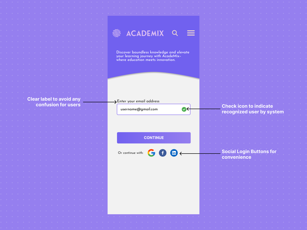
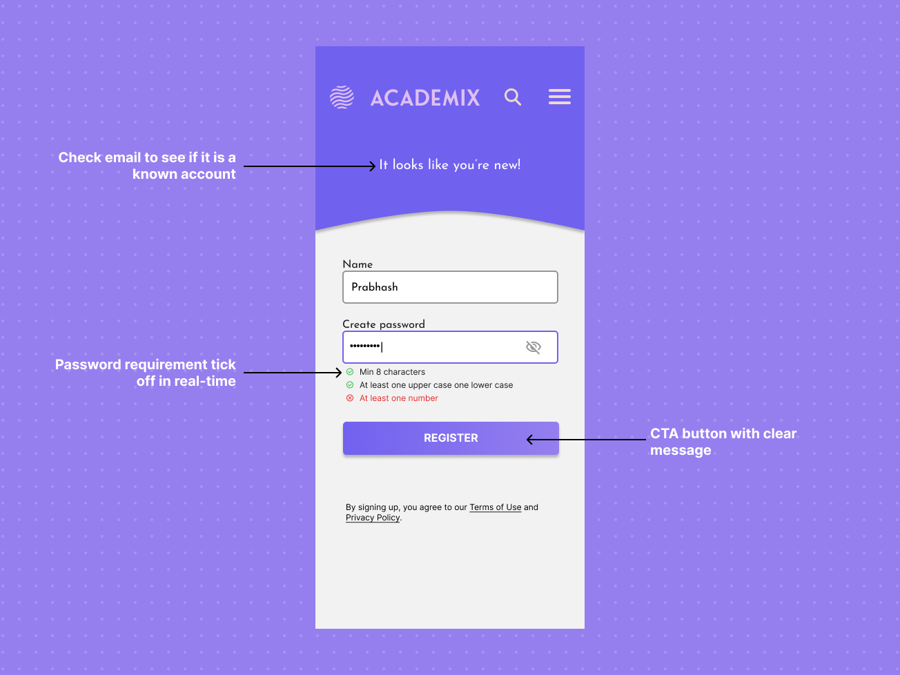
Instead of forcing users to decide between “Login” and “Signup,” this modern approach lets users simply enter their email address. The system checks if it’s a known account:
- If yes: The user is prompted for their password to log in.
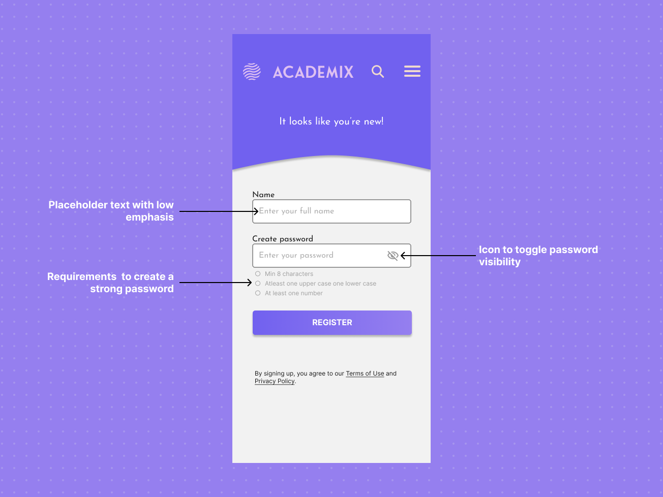
- If no: They’re guided gently through account creation.
This eliminates confusion, speeds up access, and reduces cognitive load—especially helpful for students new to online EdTech tools.
Password Guidance and Accessible Alerts
One essential part of a seamless login or signup flow is guiding users to create secure passwords and catching mistakes before they cause frustration—all while remaining accessible for everyone.
Accessible Password Creation Guide
When new users reach the signup step, a password guide appears right below the password field. This guide includes:
- Clear checklist: Shows password requirements (e.g., “Minimum 8 characters”, “At least one number”)
- Dynamic feedback: As users type, each requirement ticks off in real-time—changing from gray to green, with both color and icon (checkmark).
- Alert for weak passwords: If requirements aren’t met, a visible alert lets users know what still needs fixing.
Invalid Email & Wrong Password Alerts
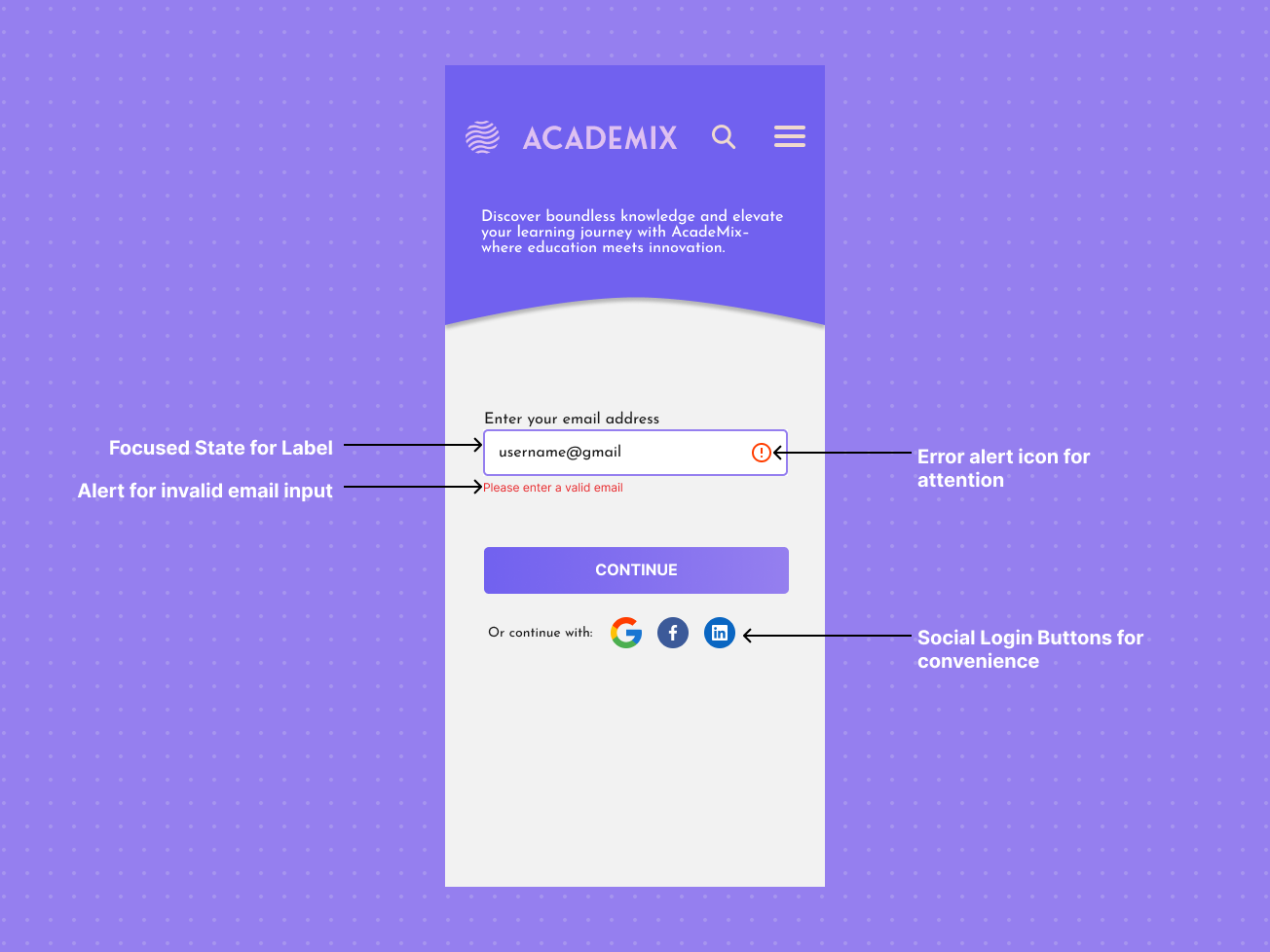
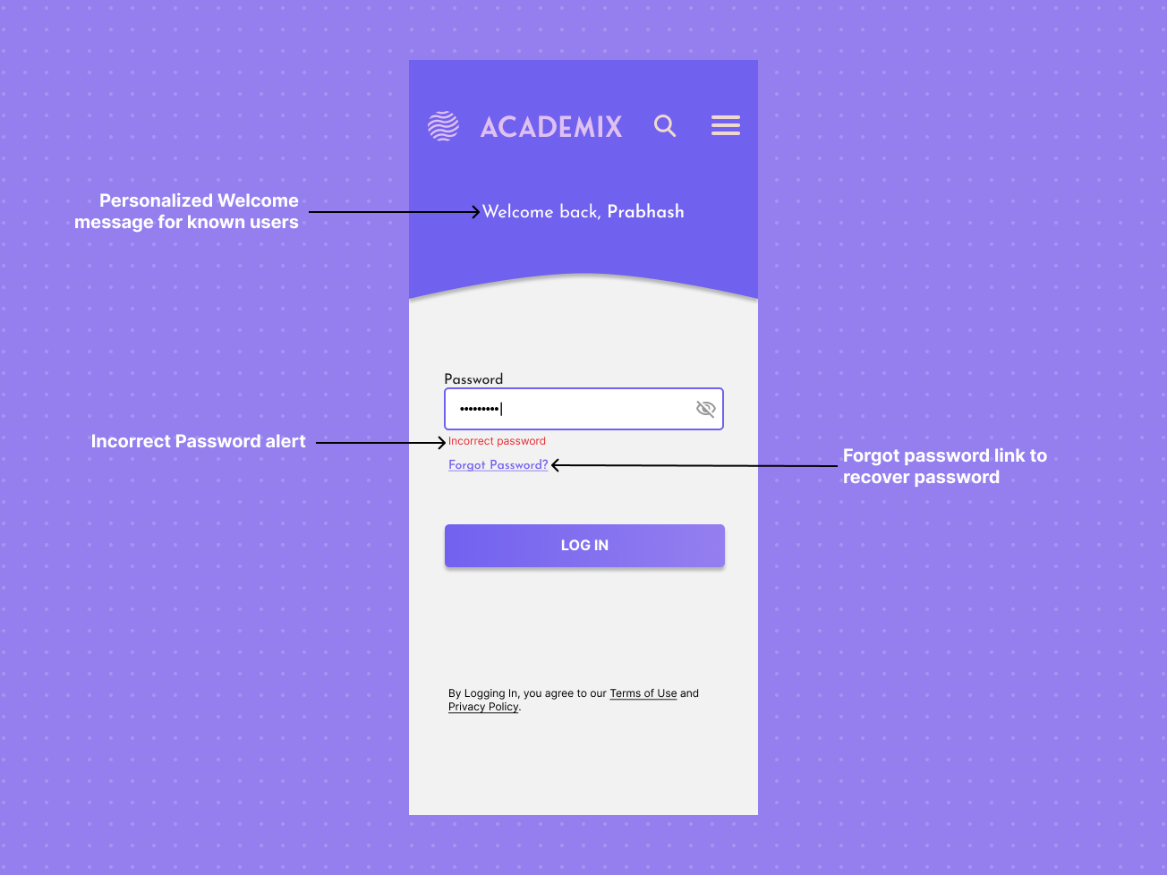 For login and signup, errors are caught instantly and explained:
- Invalid email address: “Please enter a valid email” appears below the email field.
- Wrong password: “Incorrect password”
- Visible cues: Error states highlight an icon and descriptive text—never relying on color alone.

Reviews
4 reviews

Prabhash, you’ve done a great job creating a clean, mobile-first flow with thoughtful accessibility touches. One area to improve is making the post-signup step more seamless so users aren’t forced to log in again. Overall, this is a strong project and a solid foundation to keep building on!

Great job, Prabhash! I really like your choice of primary color and the font, they work really well together.
A few points you might consider improving to make the experience even smoother:
- After signing up, the need to log in again feels a bit confusing and frustrating. Since the account was just created, it would be more seamless to go straight in without an extra login step.
- On the password screen, having a back button would be super helpful in case the user entered the wrong email and needs to go back.
- The Log In / Sign Up buttons could be made wider with a bit more spacing between them to avoid mis-taps and make the flow more user-friendly.

Good job, I just have some comments:
- You don't need search here.
- You don't need menu also if you are not logged-in.
- Email error message, instead of error icon, put X icon.

Hello Prabhash, Good job with the design.
Your project submission effectively presents a mobile-first, single-channel login and signup flow for an EdTech platform. The design successfully addresses the core requirements of the brief.
Yet, A few points to focus on the areas where the design could be enhanced to further meet the project's goals:
1. Interaction Clarity
The initial screen shows a checkmark icon to indicate a "recognized user." While this is a good visual cue, the user flow could be made more explicit. Adding a text message like "It looks like you already have an account" would provide immediate clarity and reduce user uncertainty about the next step.
2. Accessibility Details
The project correctly highlights the use of both icons and color for alerts. To fully address the WCAG criteria for accessible alerts, you also need to confirm that these alerts are announced to screen reader users. An annotation specifying this implementation detail would strengthen the accessibility rationale.
3. Handling of Social Logins
The design includes social login buttons, but the project does not show the user flow for these. You could consider demonstrating whether a social login bypasses the email check or requires the user to link an email address afterward.
4.Consider an Alternative Login Method
The project focuses on a password-based login. To further simplify the process and enhance usability, you could consider an alternative like a one-time passcode (OTP) sent to the user's email or phone number. This would eliminate the need for users to remember a password, aligning with the goal of creating a "frustration-free" flow. The design could present this as an option after the user's email is recognized, offering a choice between using a password or a passcode.
You might also like

Designing A Better Co-Working Experience Through CJM


Pulse Music App - Light/Dark Mode


Monetization Strategy


Zoom Sign in Screen


Button System for Mobile Web Platforms Brief


Mobile Onboarding

Visual Design Courses

UX Design Foundations


Introduction to Figma

Design Terminology
