Accolade, Inc. CJM

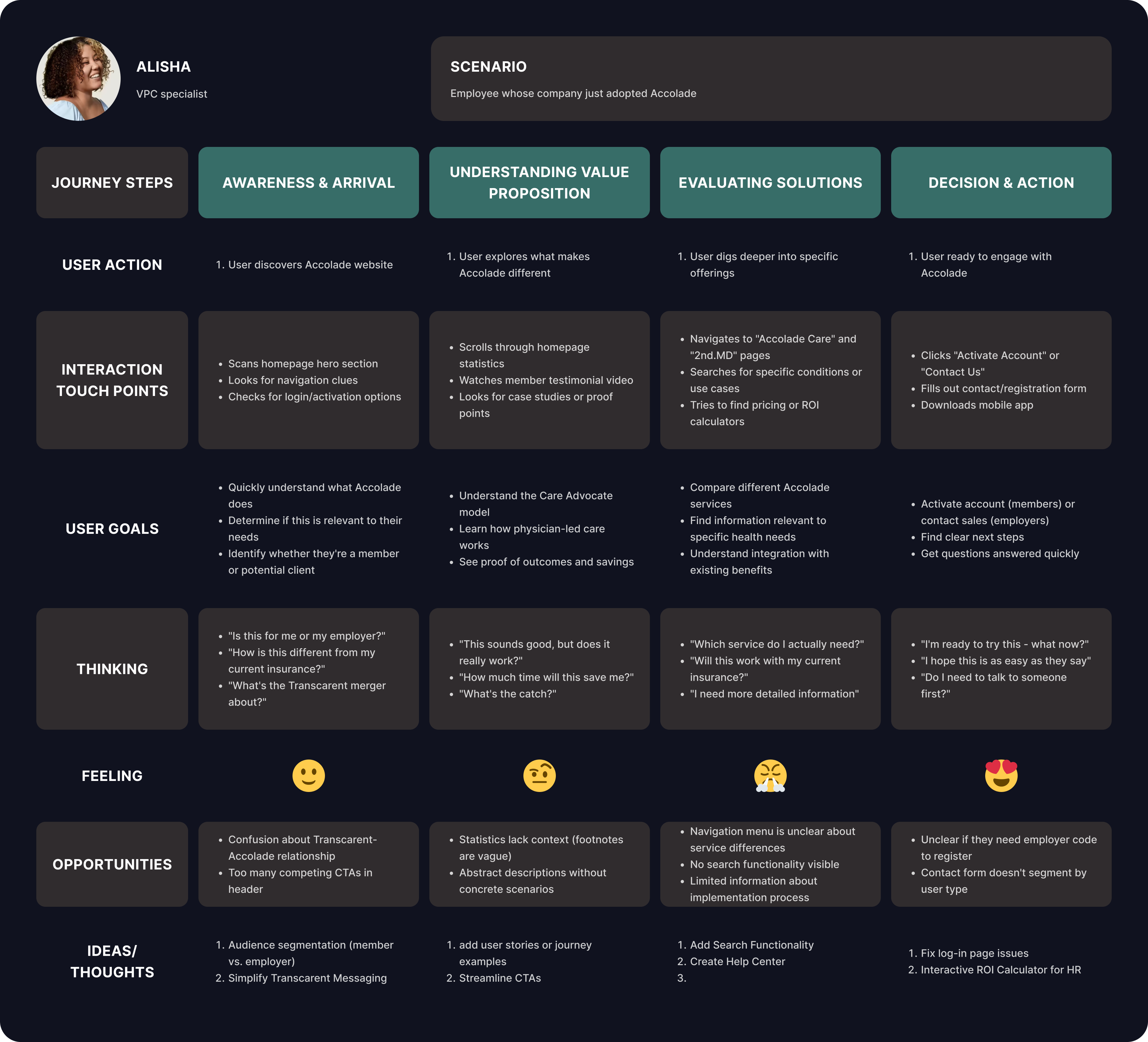
The general website for Accolade, Inc. doesn't fully explain what their services are and who the target audience is. The actual member portal app must also connect to the general website as well so users find what they need. I considered what possibly goes through a new user's mind to see where we can automate or improve the user-end.

Reviews
1 review

Ooo okay, this CJM feels thoughtful right away 🧠✨ It doesn’t look like you just filled in stages — it feels like you actually mapped emotions and friction points properly.
I like that the journey seems structured and not overly complicated. The way you break down touchpoints and user feelings makes it easier to see where improvements can happen. That’s what makes a journey map actually useful, not just decorative 📍📊
If I’d push it further, maybe highlight priority opportunity areas more boldly like “this is where the biggest impact is.” 🚀 But overall, solid analytical thinking and clear UX strategy. Nice work.
You might also like

Smartwatch Design for Messenger App


Bridge: UI/UX Rebrand of a Blockchain SCM Product


Pulse Music App - Light/Dark Mode


Monetization Strategy


Designing A Better Co-Working Experience Through CJM


Design a Settings Page for Mobile
User Research Courses

Ethical & Responsible Product Design


Product Management Foundations


The Product Development Lifecycle & Methodologies
