Accessible Signup Form for - Slack


This project involves designing an accessible login/signup page for Slack, a widely-used SaaS platform for team communication, optimized for mobile devices. The objective was to create a seamless, inclusive, and user-friendly experience that adheres to WCAG 2.2 accessibility standards, ensuring all users—regardless of ability—can interact with the form effectively. My design process prioritized accessibility, usability, and visual clarity, with a focus on supporting diverse users, including those with visual, cognitive, and motor disabilities.
Decision-Making Process and Rationale:
Below is a detailed breakdown of my decision-making process and the rationale behind each design choice, ensuring alignment with accessibility best practices, usability principles, and visual design standards.
- Choosing the Platform and Device:Decision: I selected Slack as the SaaS platform because it’s a globally recognized tool for team communication, and its login/signup page is a critical entry point for users. I chose to design for mobile devices to address the constraints of smaller screens and touch interactions, adopting a mobile-first approach.
- Rationale: Slack’s user base is diverse, including professionals who rely on quick access via mobile devices. A mobile-first design ensures that the form is accessible and usable on smaller screens, where touch targets and screen real estate are limited. This decision aligns with the need to prioritize usability for users on the go, such as professionals accessing Slack during meetings or travel.
- Designing the Layout and Structure:Decision: I created a simple, single-column layout with the Slack logo at the top, followed by a clear heading, instructions, an email input field, and action buttons. The form includes two primary screens: one for initial email entry ("Enter Your Email to Log In or Sign Up") and another for signing in ("Sign In to Slack with Your Work Email").
- Rationale: A single-column layout reduces cognitive load by presenting information linearly, which is especially helpful for users with cognitive disabilities, such as those on the autism spectrum (ASD), who may find complex layouts overwhelming. The logo placement ensures brand recognition, while the heading and instructions provide clear context, reducing anxiety about the next steps. I avoided tabs or excessive navigation to keep the flow straightforward, ensuring users can focus on one task at a time.
- Ensuring Accessibility (WCAG Compliance):Clear Labels and Instructions:Decision: I placed a persistent "Email" label above the input field and included instructions like "Enter Your Work Email, for example, john@company.com".
- Rationale: Persistent labels ensure that screen readers can announce the field’s purpose, supporting users with visual impairments. The instruction uses direct language with a concrete example to avoid ambiguity, which is crucial for users with cognitive disabilities or low digital literacy. I initially used "e.g." but later replaced it with "for example" to eliminate abbreviations that might confuse non-native speakers or users unfamiliar with shorthand.
- Error Handling:Decision: For invalid inputs (e.g., "john@glennon.com"), I added an inline error message: "Invalid Email. Please Enter a Valid Work Email, for example, john@company.com". The message appears below the field in red (#D32F2F) with a 4.5:1 contrast ratio against the white background.
- Rationale: Inline error messages allow users to identify and fix issues immediately without losing context. The message is descriptive ("Invalid Email"), actionable ("Please Enter a Valid Work Email"), and includes an example, aligning with WCAG guidelines for error identification. The high contrast ensures visibility for users with visual impairments. I chose not to rely on color alone by also changing the field’s border to red, though I plan to add an error icon in future iterations for users with color vision deficiencies.
- Authentication Alternatives:Decision: I included Google and Apple sign-in options instead of traditional CAPTCHAs, which are often inaccessible.
- Rationale: CAPTCHAs can be a significant barrier for users with visual or cognitive impairments. By offering single sign-on (SSO) options, I ensured that users can authenticate without solving complex puzzles, making the process more inclusive. This decision aligns with WCAG’s emphasis on providing accessible alternatives for security features.
- Contrast and Visual Cues:Decision: I used a blue button color (#1264A3) with white text for primary actions and underlined links (e.g., "Log In to Your Team") to provide a non-color cue.
- Rationale: High contrast is essential for readability, especially for users with visual impairments. The current button contrast is 4.1:1, which I recognize falls slightly short of WCAG AA’s 4.5:1 requirement. I plan to adjust this to a darker blue (#0D47A1) in future iterations to fully comply. Underlined links ensure that users with color vision deficiencies can identify interactive elements without relying on color alone, as recommended by WCAG.
- Enhancing Usability:Decision: I used action-oriented button labels like "Check Email" and "Sign In With Email" instead of generic labels like "Continue". Touch targets (buttons) are sized at 48x48px, and the layout minimizes scrolling.
- Rationale: Action-oriented labels clarify the next step, reducing uncertainty for users who need precise guidance, such as those with ASD. The 48x48px touch targets ensure that users with motor impairments can interact easily on mobile devices, aligning with WCAG’s touch target size recommendations. A minimal-scroll design prevents users from feeling overwhelmed, especially on smaller screens, enhancing overall usability.
- Decision: I replaced vague instructions like "We suggest using the email address you use at work" with "Enter Your Work Email, for example, john@company.com".
- Rationale: Direct language with examples avoids assumptions and ensures clarity for users with cognitive disabilities or low digital literacy. This change was informed by accessibility best practices that emphasize concrete, unambiguous communication.
- Visual Design Choices:Decision: I chose a muted color palette (soft blues, whites, dark grays) and sans-serif fonts with a minimum size of 16px. I avoided rapid animations or flashing elements.
- Rationale: A muted palette creates a calming experience, avoiding sensory overload for users with photosensitivity or sensory processing challenges. Sans-serif fonts at 16px ensure readability for users with visual impairments or older adults. Avoiding animations prevents discomfort for users with vestibular disorders or seizure triggers, aligning with WCAG’s guidelines on reducing motion.
- Decision: I used a single-column layout with ample white space between elements.
- Rationale: White space reduces visual clutter, making the form easier to scan and process, especially for users with cognitive disabilities who may struggle with dense layouts.
- Iterative Improvements Based on Feedback:Throughout the design process, I iterated based on accessibility best practices and feedback. For example:
- I initially used "Continue" for the primary button but changed it to "Check Email" to make the action clearer and reduce anxiety about the next step.
- I updated the error message from a vague "Help! I need somebody!" to a descriptive "Invalid Email. Please Enter a Valid Work Email, for example, john@company.com" to provide actionable guidance.
- I adjusted the instruction language to be more direct and replaced "e.g." with "for example" to enhance clarity for all users.
- These iterations reflect my commitment to creating an inclusive design that evolves based on user needs and accessibility standards.
Screens Overview:
- Screen 1: Initial email entry page ("Enter Your Email to Log In or Sign Up") with clear instructions and a "Check Email" button.
- Screen 2: Sign-in page ("Sign In to Slack with Your Work Email") offering Google/Apple sign-in or email sign-in.
- Screen 3: Email entry page with an error message for an invalid email.
- Screen 4: Sign-in page with the same error message, maintaining consistency across flows.
Future Improvements:
- Add an error summary above the form with a clickable link to jump to the problematic field, enhancing screen reader support.
- Include an error icon next to error messages as a non-color cue for users with color vision deficiencies.
- Programmatically associate error messages with fields using aria-describedby for better screen reader compatibility.
- Improve button contrast to 4.5:1 (e.g., using #0D47A1) to fully meet WCAG AA standards.
- Add help links like "Forgot Password?" and "Contact Support" for consistent user support.
- Create an interactive prototype to demonstrate keyboard navigation and error handling for a more engaging presentation.
Conclusion:
This project reflects a thoughtful design process driven by accessibility, usability, and visual clarity. By prioritizing clear communication, high contrast, accessible authentication, and a simple layout, I aimed to ensure that all users—regardless of ability—can successfully interact with Slack’s login/signup flow. Each design decision was informed by WCAG guidelines and best practices for inclusive design, with iterative improvements to address diverse user needs. I look forward to feedback to further enhance this design and continue growing as a UX designer!

Reviews
1 review

The overall flow feels simple and easy to follow, which is great for mobile users. I like that the labels are always visible and the error message is placed right under the field, so users don’t have to guess what went wrong.
Where it gets a bit inconsistent is in the copy. One screen says “Enter Your Email to Log In or Sign Up” while the other one says “Sign In to Slack with Your Work Email.” It’d be stronger to pick one tone and stick with it across all screens so users don’t second-guess if they’re in the right place.
Another small detail: the example email “john@company.com” is currently shown above the field. It might work better as placeholder text inside the input itself, so it feels more contextual and reduces the amount of instructional copy above. That would keep the screen lighter and easier to read, especially for mobile.
I also noticed inconsistency in the way case is used in headings and button labels. For example, headings are written in title case (“Enter Your Email to Log In or Sign Up”) while button labels use sentence-style phrasing like “Create an account.” Picking one convention (either title case or sentence case) and applying it across headings, labels, and buttons would create a more unified and professional feel.
Overall, the design is clear, but these updates would make the flow feel more polished and trustworthy.
You might also like
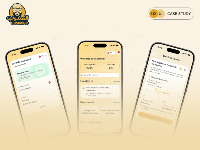
El Mandoub-GovTech App

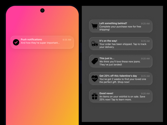
Notification microcopy - Project

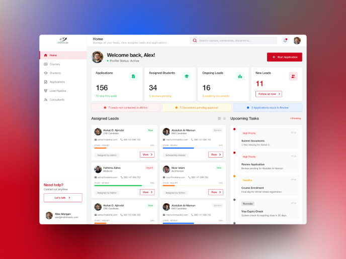
MalishaEdu Counselor Workspace

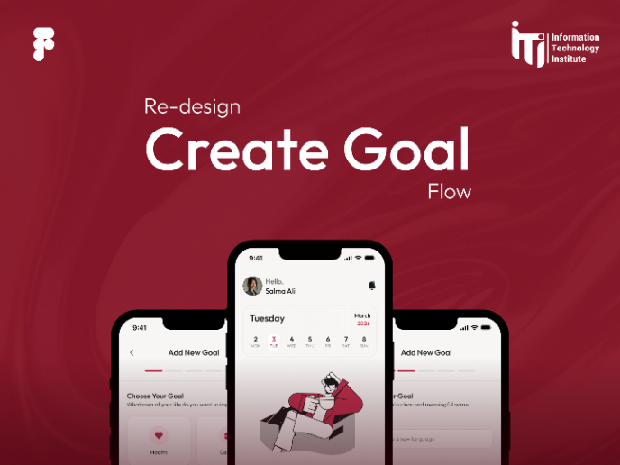
Goal Creation Flow

Portfolio website

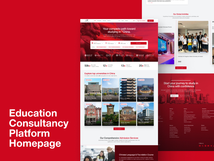
MalishaEdu - Website Design
Visual Design Courses

UX Design Foundations


Introduction to Figma

Design Terminology
