Accessible Signup Form for SaaS Platform

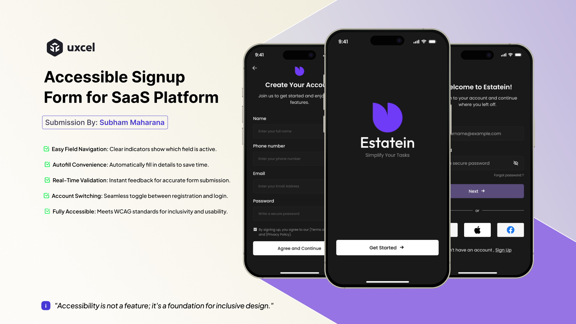
For this project, I designed a simple and accessible signup form for a SaaS platform, focusing on making the experience easy for all users. The goal was to create a form that works well on any device and helps users sign up or log in without any hassle. Here’s what I focused on:
- Easy Field Navigation: Users can clearly see which field they are working on.
- Autofill Convenience: The form supports autofill, making it quicker to fill in details.
- Real-Time Validation: Users get instant feedback to fix any mistakes while filling out the form.
- Smart Account Switching: The form automatically switches between sign-up and login, depending on the user’s action.
- Fully Accessible: The design meets WCAG standards, making it usable for everyone, including people with disabilities.
This project is all about making the signup process as simple and accessible as possible, and there's room to add even more features in the future.
If you notice any mistakes or areas for improvement, please feel free to comment. I'll be sure to implement your feedback!

Reviews
3 reviews

Good job Subham. I really loved the microinteraction here.
UX Feedback:
Onboarding Journey for SaaS Platform:
- Since this is a SaaS platform, an onboarding journey is essential. It helps new users understand the product's features and functionality, ensuring a smoother experience and reducing the learning curve.
Error Message in Email Input:
- Error messages should appear in red to align with user expectations and standard design practices. Red is universally associated with errors, making it easier for users to identify and address the issue.
"Sign Up" Button Highlight:
- The "Don’t have an account? Sign Up" button should be highlighted with a different color to draw attention. This ensures users who don’t already have an account can easily spot the option and take the desired action.
UI Feedback:
Input Field Border Stroke:
- The border stroke of input fields should be adjusted based on contrast. If the contrast is too low, a thicker stroke is needed to improve visibility. Conversely, a thinner stroke works well when the contrast is high.
iOS Content Margin Guidelines:
- iOS design guidelines typically use 16px or 20px margins for content width. Adhering to this standard ensures the layout feels consistent and optimized for mobile devices.
Form Spacing:
- Review the spacing within forms to maintain a clean and organized appearance. Proper spacing improves readability and ensures a better user experience.
Rest seems great. All the best!

Great job on the SaaS signup form! The focus on accessibility, simplicity, and features like autofill and real-time validation is spot on. To enhance it further, try making the “Sign Up” button more visible and ensuring error messages stand out in red. Overall, a strong, user-friendly design, well done!

The UI looks good! The Interaction is also on the spot. Some points which could be pointed to make it amazing are:
- Password Hint can be given right at the moment when user click on password field instead of pointing it out after entering the password.
- In the Phone number Input Field, we can add the country code selection field separately for ease of users instead of typing it manually as there's possibility some users don't know the country code.
- The checkbox icon for T&C looks disabled and doesn't give the impression of a selection. We can use simple checkbox pattern which is common and users are aware of it.
You might also like

Accessible Signup Form


Entrant - Analytical Dashboard


Transit Cairo — Digital Mobility Redefined


Babylon Balance - Designing Financial Clarity Through Constraint


Entrant Accessible Signup and Login Forms

CJM x Mindspace case study - Ester Cinelli

Visual Design Courses

UX Design Foundations


Introduction to Figma

Design Terminology
