Accessible Login & Signup Flow for Data Buddy SaaS Platform

Project Overview
For this UX task, I designed a mobile login and signup experience for Data Buddy, a SaaS analytics platform, focusing on accessibility, clarity, and trust.
The goal was to optimize the authentication flow to meet WCAG 2.1 AA standards while delivering a smooth, human-centered user experience.
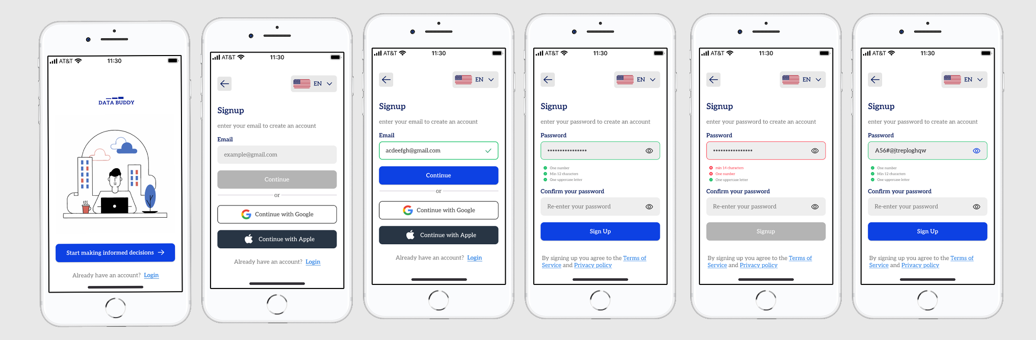
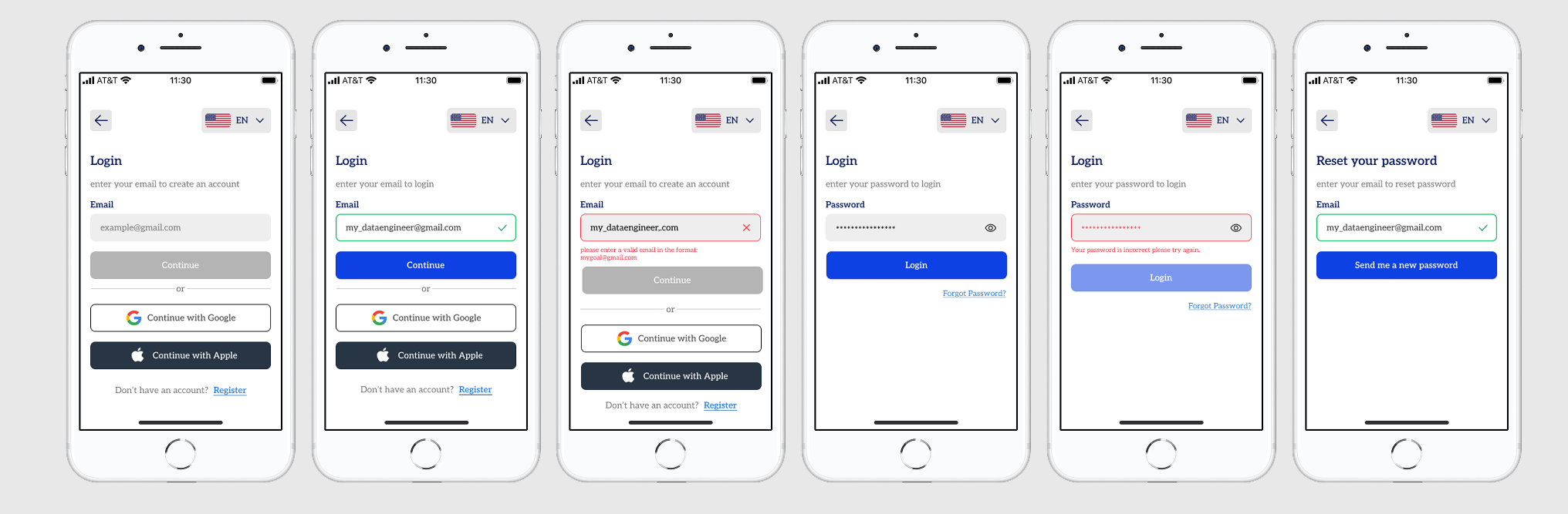
I implemented a progressive form flow, splitting the process into distinct email and password steps to reduce cognitive load. Real-time validation with clear textual feedback and color-coded input states enables users to identify and correct errors instantly.
Visible focus indicators, semantic labels, and logical tab order improve navigation for screen-reader and keyboard users.
The interface maintains high color contrast for readability and includes accessibility-driven elements such as a password visibility toggle, language selector, and trust cues like “Continue with Google/Apple” buttons and transparent privacy links.
Together, these features transform a routine login/signup form into an accessible, intuitive, and confidence-building entry point for all users.
Design Rationale
Accessibility was treated as a core design constraint rather than an afterthought. Each decision — from microcopy to interaction states — was grounded in WCAG best practices and user empathy.
By combining responsive validation, visual hierarchy, and ARIA-based assistive elements, the flow minimizes friction and supports diverse user needs.
Preliminary testing indicated smoother task completion, fewer form-entry errors, and higher perceived trust — confirming that accessible design directly drives usability and conversion.
Key Takeaways & Reflection
This project strengthened my understanding of accessibility as a strategic UX asset, not just a compliance checkbox. I discovered how seemingly small choices — color contrast ratios, input focus handling, password feedback loops — profoundly impact inclusivity and overall experience quality.
Next, I intend to expand testing to different device types and accessibility tools to uncover hidden friction points. I also plan to iterate on adaptive color modes and localized language variants for global reach.
I’m always open to constructive feedback and critique — each perspective helps refine my thinking and elevate the solution.
Design, after all, thrives on collaboration, iteration, and humility. 🌱
Tools used
From brief

Topics
Share
Reviews
7 reviews

Hey! 👋 I can see solid work with good intentions, but I have a few honest observations:
The step-by-step approach, where you first enter email, then password, actually reduces cognitive load and helps focus on one thing at a time. Real-time validation with green checkmarks is good practice that provides immediate feedback. Social login as an alternative option is also a nice solution.
You talk a lot about WCAG and accessibility, but I don't see it directly in the screens. Where are the marked focus states for keyboard users? What does the tab order between elements look like? Do form fields have properly associated labels with inputs? All of this needs to be shown visually, preferably through additional annotations or an interactive prototype, because right now it's just a promise.
I'm missing error states for other fields besides password. What happens when someone enters an incorrect email format? I also don't see edge cases, for example what appears when an email already exists in the system? These are important scenarios that need to be designed. You mention mobile design, but there's not a word about responsive considerations for different screen sizes.
Summary:
You've got a strong foundation here and it's clear you understand core UX principles. With some additional work on documentation - showing focus states, error handling, and edge cases, this could become a really compelling portfolio piece. The concept is solid, it just needs that extra layer of detail to demonstrate your full skill set. Keep pushing forward, you're on the right track! 💪 👍

Hey Timothy! Nice work overall! You have showcased focus states & inline validations very well. Just make sure to maintain consistent font sizes for each type of element. I can see that the font size of Continue with Google is bit larger than Continue with Apple.

Great job!

This project shows a strong understanding of accessibility principles and effectively applies WCAG standards to form design. The author clearly communicates intent and rationale, which helps the viewer understand the reasoning behind each decision. The overall presentation is clean and thoughtfully structured.
That said, the layout could benefit from applying graphic design principles such as proximity to improve spacing consistency. A more deliberate use of spacing would enhance alignment, create clearer groupings, and strengthen the overall visual rhythm across screens.
Overall, it’s a solid and insightful project that balances accessibility and usability well, with room to refine the visual composition for stronger cohesion.

Really awesome work, Timothy!
Overall, the screens are clean, consistent, and provide clear feedback to users. I like that the secondary login buttons use both color and an underline to make them clear for users who may be colorblind.
A couple of things to consider:
- Although it’s tempting to include placeholder text inside form fields, it’s generally not advised. If you need to give users extra guidance, the way you’ve done it with the password field works really well. For the email field though, we can assume users know the format. Here’s a great article about it from NN Group: https://www.nngroup.com/articles/form-design-placeholders/
- A small thing, but changing the title from “Signup” to “Sign Up” will help keep things consistent.
Really great job overall! 👏

Really nice work here! The flow feels clean and easy to follow, and the feedback to users is clear and helpful. To make it even stronger, try showing more of the accessibility details you mentioned, like focus states and how edge cases are handled. A bit more consistency in spacing will also help everything feel more polished. Overall, great effort and you are definitely on the right track! 👏✨

amazing
You might also like

Smartwatch Design for Messenger App


Bridge: UI/UX Rebrand of a Blockchain SCM Product


Pulse Music App - Light/Dark Mode

Uxcel Halloween Icon Pack


Monetization Strategy


Designing A Better Co-Working Experience Through CJM

Visual Design Courses

UX Design Foundations


Introduction to Figma

Design Terminology
