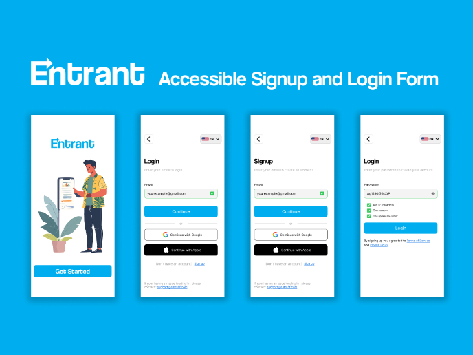
Accessibility Signup Form for Saas Platform
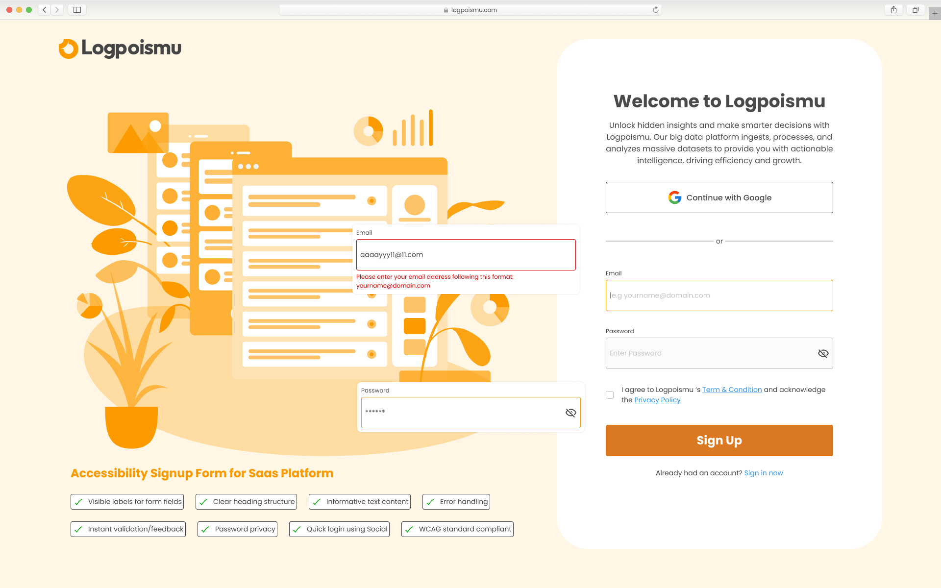
The process for making the Accessibility Sign Up form for SaaS product involved the following key steps, focusing on inclusive design principles:
- Clear and Visible Labels: The design ensures that each input field ("Email" and "Password") has a visible label positioned above it. This is crucial for all users, especially those with cognitive disabilities or using screen readers, to understand the purpose of each field.
- Informative Error Handling: When an invalid email format is entered, a clear and informative error message appears directly below the "Email" field: "Please enter your email address following this format: [email protected]". This helps users understand the issue and how to correct it. The error message is also visually distinct (red text, potentially an icon – though not fully visible) to draw attention.
- Password Visibility Control: The inclusion of an eye icon in the "Password" field allows users to toggle the password visibility. This is essential for users who have difficulty typing or remembering passwords, as they can visually confirm what they've entered.
- Clear Heading Structure: The "Welcome to Logpoismu" text is presented as a clear heading. This provides structure to the content and helps screen reader users navigate the page.
- Sufficient Contrast: While not explicitly stated, the design appears to prioritize sufficient color contrast between text and background elements. This is vital for users with low vision. The dark text on the light background generally looks accessible.
- Keyboard Navigation: Although not visually evident, an accessible form is built with proper HTML semantics to ensure logical keyboard navigation using the Tab key. This means users can navigate through the form fields, buttons, and links in a predictable order.
- Checkbox for Agreement: The "I agree to Logpoismu's..." checkbox is a standard accessible form element. It has a clear label associated with it, allowing users to understand the terms they are agreeing to.
- Clear Call to Action: The "Sign Up" button has prominent visual styling and clear text, making it easily identifiable as the primary action.
- Quick Login Using Social (Optional but helpful): Offering "Continue with Google" provides an alternative and often quicker login method, which can be beneficial for some users.
In essence, the process involves a combination of thoughtful visual design to ensure that all users, regardless of their abilities or how they interact with the web, can understand, navigate, and successfully complete the sign-up form. The focus is on clarity, predictability, and providing necessary cues and controls.
Tools used
From brief

Topics
Share
Reviews
2 reviews

Hey Ho Dac, I really liked the design, look and feel. The UX seems very promising and appealing. Although below are the findings which could help for the betterment of the design.
- Body texts are too much. Below the main heading "Welcome to.." the body texts are more than required. To let user perform the signup, we should always keep minimal data. So that they could read lesser and take decision faster.
- Kindly re check the font sizes.
- Though the right side should be heavier than the left. But here because of the heavy graphics left has become bit heavier.
- Also, chips in the left seems like buttons. Please take a note of it.
Rest looks fine. All the best!

Good login screen try to make simple correction. The increase the corner radius of the text box It would be nice to see more.
You might also like
Accessible Signup Form

Entrant - Analytical Dashboard

Transit Cairo — Digital Mobility Redefined

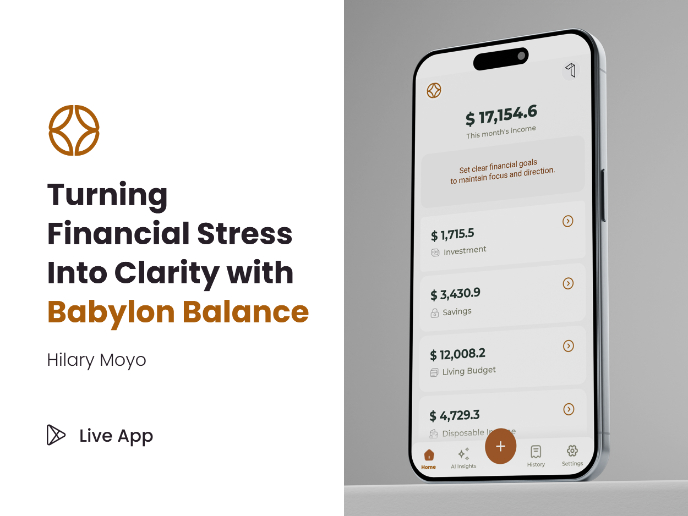
Babylon Balance - Designing Financial Clarity Through Constraint

Entrant Accessible Signup and Login Forms
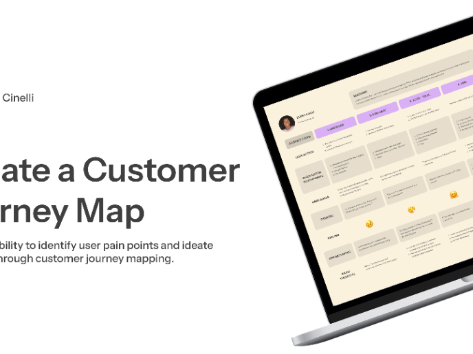
CJM x Mindspace case study - Ester Cinelli

Visual Design Courses

UX Design Foundations


Introduction to Figma

Design Terminology
