Signup Form Accessibility Performance

Figma Present: click
Figma Project: click
Telegram: @figmagod
From brief

Share
Reviews
5 reviews

Dear Figmagod,
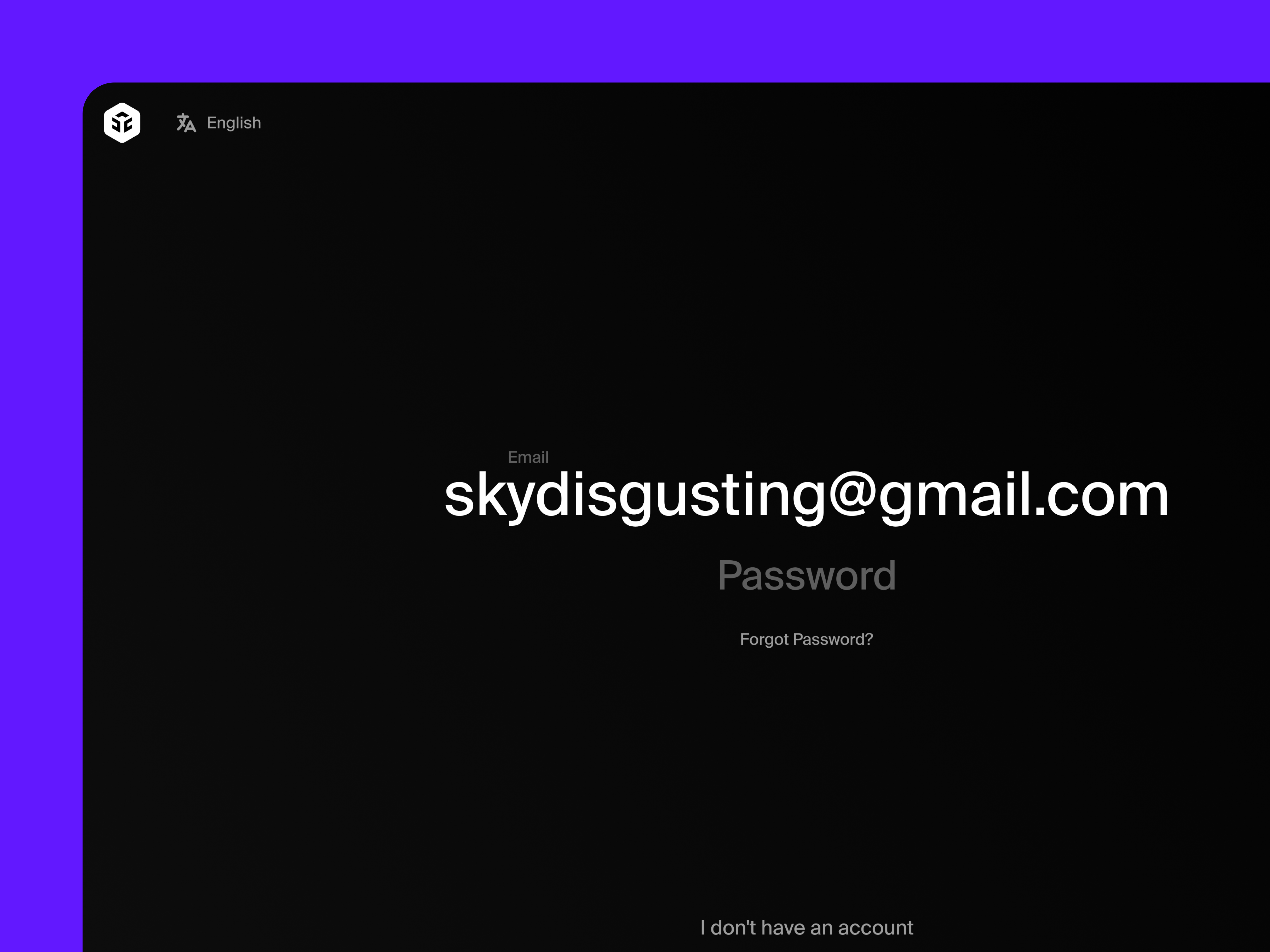
The animations are cool and it does feel highly interactive! But I’m afraid it leans away from what makes a signup form accessible. When every field is animated and the screen shifts from dark to light so suddenly, it can be disorienting for some users, cause motion sensitivity, and add extra friction to something that should feel quick and simple.
I’m curious about the thinking behind your design choices, and how you see animation supporting accessibility here.
PS. the sky is pretty, not disgusting (from a humble servant 🙇)

Cool animations Matvei!
This looks like great exploration project. I really like the clean, minimal approach you've taken with this interface, it feels modern and uncluttered, which is great for user focus.
I noticed there's no show password option. It's become pretty standard practice and really helps users who struggle with password entry or have accessibility needs. Was there a design constraint that led to skipping it?
The continue button placement in the top right is interesting, what drove that decision? Most users expect primary actions to flow naturally after the form content.
Good job!

Matvei, your clean design is refreshing, just be mindful of accessibility details like motion and password visibility, and overall you’re on a solid path!

Okay first of all, love that you focused on accessibility 👏♿ That already puts this project on a different level. It’s not just about “pretty signup forms,” it’s about making sure more people can actually use it. Big respect for that.
The structure feels clear and calm. Labels are readable, spacing looks comfortable, and it doesn’t feel cramped or overwhelming. I especially like that it seems thoughtful about contrast and clarity which is super important for forms 🔎✨
If I’d push you a bit, I’d love to see micro-interactions around validation — like how errors are announced, focus states, or keyboard navigation cues ⌨️💡 That would make the accessibility story even stronger. Overall though, this feels intentional and responsible. Really nice work.

This is a strong project, Matvei. You focused on accessibility from the start, which is essential for inclusive design.
I like that you created a signup form for a SaaS platform with clear attention to usability and performance. Sharing Figma links and Telegram contact makes it easy for others to review and collaborate.
Overall, your work shows careful consideration of accessibility and thoughtful execution, which will improve the user experience for all users.
You might also like

HealthFlow: Designing a Simple and Insightful Wellness Dashboard


Improving Dating App Onboarding: A/B Test Design

FORM Checkout Flow - Mobile


A/B Test for Hinge's Onboarding Flow


Accessibility Asse

Uxcel Halloween Icon Pack

Visual Design Courses

UX Design Foundations


Introduction to Figma

Design Terminology
