Typography & Branding
Uncover how typography plays a key role in shaping and conveying a brand's visual identity and personality
Knowing the details of typographic design is only useful if you can apply it to your work. Understanding the difference between a serif and sans serif typeface, for example, is only important if you also know when and where to implement each.
Typography can have a significant impact on a company's branding. It can help reinforce the personality and mood of the brand and even impact how much time a user will spend on a website. When implemented poorly, however, it can confuse and frustrate users, and even go so far as to create cognitive dissonance.
Before you can determine the look and feel of your
Is your
You can also use these keywords while searching for typefaces. Many
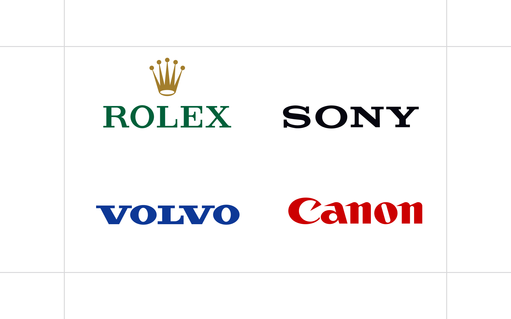
Serif typefaces, being some of the oldest typefaces still in common use, are associated with tradition, formality, and authority. If any of those words describe your brand's personality, then serif typefaces are a good place to start.
Beware that not all serif typefaces will have those characteristics. Alice, for example, offers a more whimsical, feminine take on the traditional serif
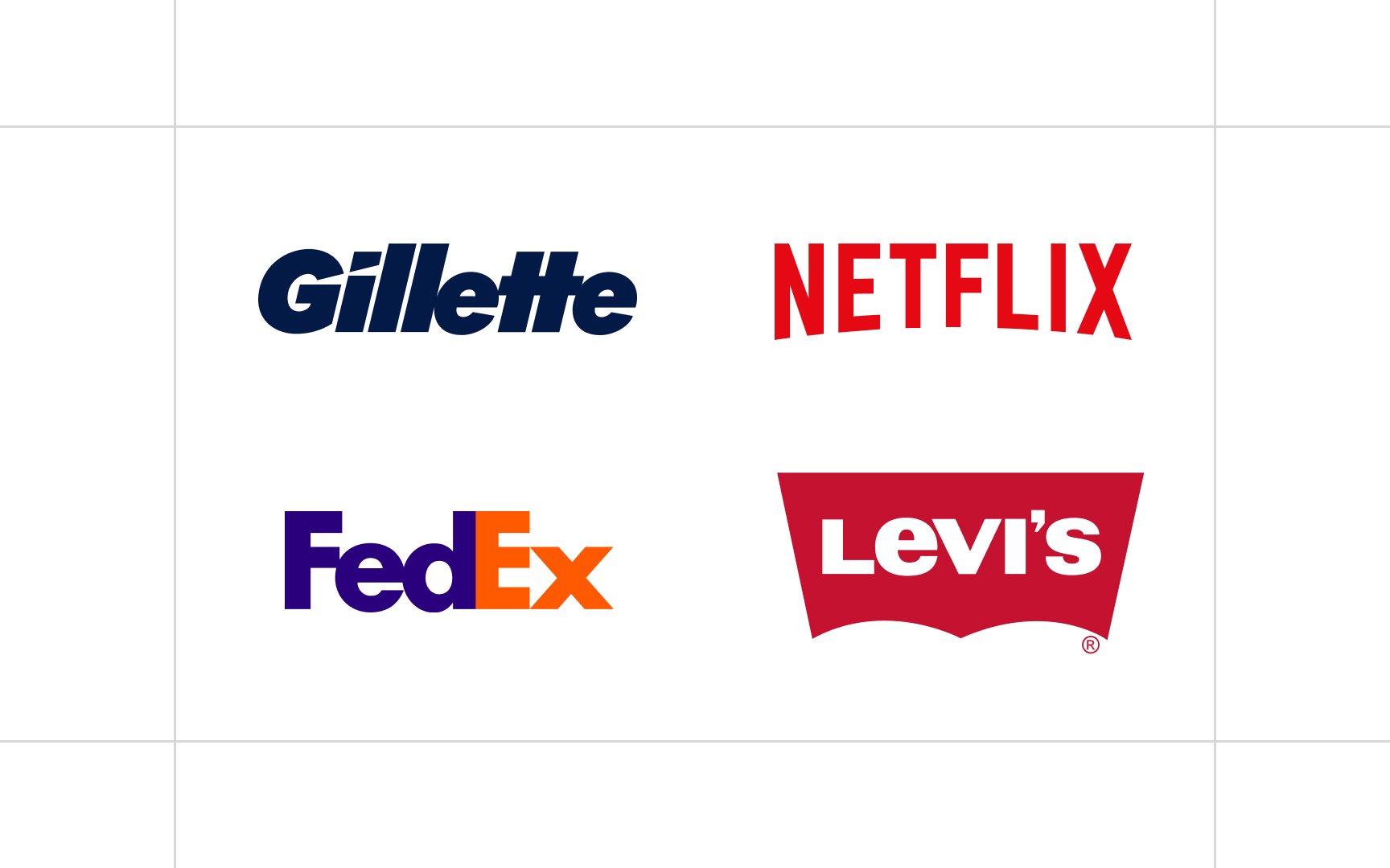
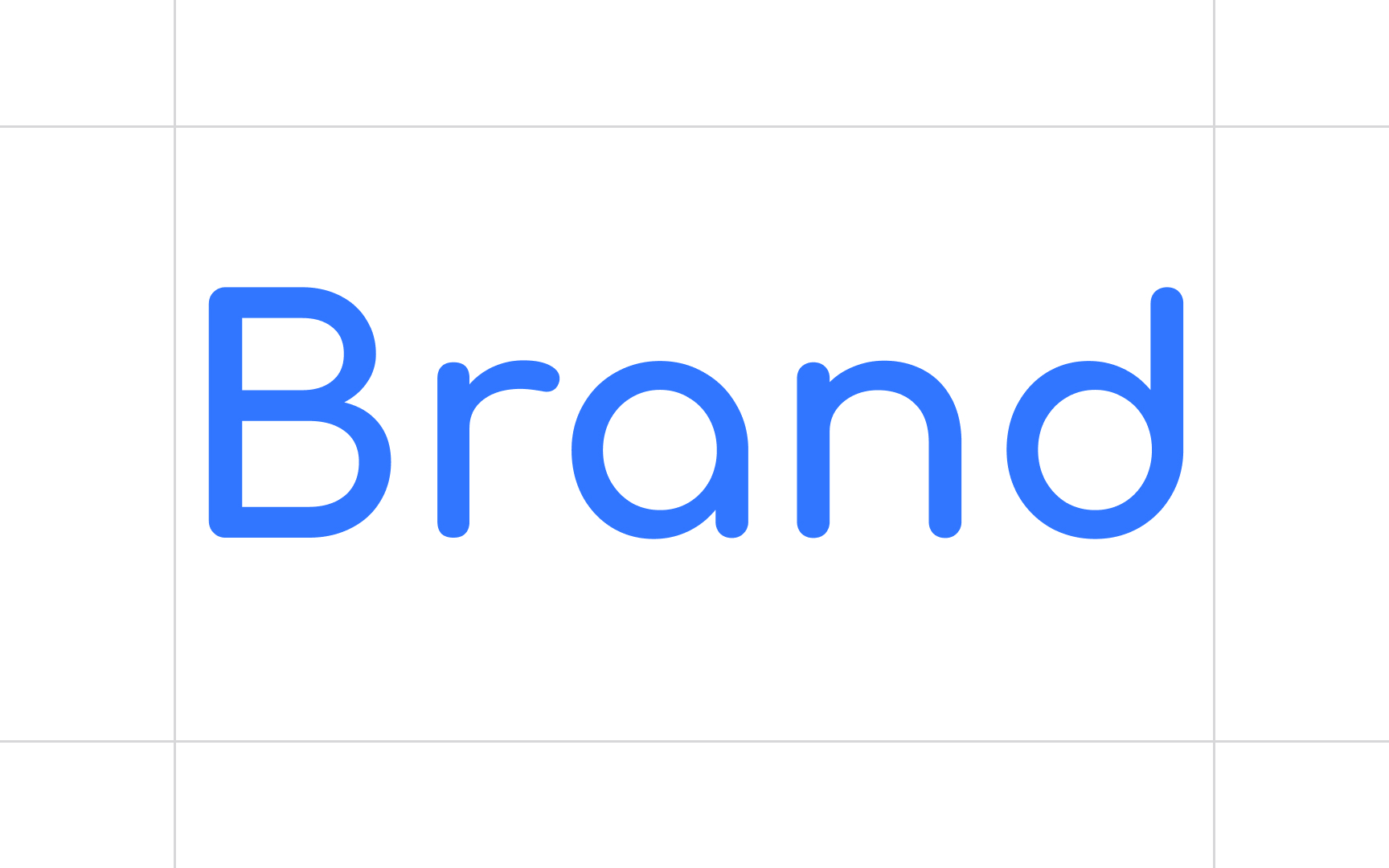
Sans serifs are, in general, more modern and stylish than serif
If your
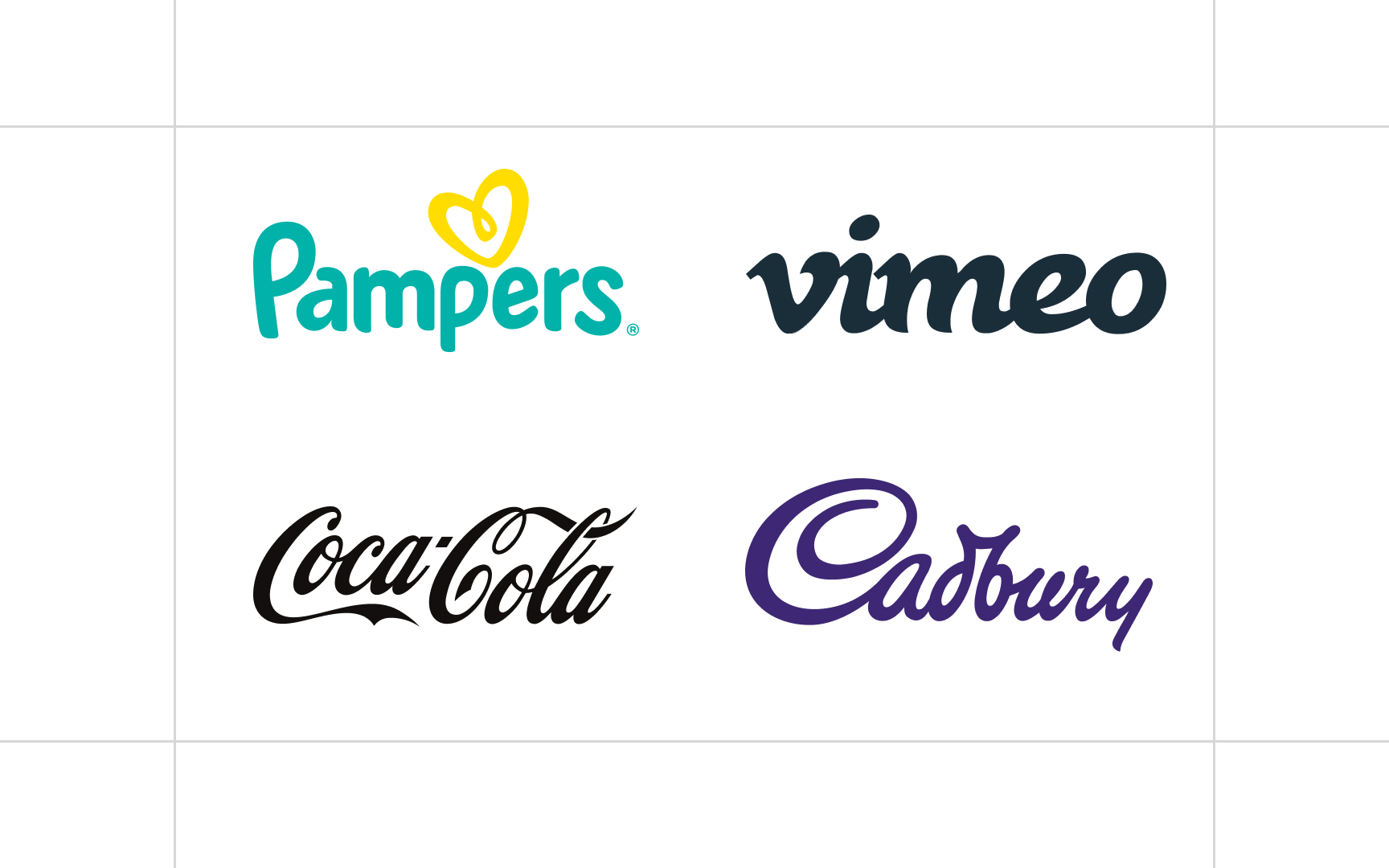
Script
There's one big caveat about using script typefaces, though — they're unsuitable for body copy. Script typefaces are perfect for things like wordmark logos or large headings, but they become very difficult to read at smaller sizes. You'll want to pair them with serif or sans serif typefaces for the body of your content.
Big brands, especially those that are content-focused, sometimes commission entirely custom or bespoke typefaces for their designs. It's a subtle way to make their
On a smaller scale, you can customize typefaces for things like logos and wordmarks without breaking the bank. Subtly changing the shape of letterforms, adding things like swashes or serifs, or otherwise customizing the appearance of an existing font can be a solid way to create a unique logo that cannot be easily copied. Just be aware of the licensing for the typeface you use as a basis for that customization.
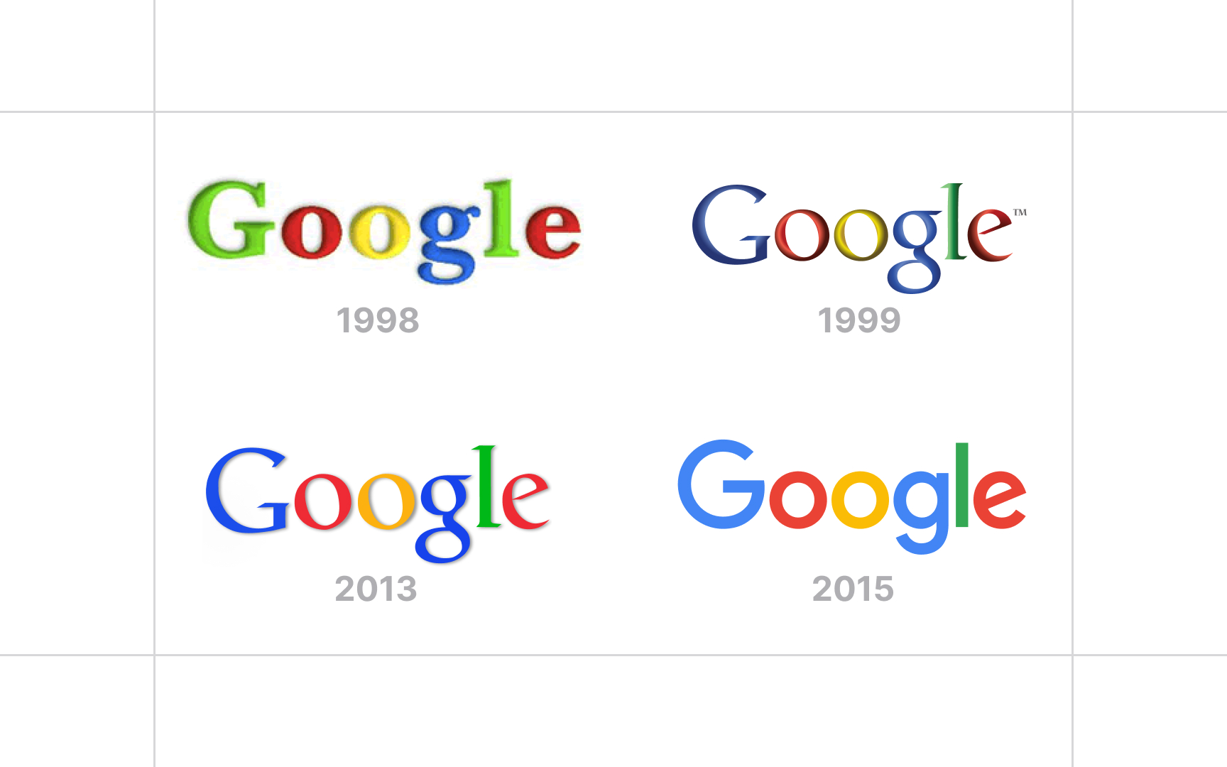
No matter what, a brand's past plays a big role in how customers perceive it. If a
You don't have to stick to the same old typefaces forever. Knowing the brand's history can actually help avoid any uneasiness among its followers when a change happens. Just think about the key aspects of the brand's previous

Whether a person is familiar with the intricacies of
Pay attention to the keywords that come to mind when you view a particular typeface. Pay attention to the feelings the typeface evokes in you. Then consider that many of your users will have the same feelings that you do when viewing the typeface. Even if a typeface is supposed to be "modern" or "formal" or "whimsical," if it doesn't evoke those feelings in you, it's unlikely to do so for most others.
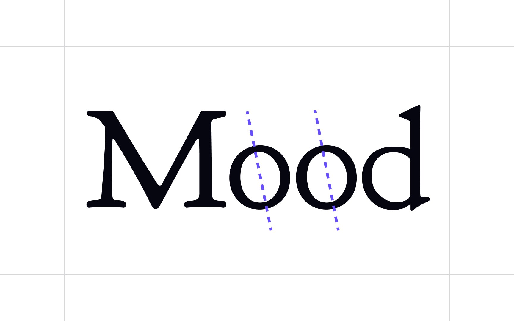
The direction of stress in a
So how do you tell the direction of the stress in a particular typeface? The easiest way is to look at the letter O. If the two sides of the character are a mirror image of each other (particularly with the sides thicker than the top and bottom), then the stress is vertical. However, if the bottom left is thicker than the top left and the top right is thicker than the bottom right (or vice versa, although that's less common), the typeface has a diagonal stress.
There are a ton of brands out there that use the same typefaces (how many brands have you seen that use Helvetica for the majority of their
Distinctive typefaces contribute to your brand's overall identity. If you're using the same typefaces as every other company in your industry, then your typography will do nothing to help your brand stand out. If your typeface is distinct (assuming it remains easy to read and still fits your brand's personality), however, it serves to heighten your brand's
Considering the wealth of text-based
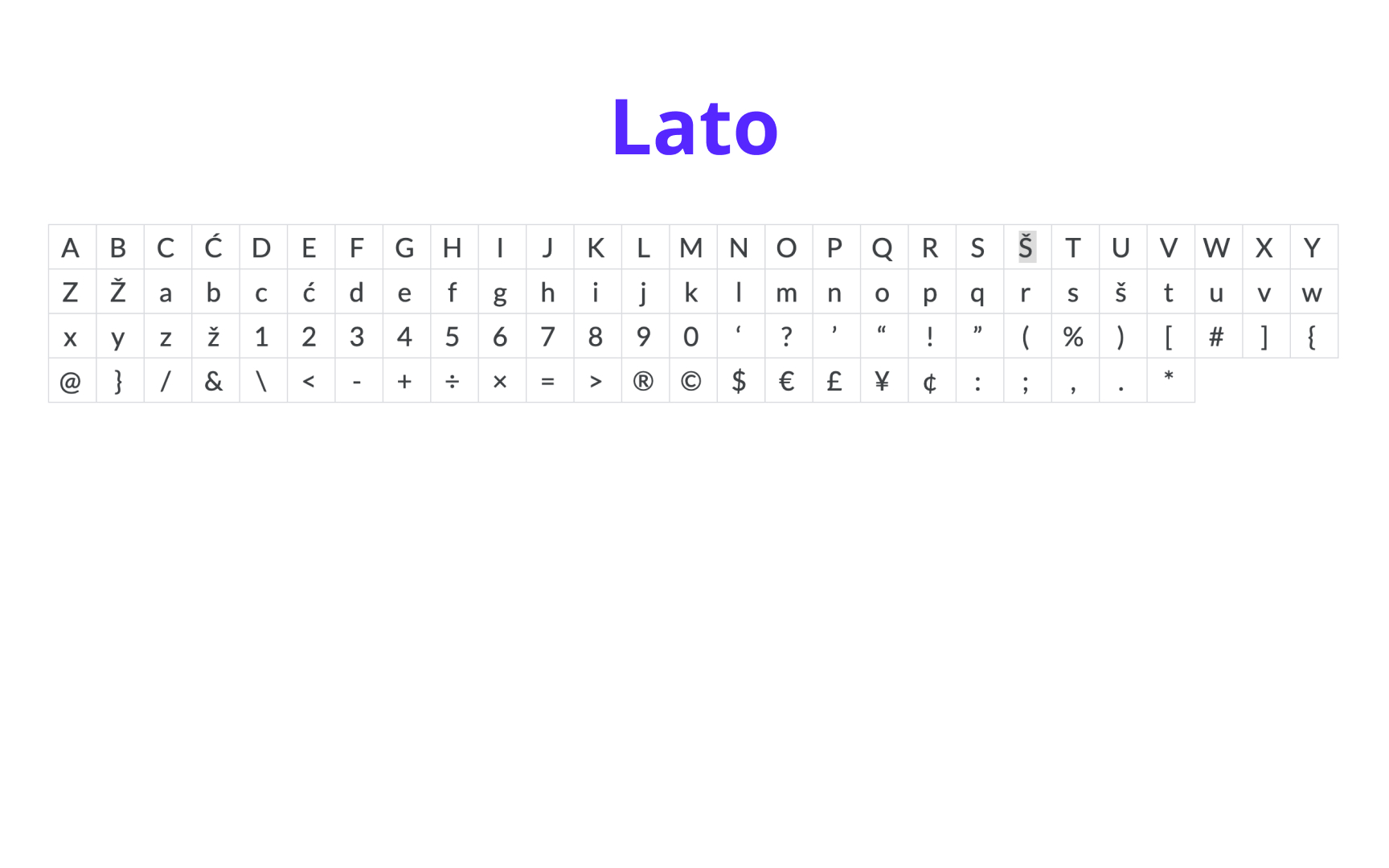
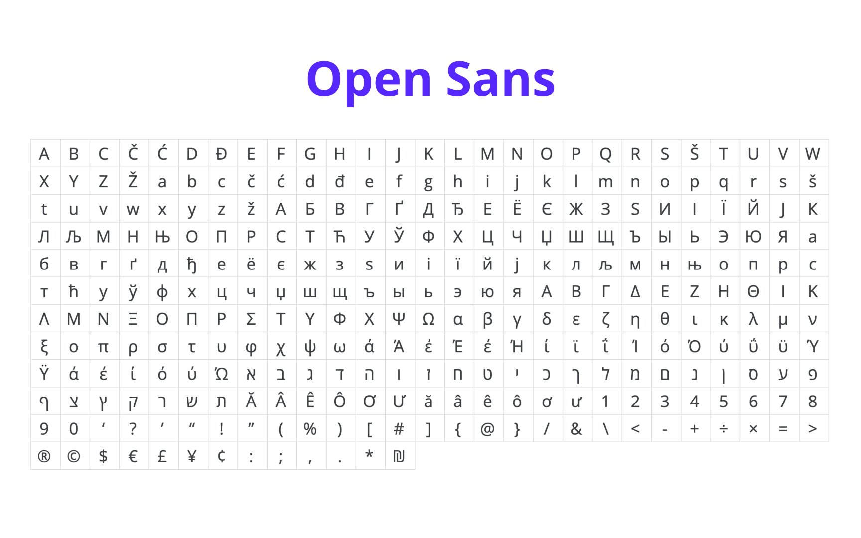
You'll also want to choose typefaces that offer a comprehensive set of glyphs, as well as a variety of styles and weights. Make sure that your chosen typeface will be able to grow with your brand and won't restrict what you can do later on.
This can be an easy thing to overlook, but the details of a
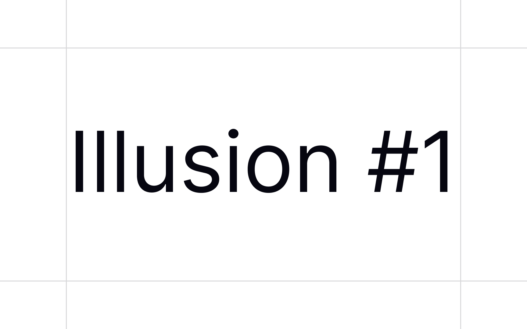
Also pay attention to whether characters like capital "C" and "G" have enough distinction between them, or whether there's any distinction between the capital "O" and the number "0." Considering these small details can make your
References
- Google Fonts: Alice | Google Fonts
- Google Fonts: Roboto | Google Fonts
- Brand typography: A complete guide | Creative Bloq
- How to Find the Right Typography for Your Brand Identity | Column Five
Top contributors


Topics
From Course

Share


