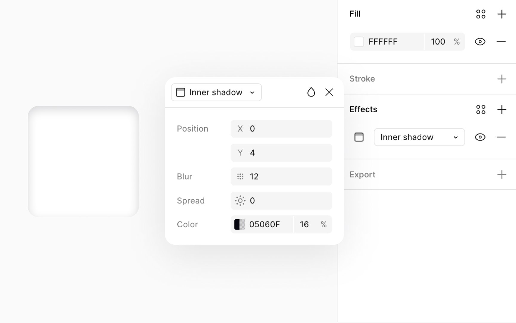
Inner shadow
Inner shadows, similar to drop shadows, add depth to your 2D designs. However, unlike drop shadows that appear behind an object, inner shadows sit inside the layer or object, giving the illusion that the shadow is contained within its boundaries.
Inner shadows are great for:
- Adding depth to text, making it pop
- Creating a recessed or indented look on objects
- Indicating an active or clicked state for buttons, enhancing UI interactivity.
For crafting an inner shadow for a clicked button, use these specific settings:
- Opacity: 30-40% to achieve a subtle, yet discernible shadow
- Offsets: X: 0px, Y: 2px to simulate the shadow falling inside the button
- Color: Use a color slightly darker than the button’s background — for a light button, a dark grey like #646464 can work well
- Blur: 4-6px to soften the edges of the shadow, making it appear as if the button is pressed down.
