What is responsive design
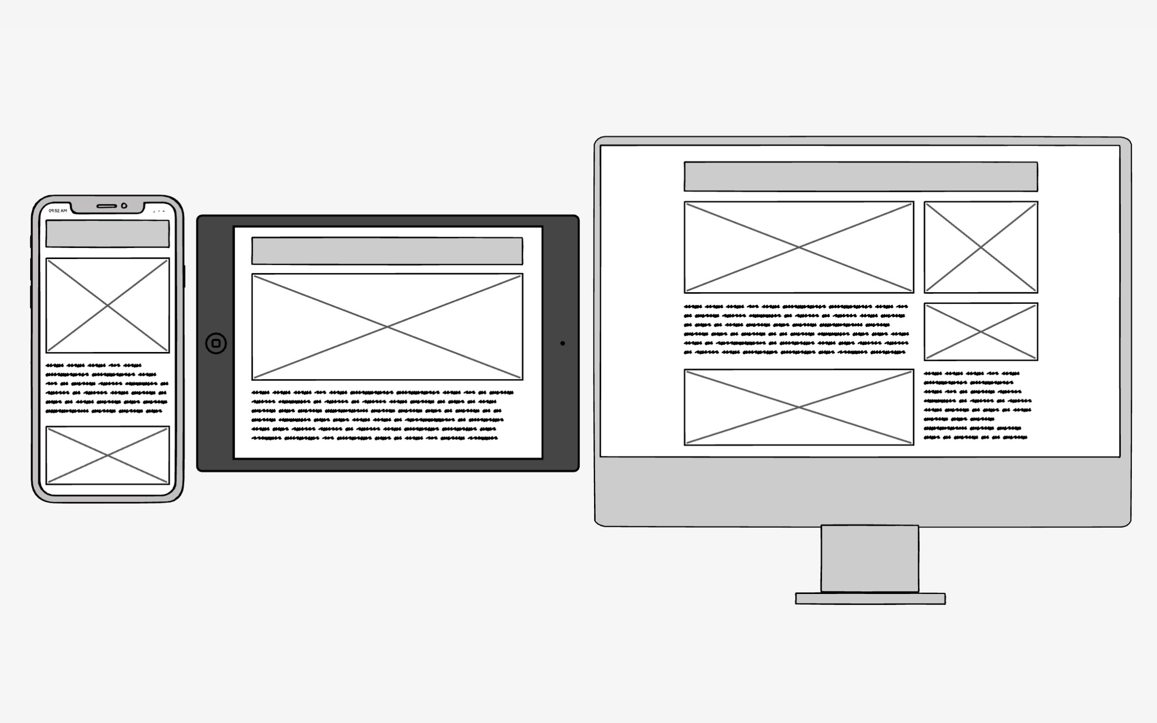
Responsive design is a solution to a problem that didn't exist until quite recently — how to make a design look good on different device types and sizes. In 2021, mobile users constitute just a bit over half of global internet users.[1] But most people use several different devices — desktops, laptops, tablets, and smartphones.
Responsive design serves all devices with the same code. The browser detects the screen size, platform, and orientation and chooses which parts of the code to use to accommodate that device type. Fluid grids, flexible images, and media queries are the three technical ingredients.[2] As a result, all users get great UX — whether they browse your website from their desktop or a small-screen mobile.
References
- Mobile Vs. Desktop Internet Usage (Latest 2022 Data) | BroadbandSearch.net
