How Colors Impact Our Mood
Explore powerful color palettes that can be used to create different moods
The same color can have different psychological effects on people in different surroundings. How can this knowledge help designers create emotionally powerful color palettes? By playing around with hues, saturation, and value, you can create a vast number of color palettes for any industry or product type.
With modern tools like Coolors, you can adjust the HSB, RGB, and CMYK values for any color, pick the exact shade of each color, or isolate the color you like most and try it with different color combinations. If you like the colors of a certain picture or movie scene, you can even upload it to Coolors and receive a color palette based on the image.
Creating an elegant
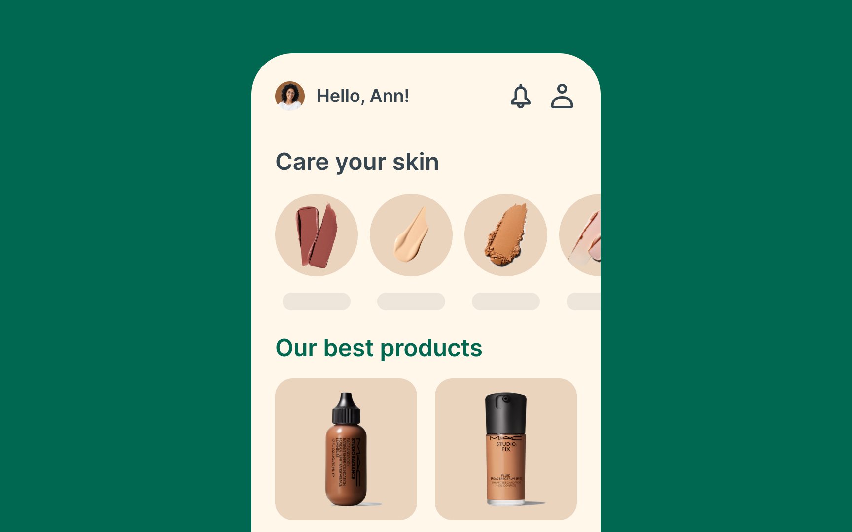
Another elegant palette is blush pink, gold, and white. The warmth of gold paired with the subtlety of blush pink and the purity of white creates a luxurious feel. A more modern palette could include emerald green, charcoal, and cream. The deep green brings richness, while charcoal adds depth, and cream provides a neutral balance.
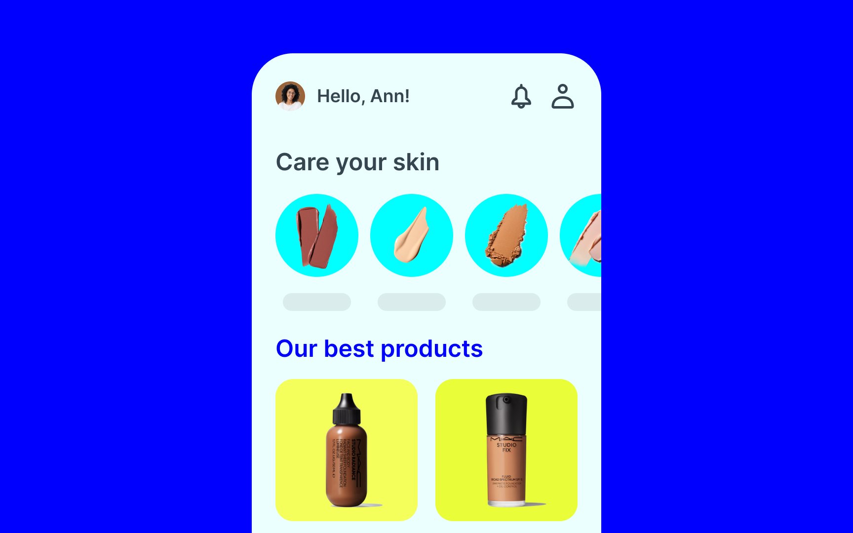
Such color palettes could be a great fit for e-commerce websites selling high-end beauty or eco-friendly products, as well as for meditation or yoga apps, among others. Keep in mind that these are just examples, and there are many more combinations you can try to achieve a refined look for your product.

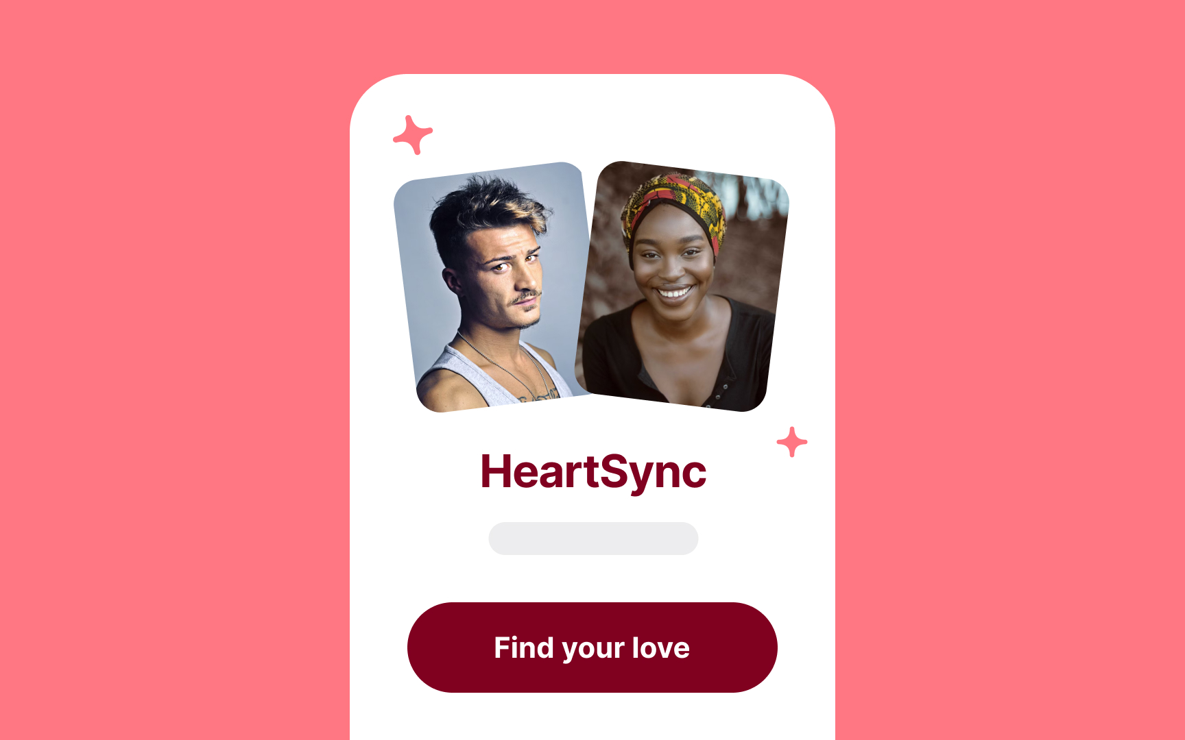
Passionate
A romantic palette could include rich burgundy, blush pink, and cream. The deep burgundy brings intensity, while blush pink softens the look, and cream adds balance.
Such color palettes are perfect for dating apps, fitness websites, or sports brands, where energy and enthusiasm are key.
Cheerful
Another option is lime green, tangerine, and turquoise, which together create a fresh and energetic vibe. A playful palette could include bubblegum pink, lemon yellow, and mint green.
Think of logos that represent Slack, Google, eBay — they all use similar color palettes to underline fun, friendliness, creativity, energy, diversity, and even nonconformity.[1]
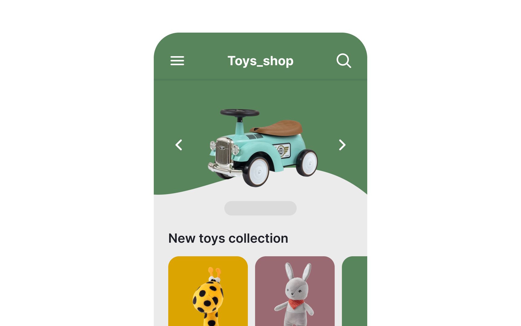
A trustworthy
Another option is forest green, beige, and charcoal. The green represents growth and stability, beige offers warmth, and charcoal adds depth and seriousness.
A traditional palette could include deep brown, tan, and cream. Brown brings a sense of earthiness and dependability, while tan and cream add warmth and balance.
These color palettes are well-suited for financial services or healthcare websites where trust and credibility are essential.
Whimsical
A fantastical palette could include teal, coral, and lilac. The teal adds a touch of mystery, while coral and lilac bring vibrancy and charm.
These color palettes are perfect for children’s websites, fantasy-themed apps, and creative arts platforms, where a sense of fun and imagination is key.
The intriguing
Another option is emerald green, dark teal, and charcoal gray, which together convey a sense of secrecy and allure. A moody palette could include burgundy, indigo, and muted gold. The burgundy adds warmth, while indigo brings depth, and the muted gold offers a hint of mystery and elegance.
These color palettes are ideal for exotic product websites and luxury brands that want to convey a sense of intrigue and sophistication.
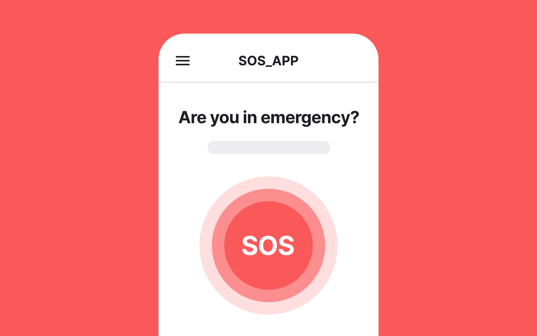
Tense
Consider a palette featuring crimson red, black, and white. This combination creates a stark and intense
Another option is electric blue, dark gray, and bright yellow. The electric blue and bright yellow bring energy and vibrancy, while the dark gray adds depth and seriousness.
For a more edgy look, try blood orange, steel gray, and midnight green. The boldness of blood orange paired with the coolness of steel gray and the darkness of midnight green creates a sense of unease and anticipation.
Tense color palettes are ideal for thriller games, emergency alert apps, and suspenseful storytelling platforms, where a sense of urgency and excitement is essential.
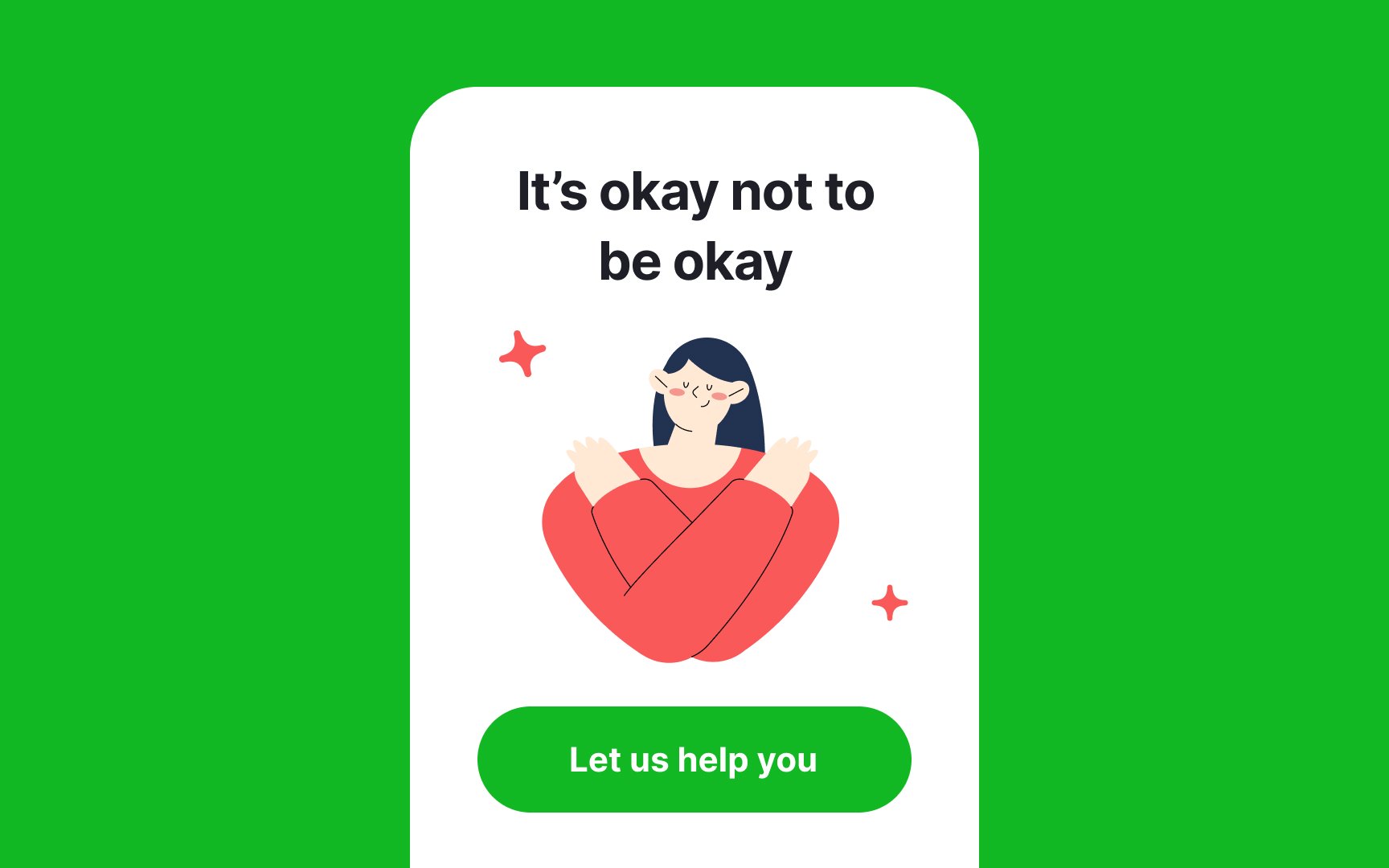
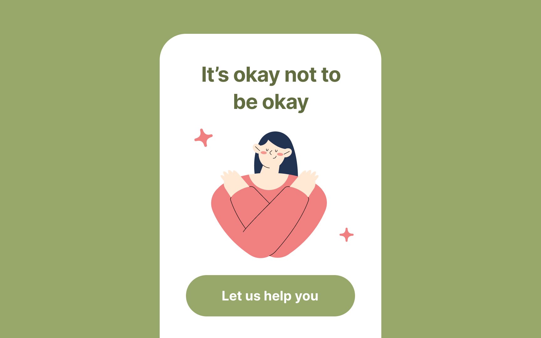
Hopeful
Consider using soft pastels like blush pink, sky blue, and pale yellow. This combination creates a gentle and calming effect, evoking feelings of peace and optimism. Another option is mint green, lavender, and coral. These colors bring freshness and vibrancy, symbolizing growth and new beginnings.
For a more earthy feel, try sage green, warm beige, and soft peach. The natural tones offer a grounding effect, while the peach adds warmth and cheerfulness.
These palettes are well-suited for wellness apps, mental health platforms, community-building websites, and any project that seeks to promote a positive and hopeful message.
References
Top contributors

Topics
From Course

Share


Similar lessons

Intro to Color Theory

Color Properties
