Collecting User Emails
Discover techniques for collecting user emails without annoying or interrupting them
Email marketing continues to be a potent tool for reaching and engaging potential customers. With a staggering 4 billion daily email users worldwide, this channel's influence is set to grow even further in the coming years.[1]
But how can your business effectively convert these users into loyal customers? There are various strategies to capture emails on your website. Consider implementing personalized sign-up pages, engaging pop-up invitations, unobtrusive floating bars, and interactive forms, to name just a few. Knowing the best practices will help you reach out to customers without annoying them or interrupting their time on your website.
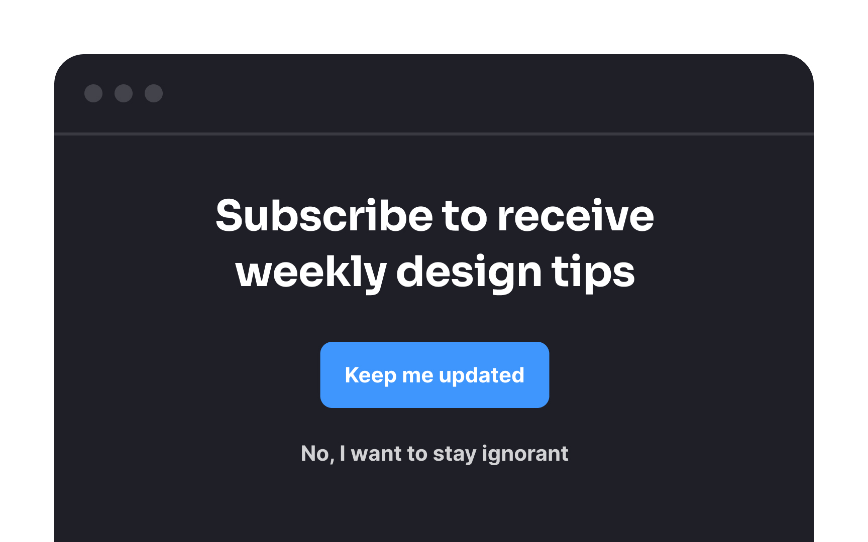
Confirmshaming is a dark pattern that involves guilting users into opting for something.[2] For example, imagine a health newsletter popup that asks users to subscribe and offers 2 CTAs: "Yes, I want to improve my health" and "No, I don't care about my health." This is an obvious play on users' emotions.
Instead of resorting to guilt-based tactics, it's far more effective to offer users something of genuine value. Provide them with a compelling incentive like an e-book, an exclusive discount, or valuable tips as a reward for subscribing. This will ensure that your product attracts a loyal audience that is genuinely interested in your content.

Make it simple to sign up for your
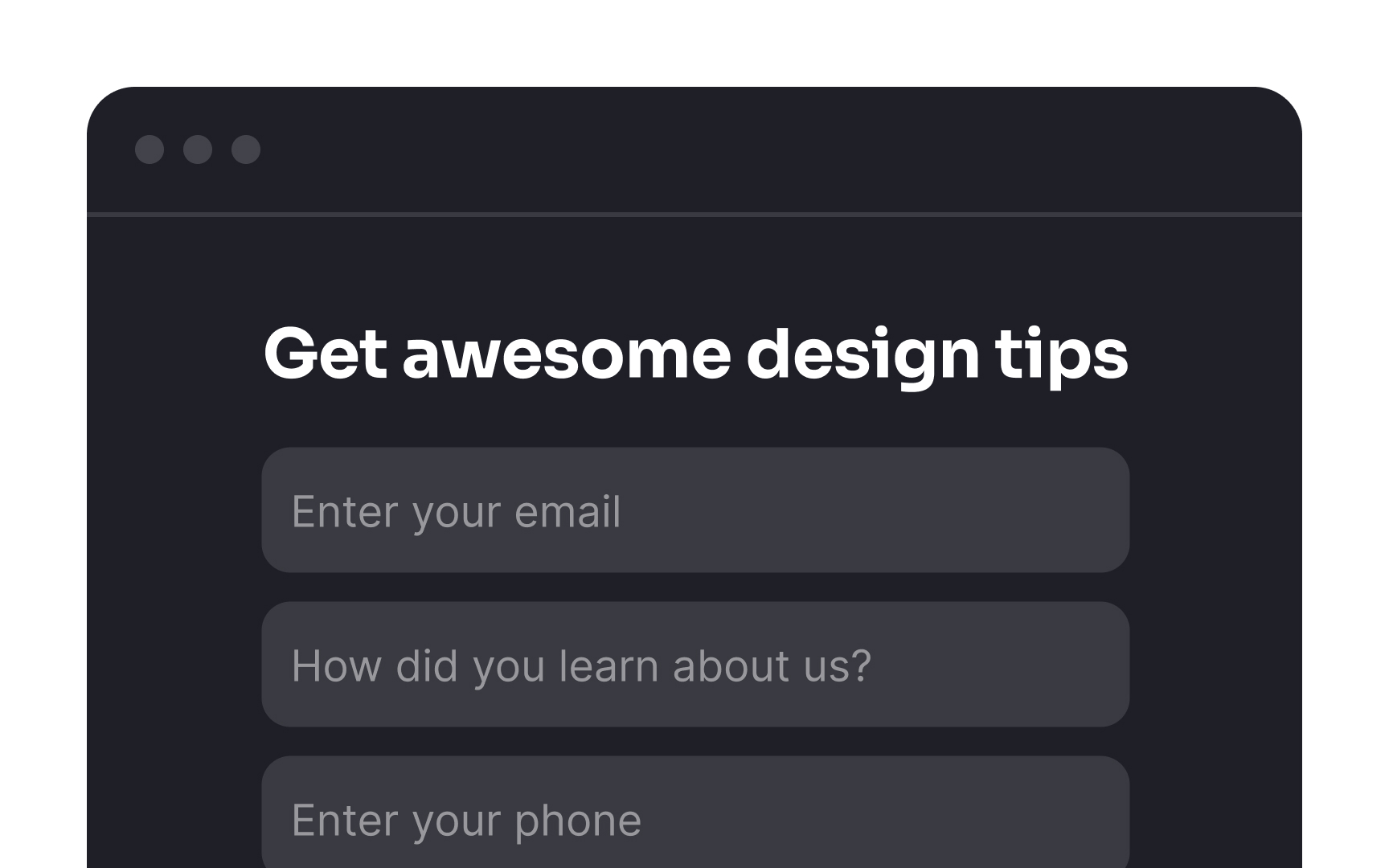
Usually, an email alone is enough for the subscription. You can also ask for a name to make your emails sound more personal.
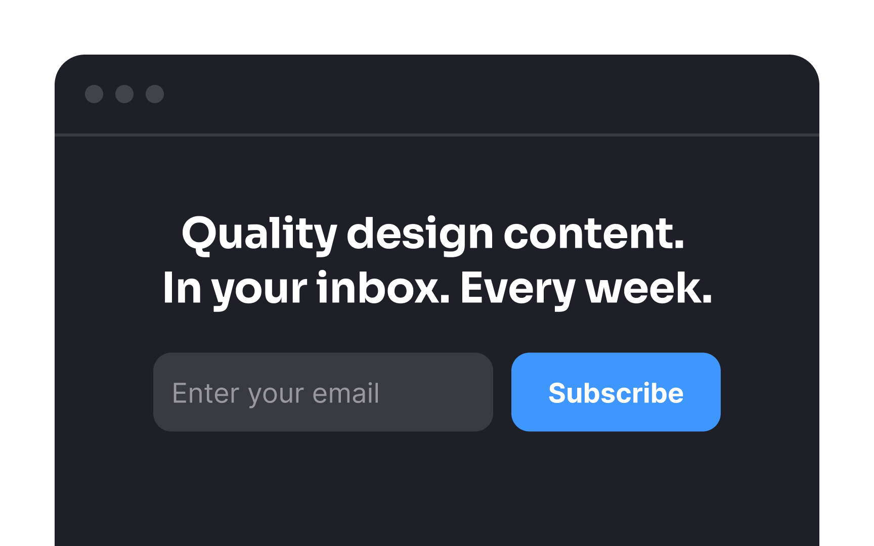
It's crucial that users have a clear understanding of what they're signing up for when they join your
However, it's important not to overwhelm potential subscribers with too much detail; keep the description straightforward and to the point. This transparency not only builds trust with your audience but also sets clear expectations and leads to a more engaged and satisfied subscriber base.
The principle is simple — the smoother and more straightforward the
Consider this when designing your subscription flow. For instance, rather than triggering a popup window after users click the Subscribe button, you can streamline the process by positioning the
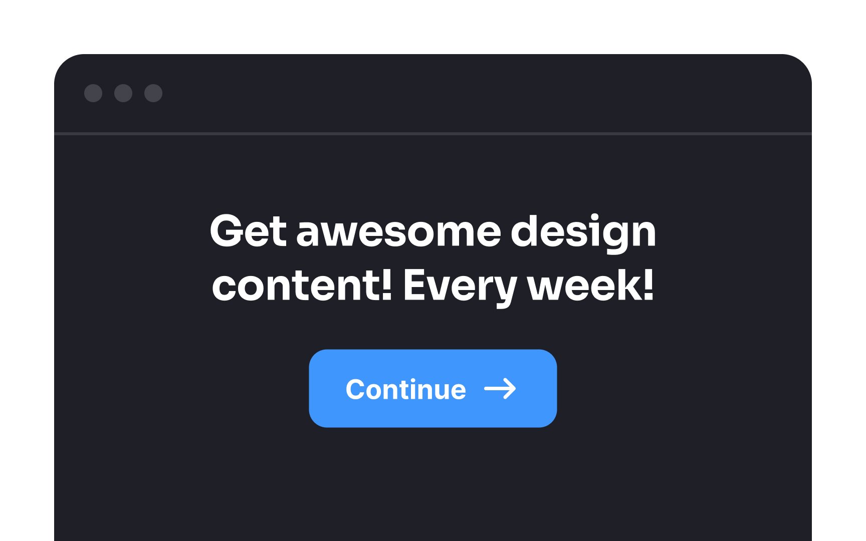
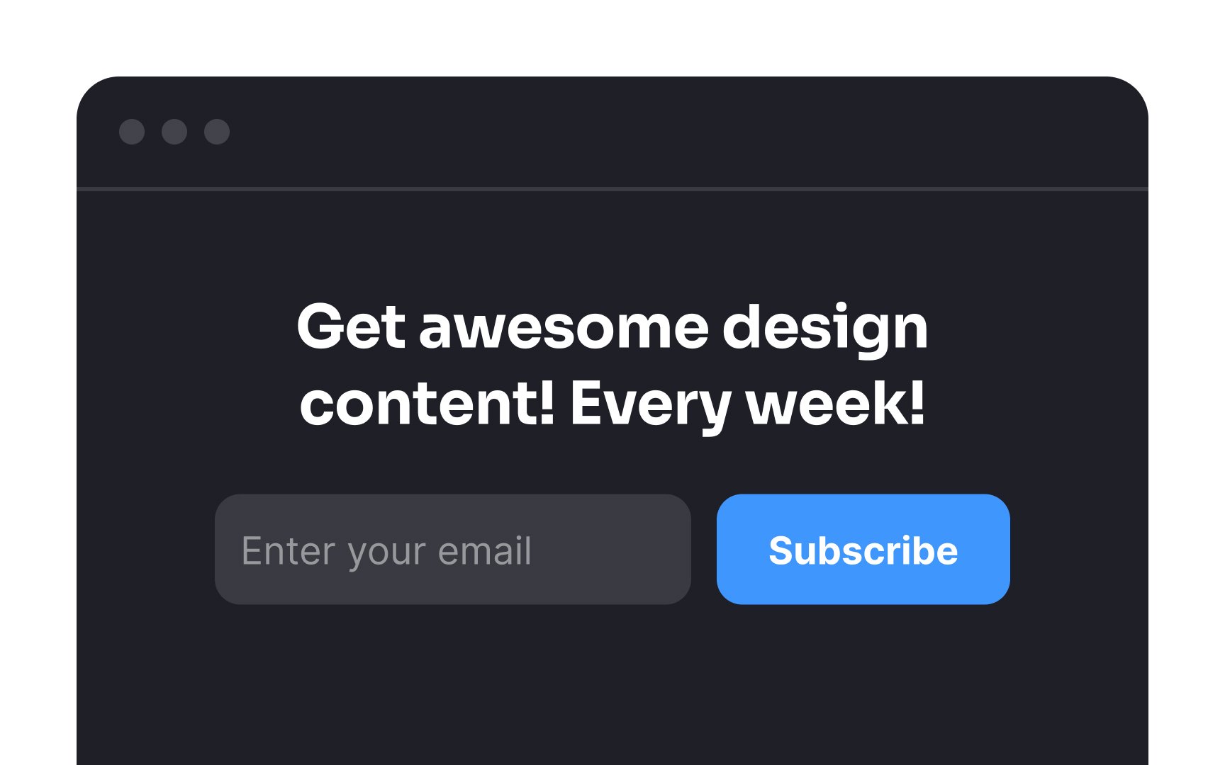
Even if your
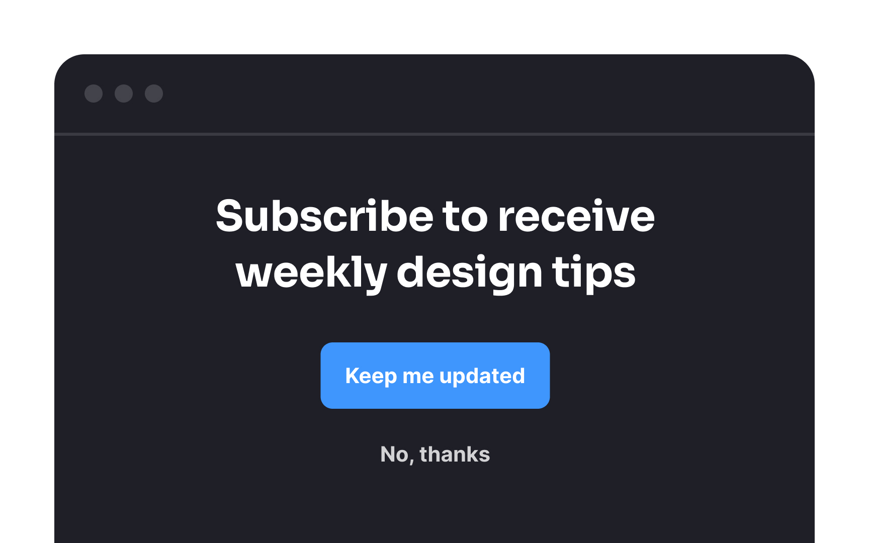
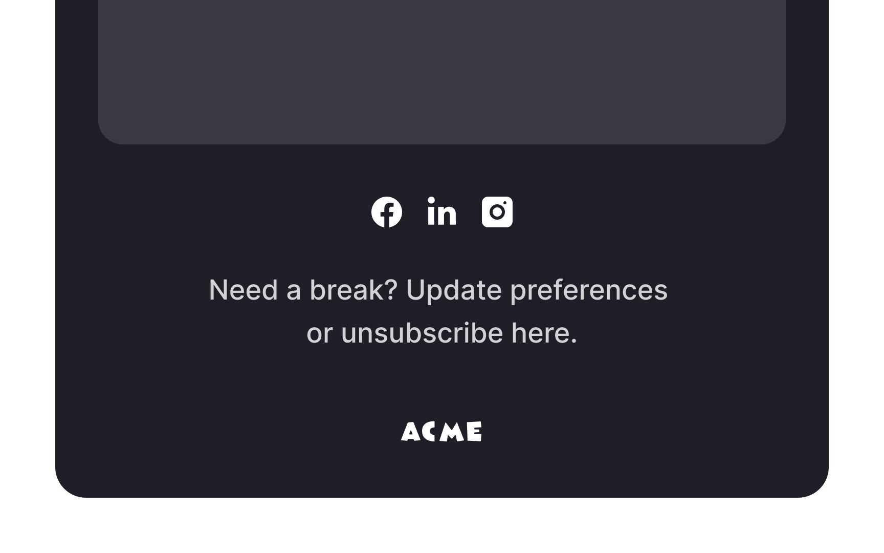
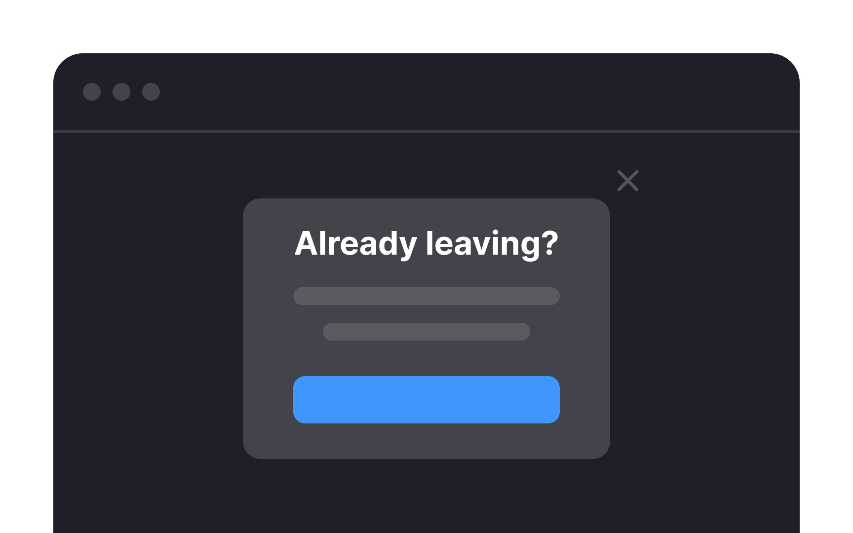
To respect your users' preferences, ensure that the option to unsubscribe is prominently displayed. Make the process of unsubscribing clear and straightforward. Demonstrating this level of transparency leaves a positive impression, and there's a chance that users may return in the future. Conversely, attempting to deceive them into staying can lead to frustration and potentially harm your relationship with them.
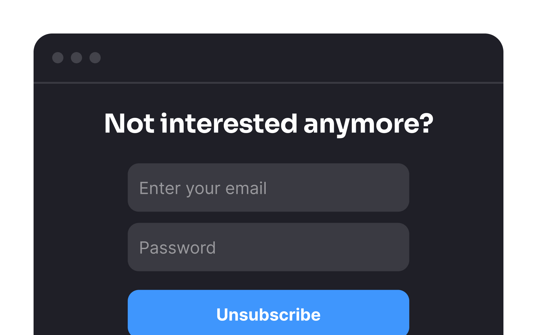
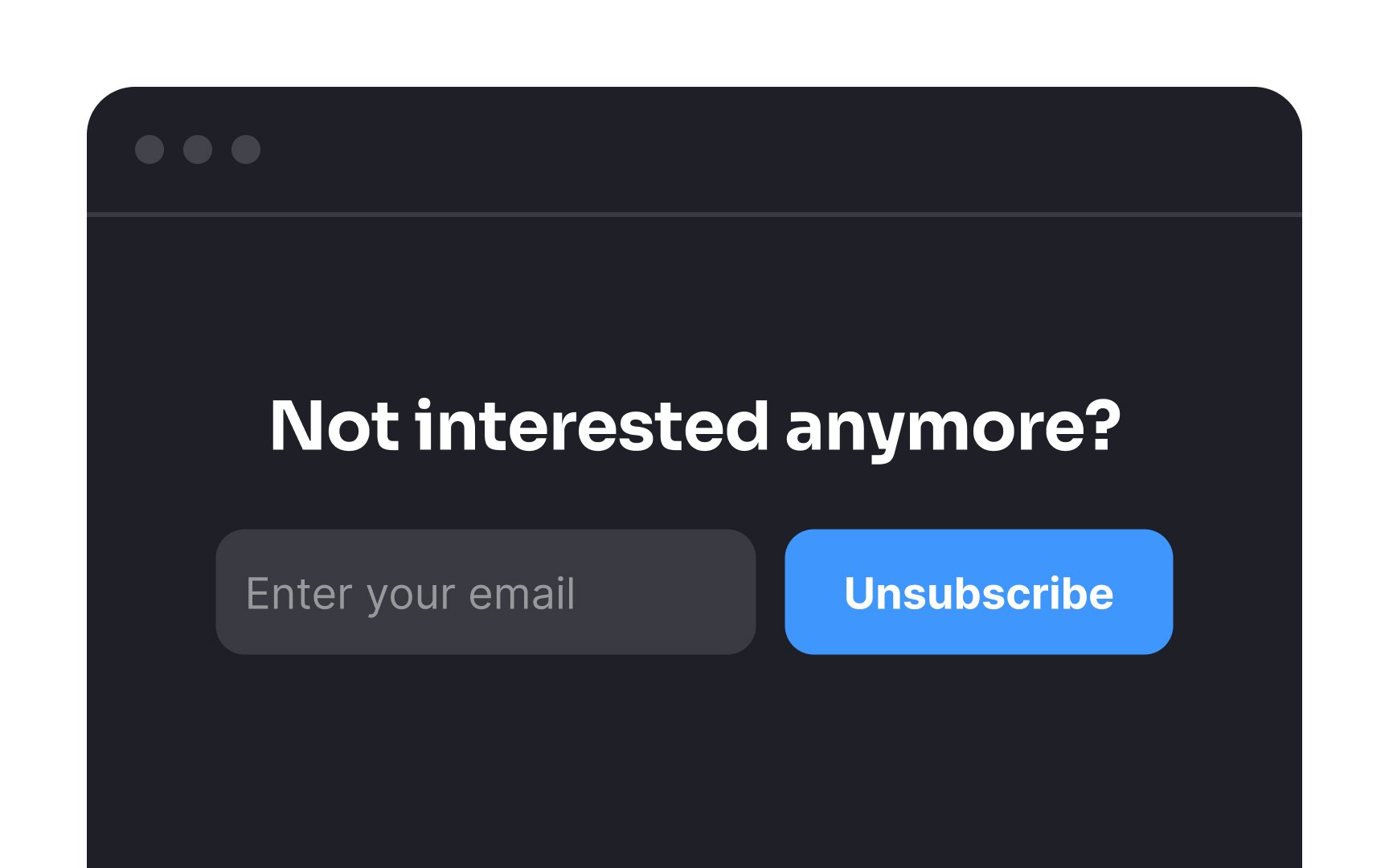
The process of unsubscribing from an
It's important to refrain from requiring users to log in or complete lengthy surveys as a prerequisite for unsubscribing. Instead, allow them to leave without hurdles. This not only respects their wishes but also creates a more positive experience. Should they ever wish to return, this approach leaves the door open for them.
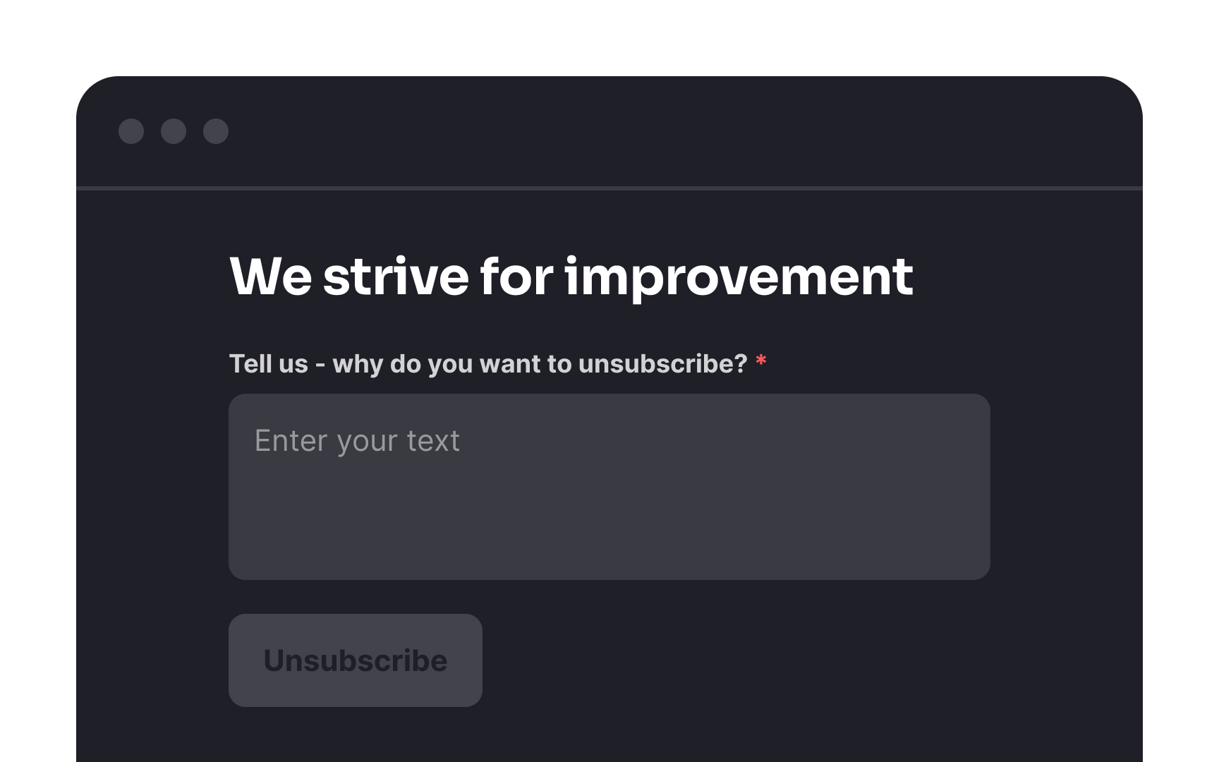
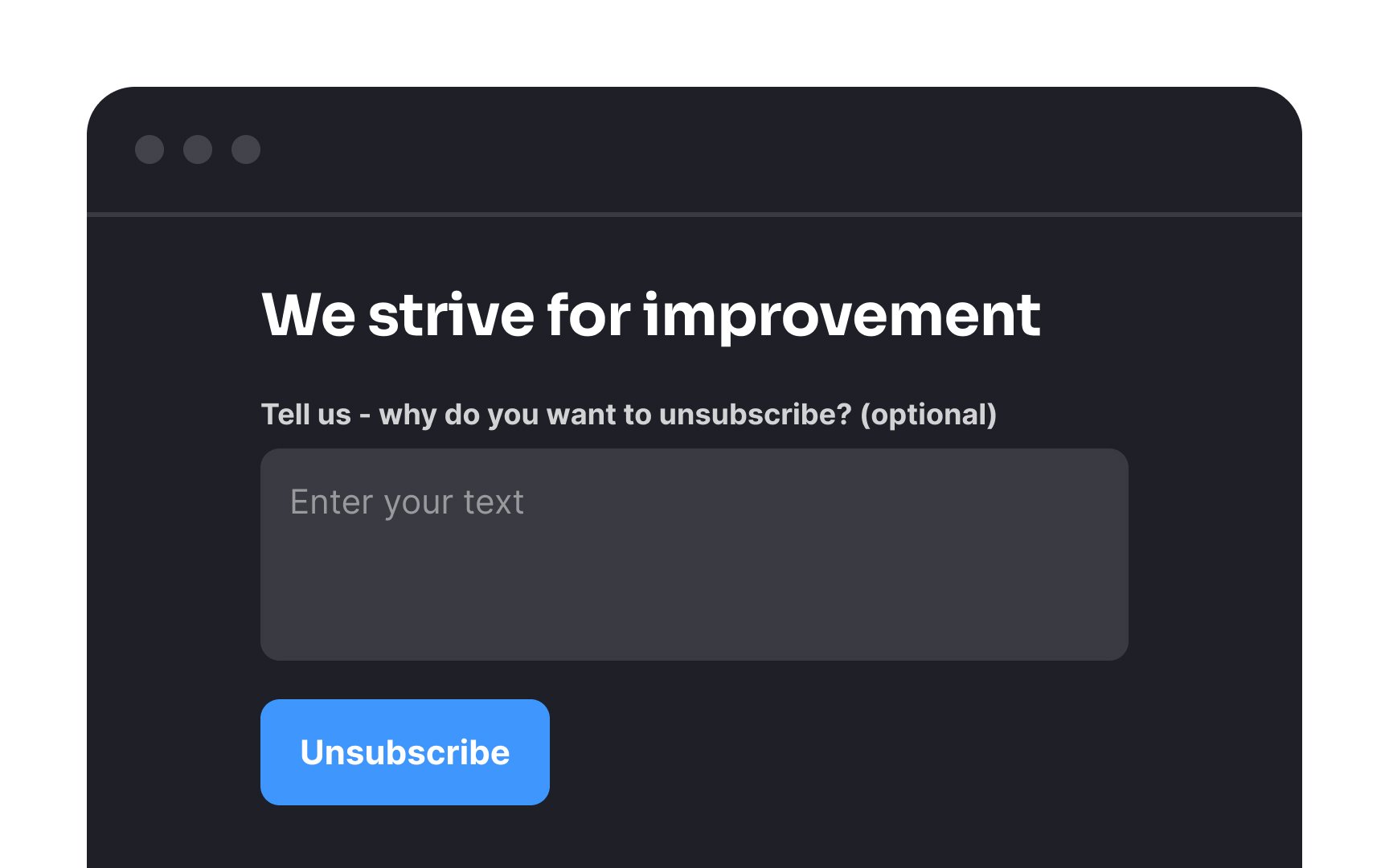
Don't compel users to provide feedback when they're unsubscribing. Instead, consider it as an optional and voluntary action. Users may find themselves in situations where they're pressed for time, not in the best mood, or simply in a circumstance where typing out feedback is inconvenient. Regardless of their specific reasons, it's crucial to value and respect their time.
Opting for an optional feedback process also benefits you. It ensures that the insights you receive are more likely to be relevant and meaningful. When feedback is made mandatory, users may be inclined to type random or hasty responses just to fulfill the requirement, which may not offer genuine insights.
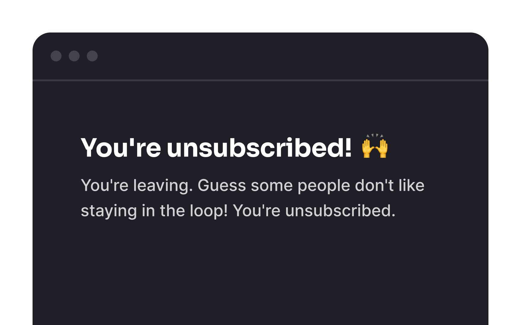
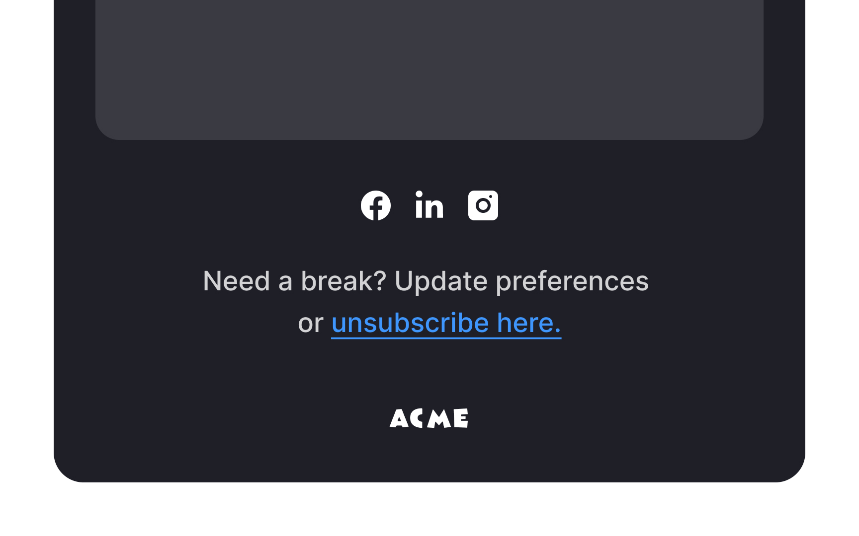
The way you say goodbye to unsubscribing users matters. Make sure your goodbye message matches how you usually talk to your audience. If your style is friendly and relaxed, suddenly sounding very formal might seem strange.
Also, avoid sounding upset or blaming users for leaving. Instead, be kind and friendly. This leaves a good impression. Even if users leave now, they might think positively about your brand and come back later.
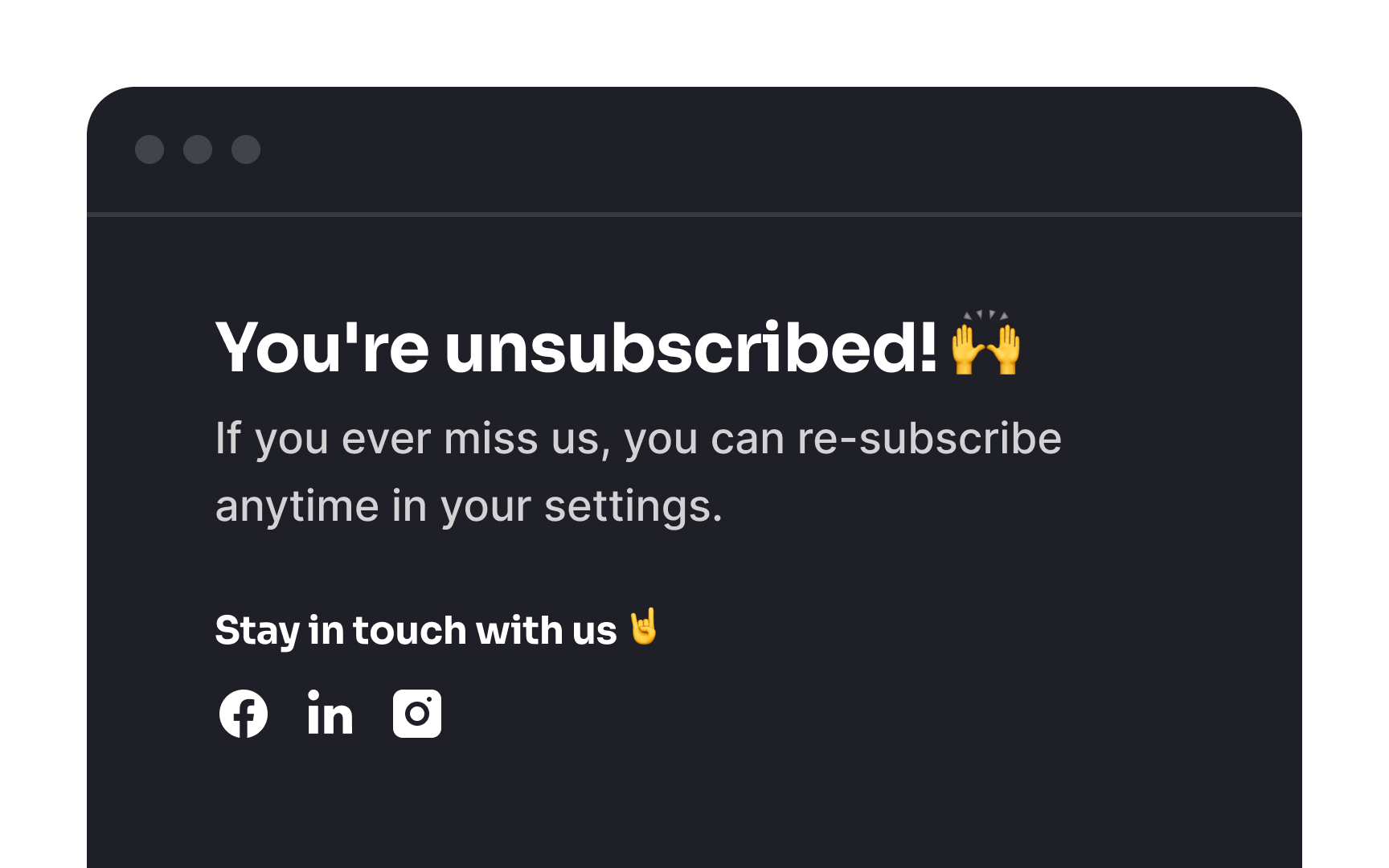
Pro Tip: How do you stay in touch with users after they've unsubscribed? Provide them with links to follow your social networks as part of your goodbye message.


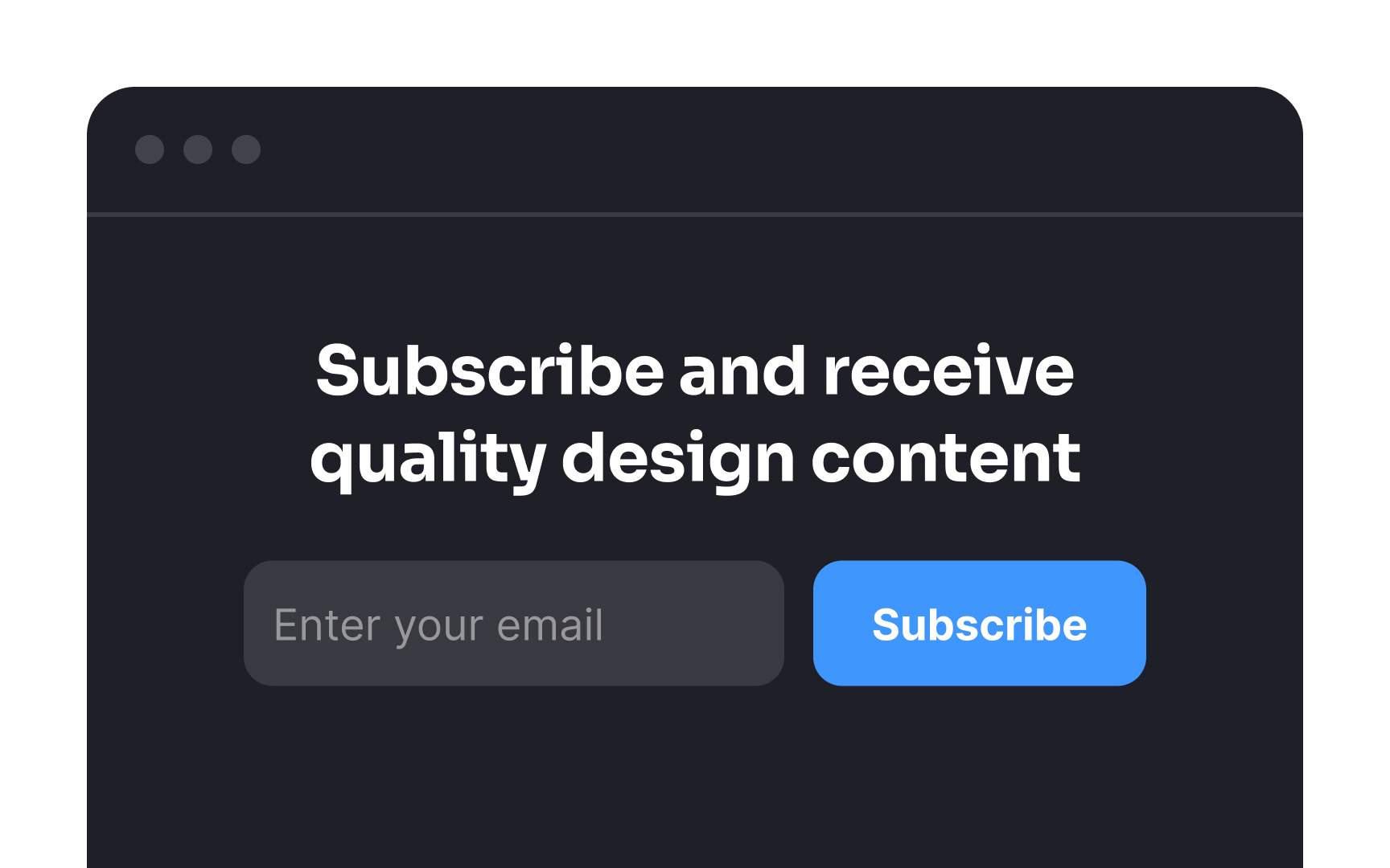
Promote your
Use a contrasting color for the Subscribe button against the background, and ensure it's appropriately sized for easy spotting. Additionally, add a compelling call-to-action like "Subscribe Now!' to draw immediate attention.
Pro Tip: The header or footer of a website is usually a good spot to place the Subscribe button.
Rather than bombarding users with
These exit-intent subscription popups often present a special offer or other incentives designed to encourage users to subscribe before leaving. When used thoughtfully, they can be effective at increasing subscription conversions, with studies showing conversion rates of around 10–15% for users who would otherwise exit the site.[5]
References
Top contributors


Topics
From Course

Share


