Chat & Messaging
Learn the best practices for building user-friendly chat apps
Chats have become one of the most prevalent modes of communication in today's digital age. Unlike phone calls, they offer a more relaxed pace, yet maintain a swifter and less formal tone compared to emails.
In this landscape, a select few major players like WhatsApp, Messenger, and Telegram dominate the consumer chat application market. However, there's a growing demand for integrated messaging functions within diverse applications, from games to dating platforms.
Learning the best practices can help you build chat apps that focus on visual aesthetics and prioritize user-friendliness.
A typing indicator is a visual cue within a
You can design typing indicators as a simple text message that reads "User is typing," or make them more dynamic, such as speech bubbles that animate into view when someone starts typing and disappear once they stop.
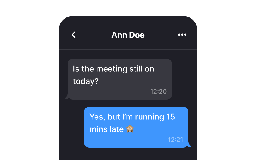
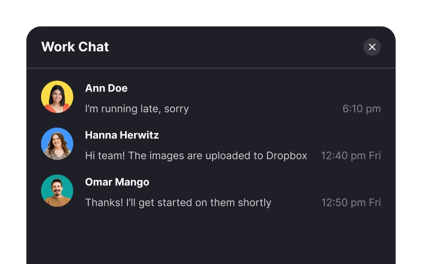
Timestamps in
Knowing the exact timing of a message is crucial as the relevance of information can shift rapidly; what's critical now might not matter tomorrow. Timestamps enable users to estimate the urgency and respond to messages with informed priority.
Pro Tip: When using absolute timestamps, make sure to convert them to users' time zones.
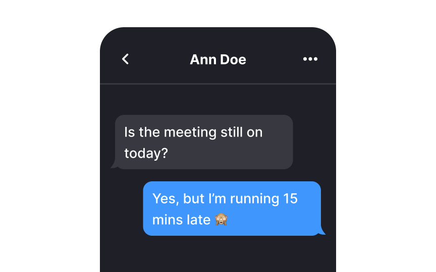
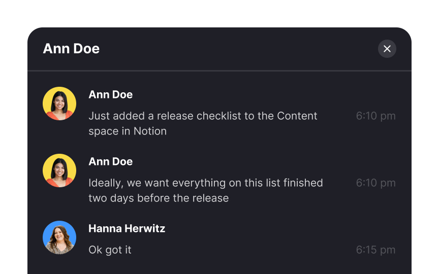
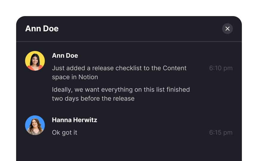
Stacking messages that were sent over a short period of time keeps the UI cleaner. When several messages are sent in quick succession, there's no need to display the exact time for each one. Instead, group together messages that were sent within a few seconds of each other and assign them a single timestamp.
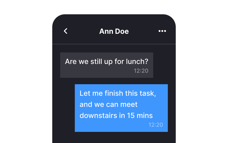
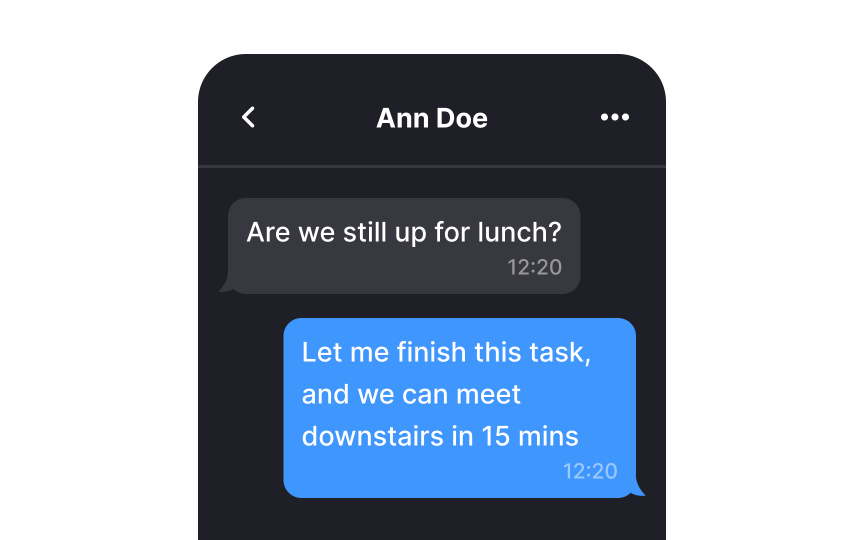
From childhood, we've learned that sharp corners have the potential to cause harm, while rounded corners are associated with safety. When you're in the process of designing
This design principle isn't just a matter of preference; it aligns with the Fundamental Modeling Concepts (FMC) Guidelines that suggest that rounded lines are more natural for our eyes to follow.[2] As corners gently curve inward toward the center, they assist users in focusing better on the content within the container.
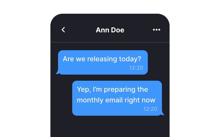
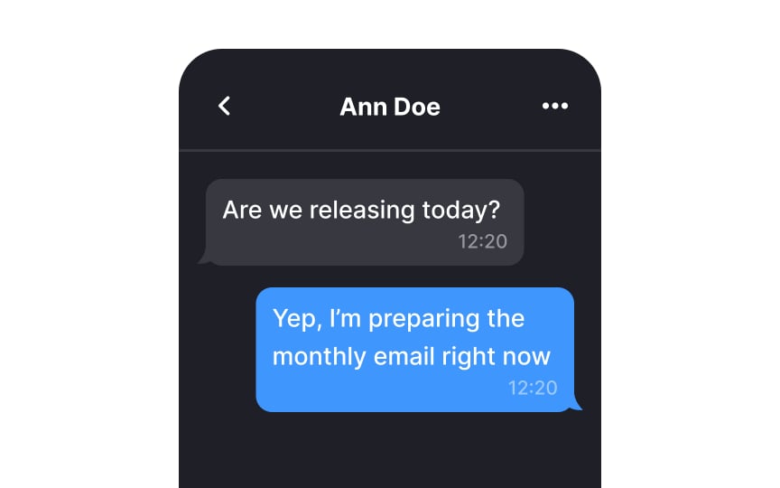
Much like speech bubbles in comic books or cartoons,
Pro Tip: When it's a group chat, consider coloring the names rather than the whole bubble.
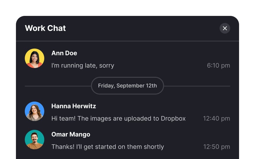
To efficiently organize messages, implement dividers in both the
Also, extend this practice to the chat list, where messages are displayed in summary. With the help of date dividers, users can quickly identify and access conversations from specific days.
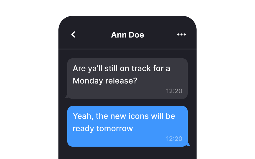
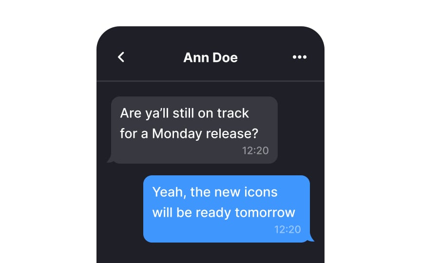
When it comes to messaging interfaces,
Conversely, employing a narrower width promotes quicker and more comfortable reading of messages. It also contributes to a more visually appealing and user-friendly interface overall.
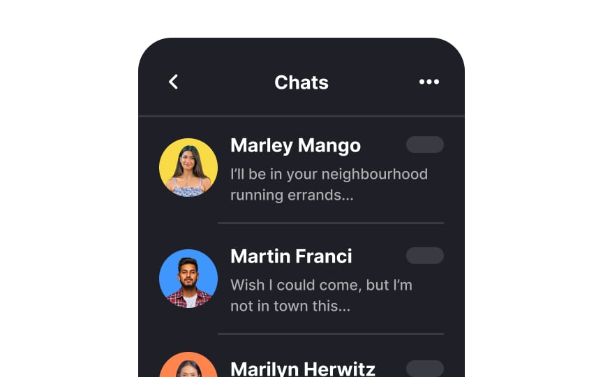
At times, users may prefer not to immediately read a message, especially when it might be an annoying piece of spam that warrants no attention. This is where displaying a message preview beneath the sender's name can save the day. It provides users with a quick glimpse of the message
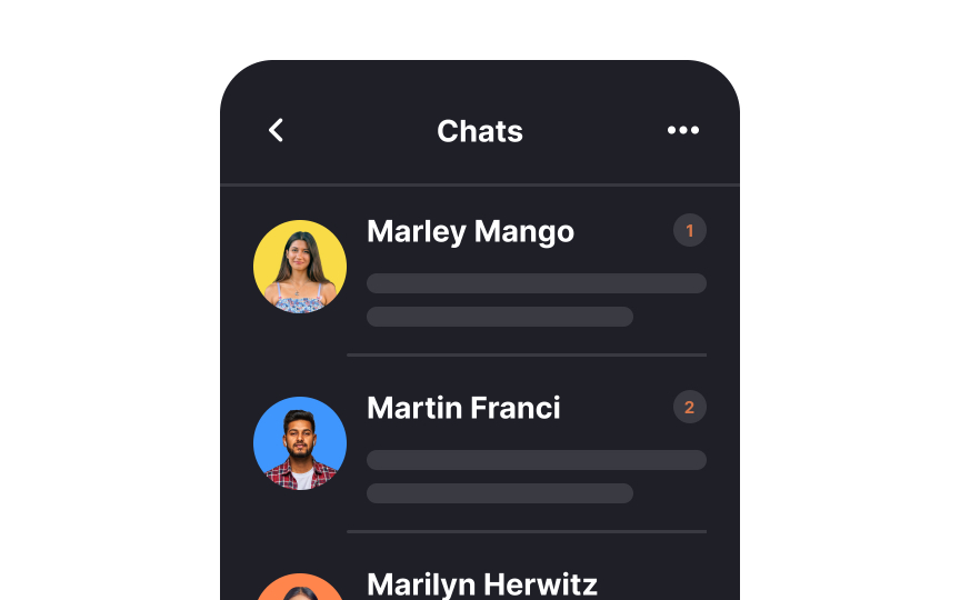
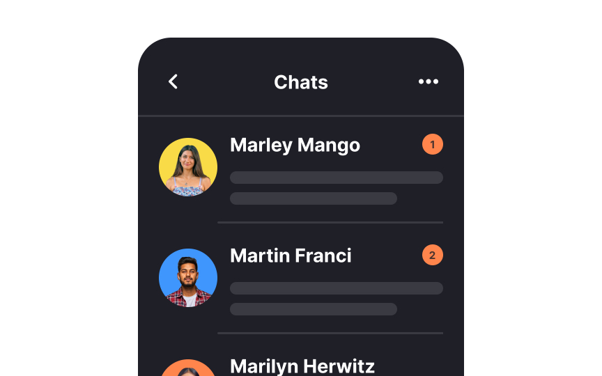
Use a prominent notification badge to signify unread messages. Human memory can be quite fallible, and many individuals might not recall whether they've already read a specific message, particularly in the midst of a hectic day. The unread badge serves as a visual reminder, reducing the risk of overlooking crucial information and helping users stay on top of their messages effectively.
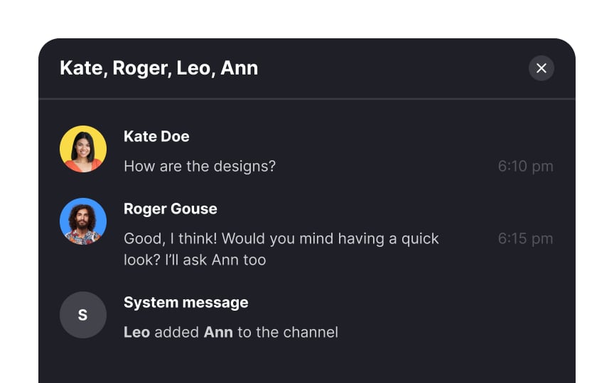
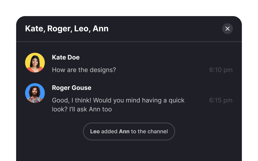
When designing a messenger interface, make sure you distinguish system messages, like "user joined the
References
- Absolute vs. Relative Timestamps: When to Use Which | UX Movement
Top contributors
Topics
From Course
Share
Similar lessons

Login & Signup Flows

User Onboarding

