Avoid distorting chart data with 3D styling
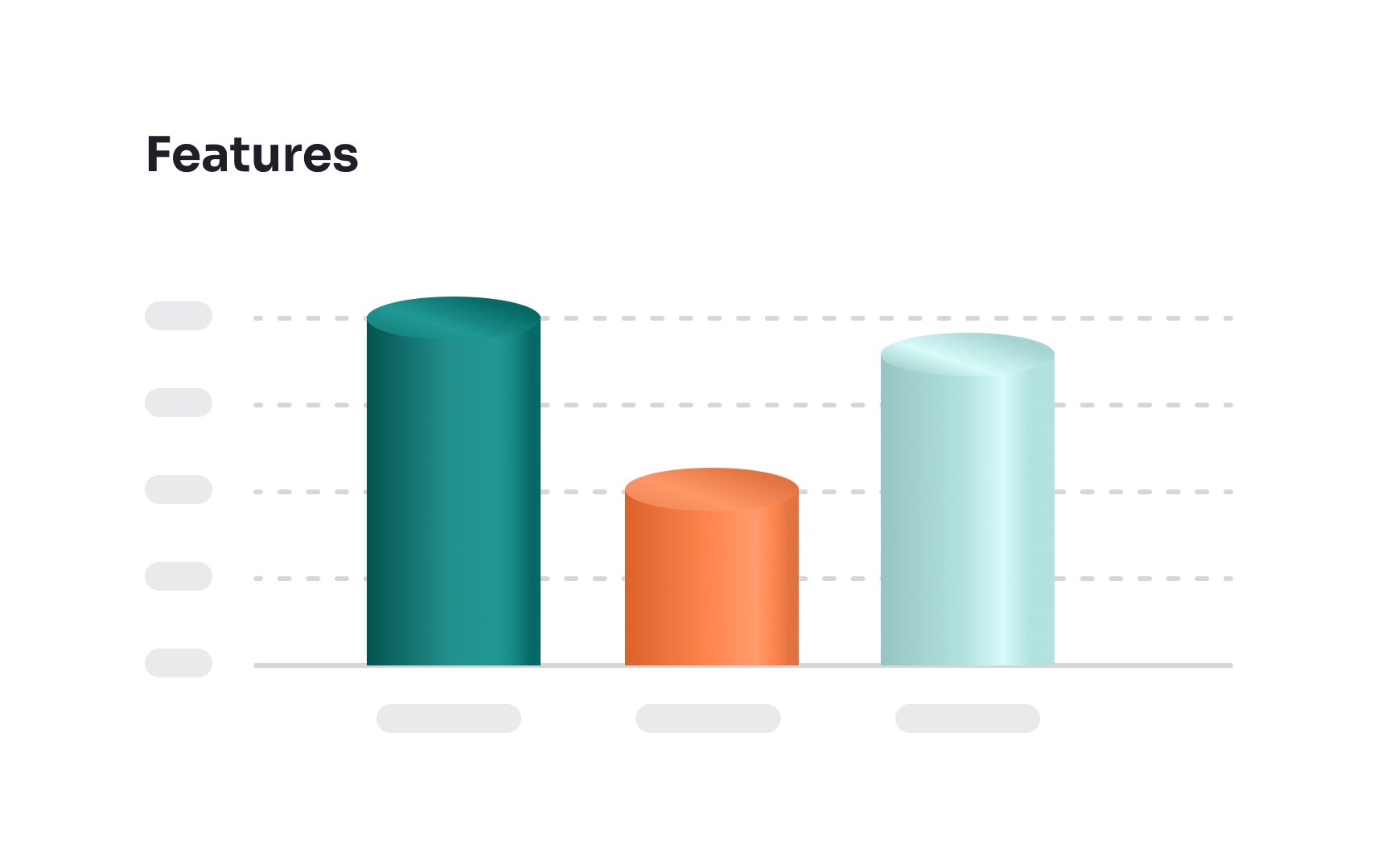
3D elements might enhance the visual appeal in video games and animations, but they're less effective in charts. The issue isn't just about aesthetics — 3D elements can actually make charts harder to read and interpret. When charts have a three-dimensional look, it can distort the viewer's perception of the data, making it challenging to pinpoint precise values and compare different elements accurately. This added complexity can lead to misunderstandings or misinterpretations of the information presented.
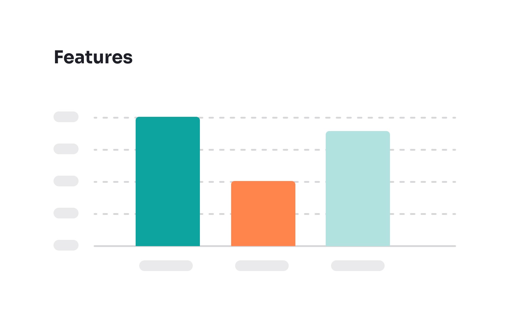
For clarity and ease of analysis, it's better to use two-dimensional shapes in charts. These provide a straightforward view of the data, ensuring that the focus remains on accurate interpretation and understanding, without unnecessary distractions or distortions.
