Vertical line divider
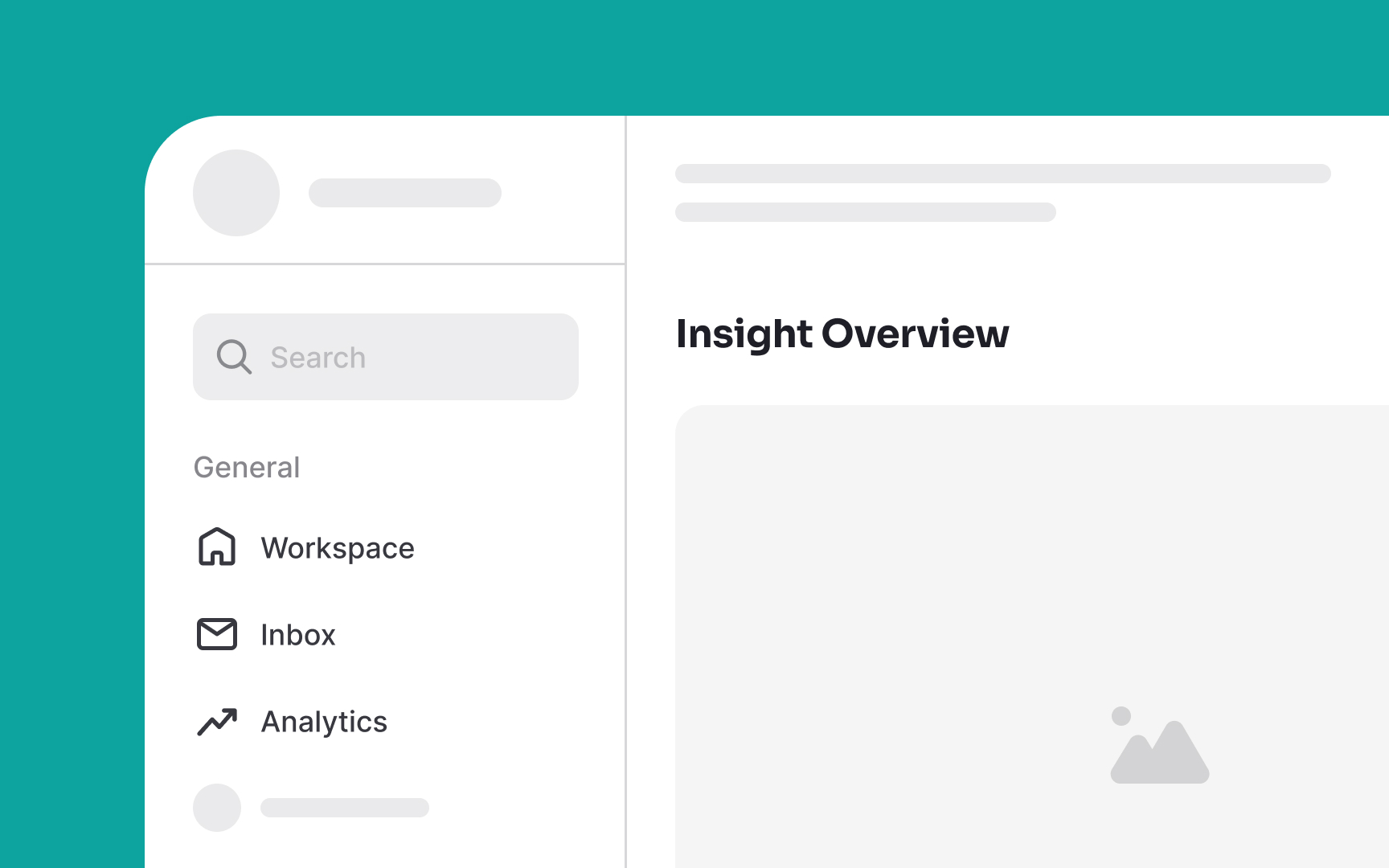
Vertical line dividers in UI design visually organize and separate content along a vertical axis. They are best used for creating column distinctions in multi-column layouts, sectioning off thematic areas on a page, and providing clarity in navigation menus.
Adjust the width of these dividers for a subtle or bold impact, but be sure to keep it consistent across your interface. You can also add a subtle indicator such as a small word positioned in the middle of the line to further enhance the differentiation. For example, you can use the word “or” in the middle of a vertical line separating a sign-up and login form.
