Consistency and standards
Nielsen's heuristic about consistency and standards refers to sticking to the same words, situations, or actions to define the same element or concept throughout a product. Designers should follow platform guidelines and conventions to increase learnability and reduce confusion.
Consistency is not the enemy of unique and creative designs, as some designers fear. People don't want surprises when they arrive at a new website. They bring expectations from previous experiences and want these expectations to be met. Applying too many changes to the appearance and behavior of standard UI components like menus, buttons, or modal dialogs increases cognitive load and the learning curve.
Consistency should extend to several levels:
- Visual: Style icons, symbols, and imagery consistently.
- Placement: Buttons and links for the same actions should have the same position across pages.
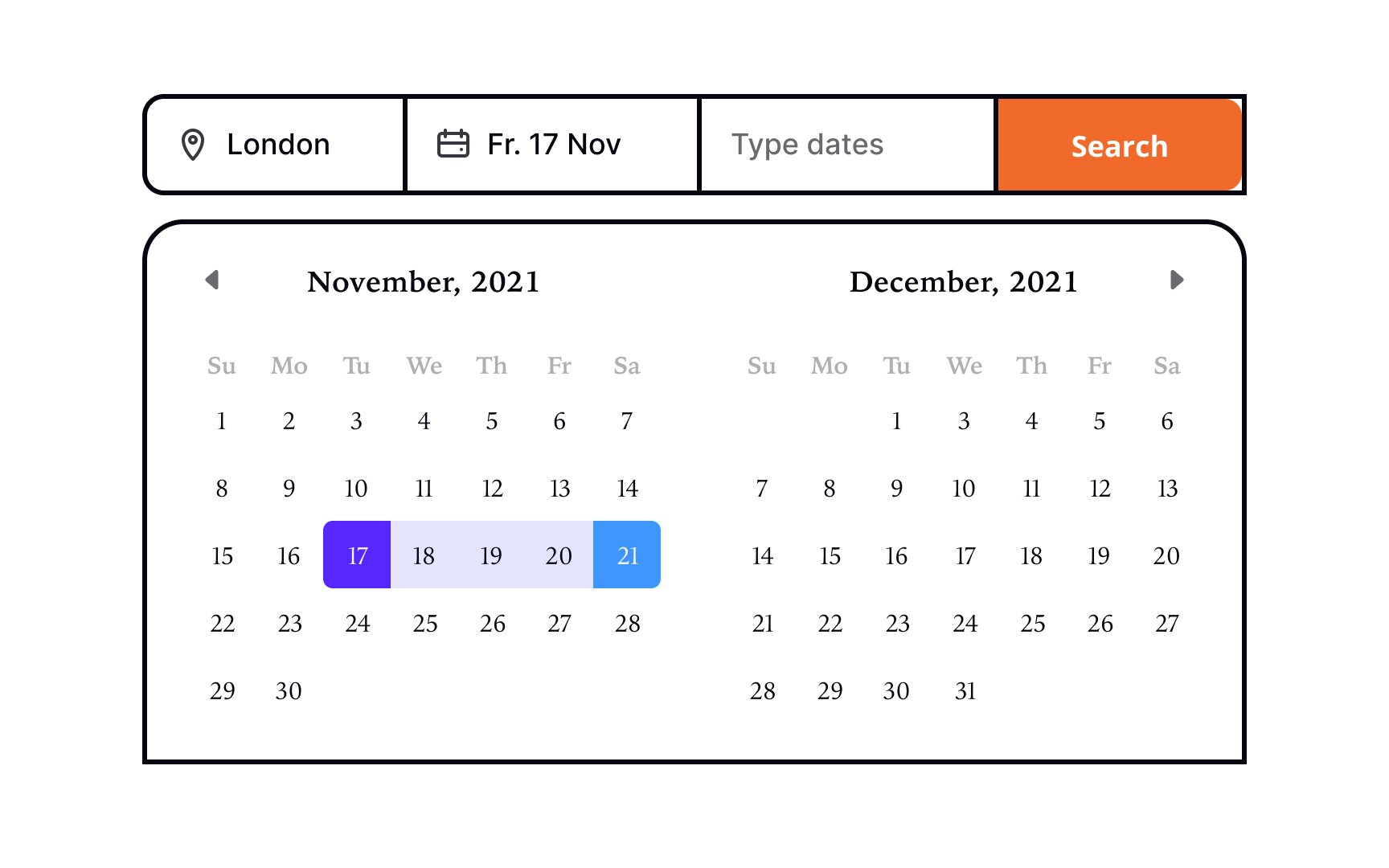
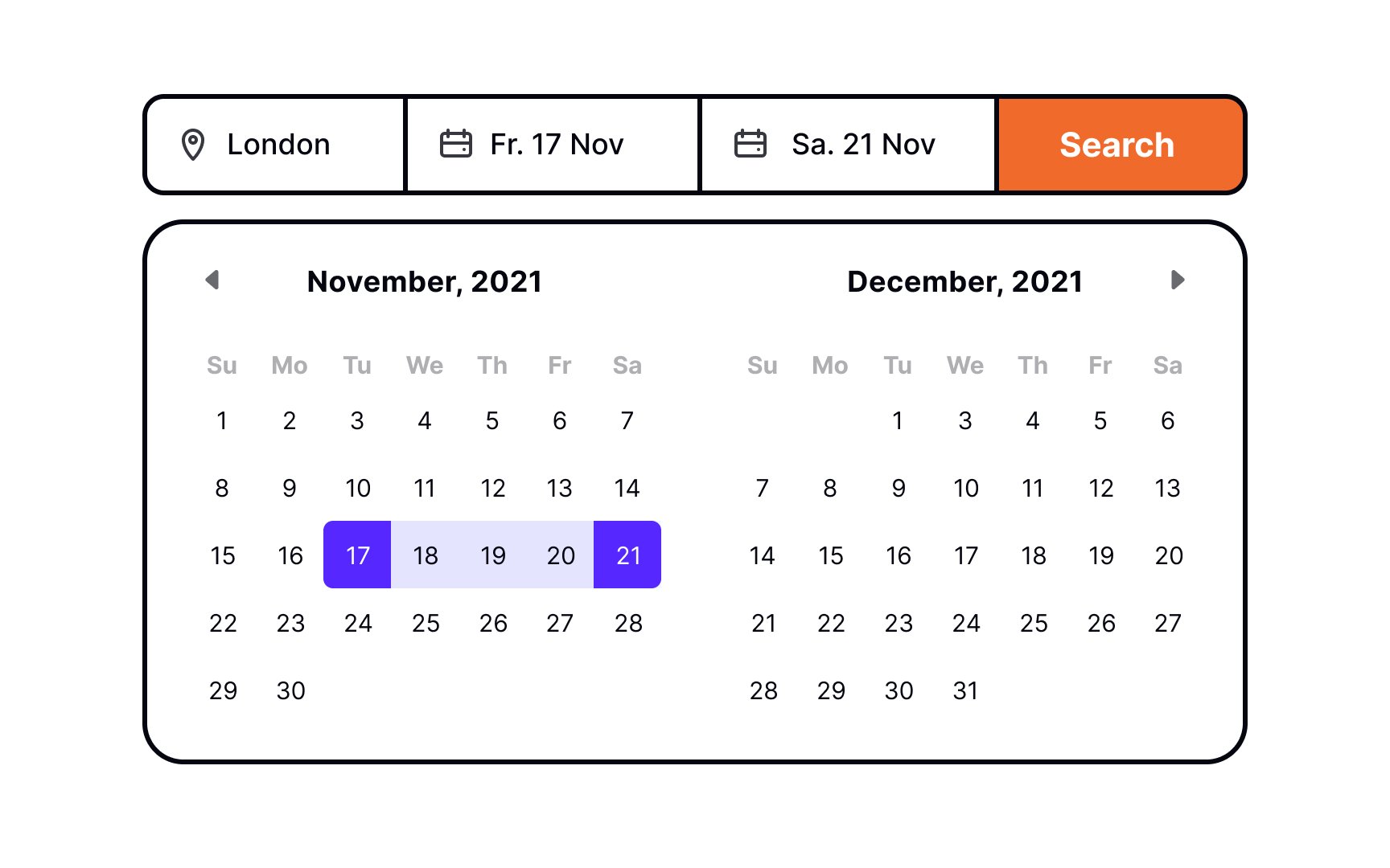
- Data collection: Use the same input format for data like dates, phone numbers, or locations throughout a product.[1]
Design systems are a perfect tool for maintaining consistency across your product designs. It benefits your users and team by providing a single source of truth for components' usage and appearance.
References
- Maintain Consistency and Adhere to Standards (Usability Heuristic #4) | Nielsen Norman Group
Top contributors