Persuasive Design Practices
Discover how to ethically utilize user psychology for persuasive design
Knowing how users think and behave helps us, as designers, to persuade them to take certain actions. Persuasion, when done ethically, can actually help your users and not just your business. It becomes unethical only if it involves deceiving and manipulating users.
In this lesson, we’ll explore how to use persuasive design practices ethically. We’ll focus on methods that guide, assist, and help users make informed decisions. Our goal is to enhance the user experience while respecting their autonomy and choices. This way, persuasion becomes a tool for good, helping users find what they need and achieve their goals efficiently.
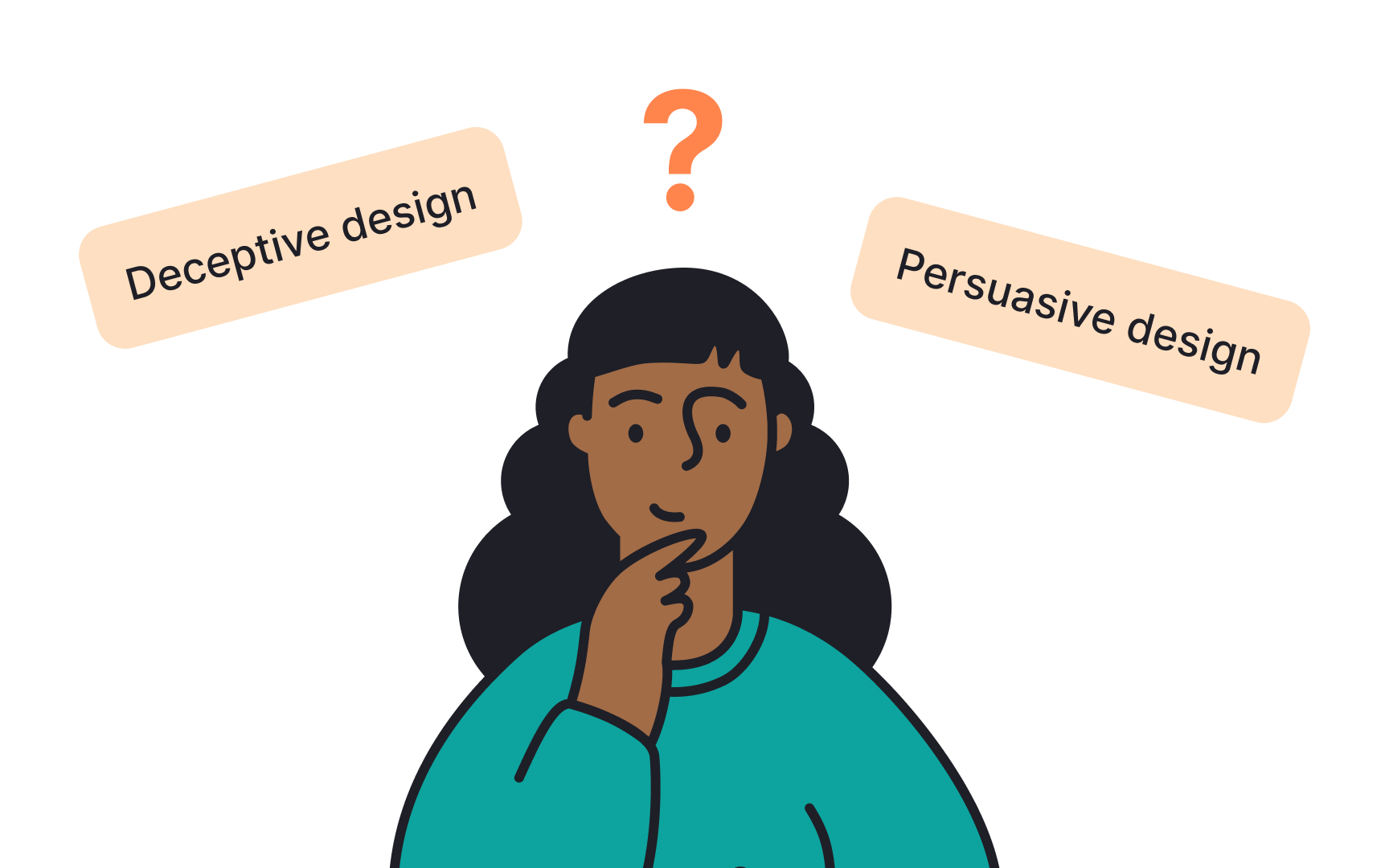
The main difference between persuasive and deceptive design lies in user consent. Persuasive design asks for users' permission to persuade.[1] It respects users and aims to improve their experience. For example, a fitness app might use notifications to encourage users to exercise more. Users can choose to follow these suggestions or ignore them. The goal of persuasive design is to help users make good choices.
On the other hand, deceptive design tricks users without their knowledge. Users might think they are making one choice, but the design tricks them into doing something else. A common example is a website that makes it hard to find the Unsubscribe button for a newsletter, tricking users into staying subscribed. The goal of deceptive design is to benefit at the expense of users.
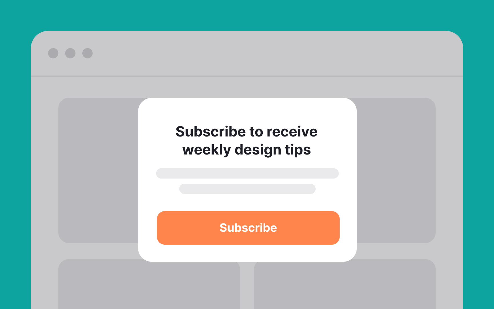
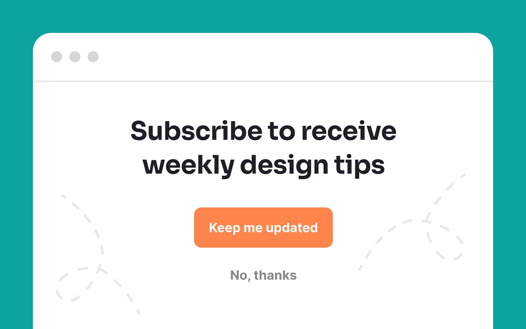
Ethical design builds trust and respect with users. Here are its main tenets:
- Be transparent: Provide honest information about what users can expect and avoid misleading claims.
- Give users clear choices: Allow users to choose features rather than enrolling them automatically. Explain the implications of their choices, like subscription costs and what’s included.
- Respect their decisions: Provide simple ways for users to opt-out or change settings. Only collect necessary data and inform users how it’s used.
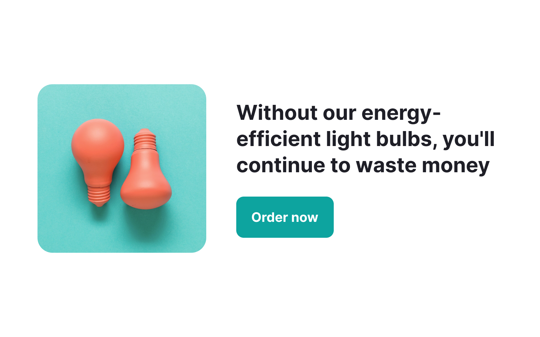
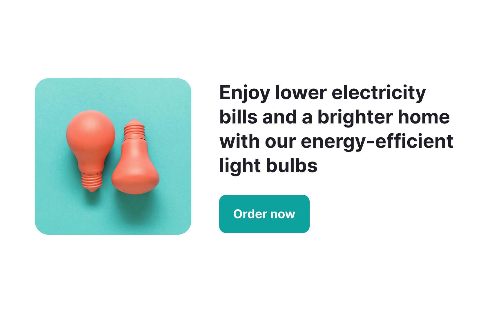
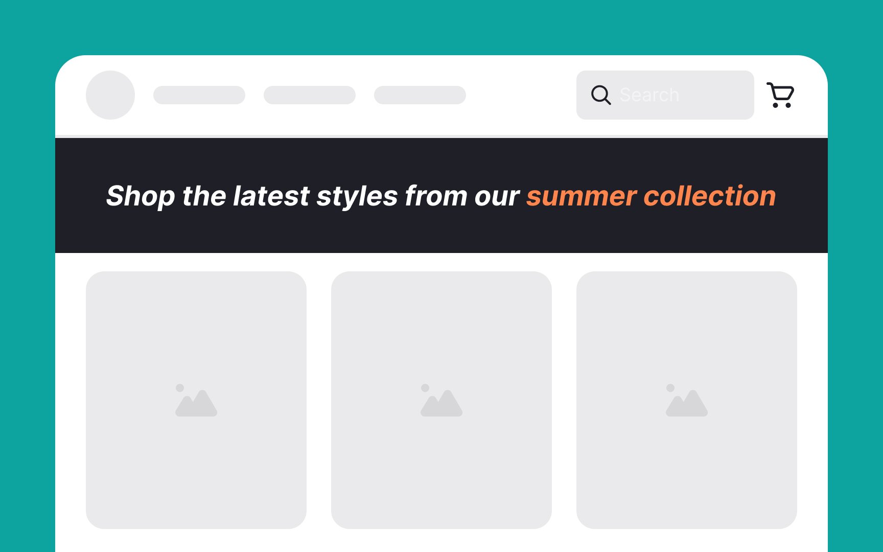
Framing is all about presenting information in a way that influences users' decisions and perceptions. For example, imagine an online store selling a fitness tracker. The product can be framed in two ways:
- Positive framing: Highlight the benefits. "Track your steps and improve your health with our fitness tracker! Join thousands of happy users who have reached their fitness goals."
- Negative framing: Emphasize what users might miss out on. "Don't miss out on tracking your health! Without our fitness tracker, you might struggle to reach your fitness goals."
Steps to use framing persuasively:
- Determine what aspects of your product or service are most beneficial or what users might miss out on.
- Decide whether a positive or negative frame will be more effective.
- Ensure that your framing is consistent across all parts of your design, including headlines, call-to-action
buttons , and product descriptions. - Use A/B testing to see which framing works better for your audience. Adjust your approach based on the results.
Pro Tip: Be mindful not to use framing in a way that causes fear or panic among users.
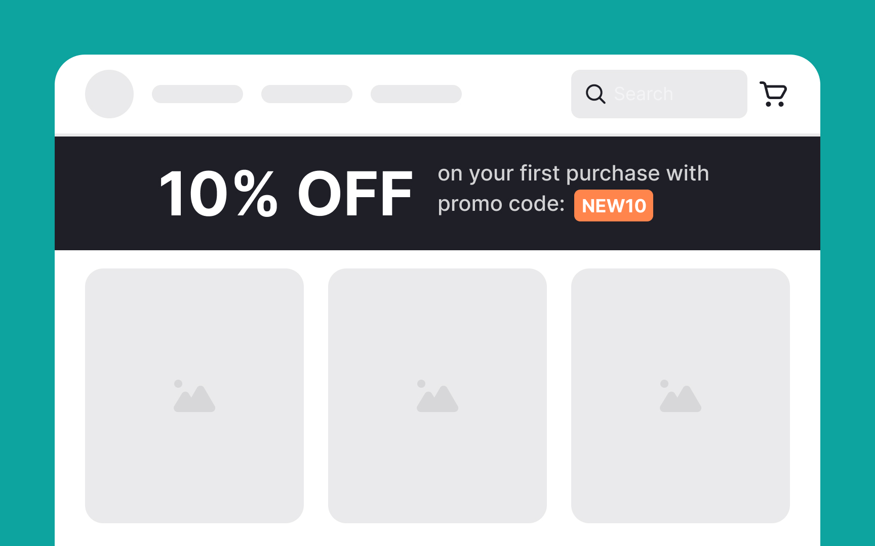
The reciprocity principle is about giving something valuable to users, so they feel inclined to return the favor. When you give first, users are more likely to respond positively and engage with your product or service.
Here’s how to use reciprocity in design:
- Offer freebies or discounts: Give users a free trial, sample, or discount. For example, an online store could offer a 10% discount on the first purchase.
- Provide valuable content for free: Share useful information, tips, or resources in the form of a blog or newsletter.[2]
- Exclusive access: Give users early access to new features or products. For instance, a gaming app could offer beta access to new game levels.
- Personalized experiences: Tailor your interactions to individual users. Personalized recommendations or special birthday offers show users that you care about their unique needs.
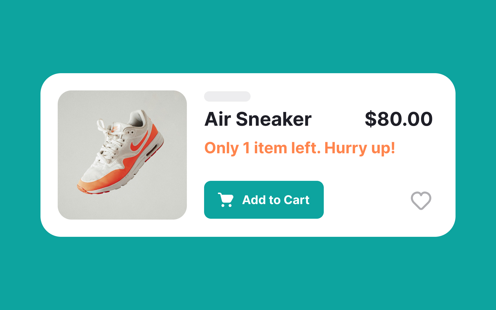

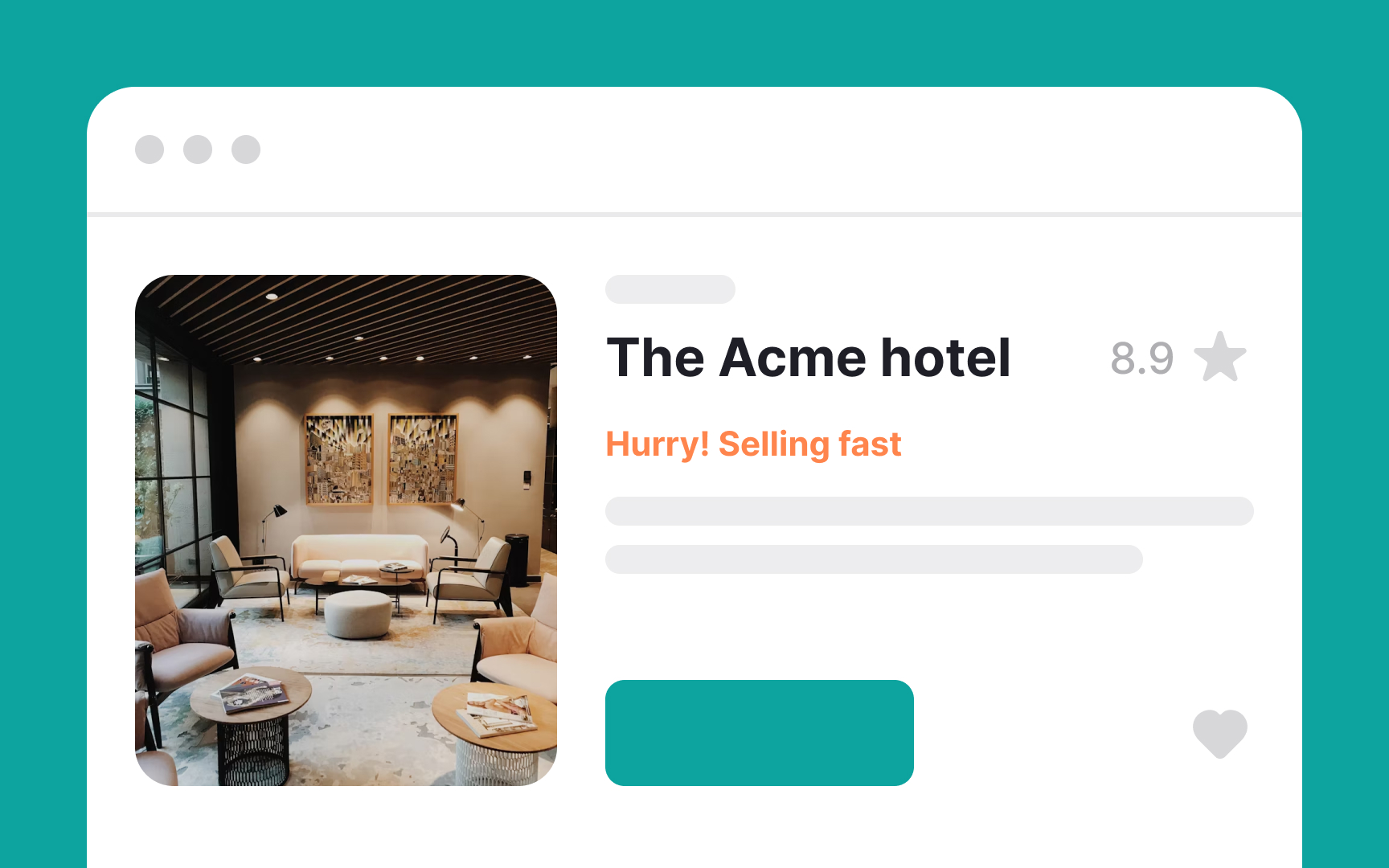
When something feels limited, people tend to act faster. That can help with conversions, but only if it’s done right.[3]
Here are common ways to apply scarcity:
- Limited-time offers: Use clear deadlines. For example, “20% off for the next 24 hours.” But make sure the offer really ends. If it doesn’t, users notice. You lose trust.
- Low stock alerts: Messages like “Only 5 left” can work, but only if the number is accurate. Fake low-stock messages create pressure, not clarity.
- Exclusive access: You can offer early access to certain groups, like members or subscribers. That’s fine if it’s real and clearly explained. Don’t call it exclusive if it’s open to everyone.
- Seasonal promotions: Tying offers to holidays or events helps create urgency. “Sale ends December 31st” works well, as long as it really ends then. Don’t extend it quietly.
- Countdown timers: These can be useful visual reminders. A timer that says “2 hours left” can prompt action. But only use a timer if it’s tied to a real deadline. Don’t reset it on refresh. Don’t fake the countdown. That crosses the line into manipulation.
The bottom line is that scarcity works best when it’s true. If people find out you faked urgency, they’ll stop trusting your messages and your product.
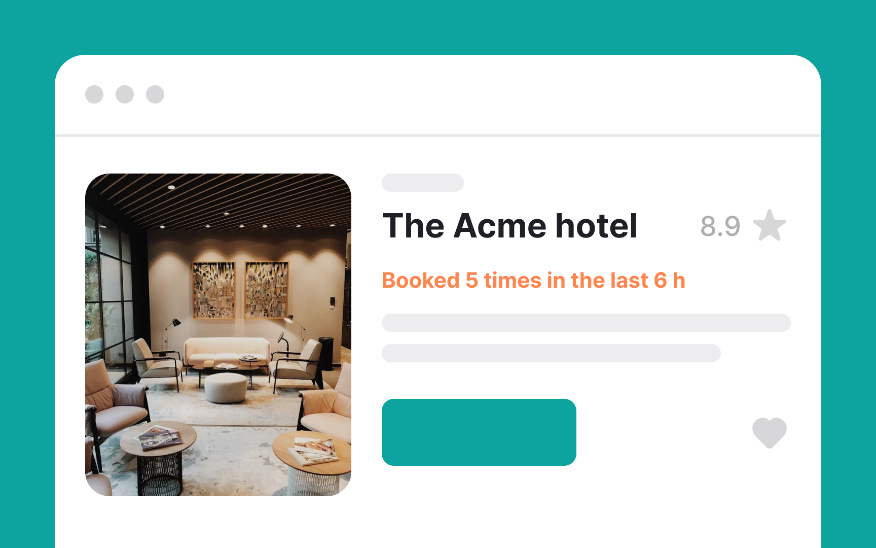
The mimetic desire theory says that we often want things because other people have them. So, we are influenced by what people around us choose and like, making us want the same things.[4]
Here’s how to use mimetic desire in design:
- Show popular items: Highlight bestsellers or trending products.
- Indicate availability: For instance, "3 items left in stock." This shows that others are buying the product.
- Display endorsements: Show endorsements from celebrities or experts. For example, "Recommended by [Expert's Name]!"
- Show social proof: Display user reviews, testimonials, or social media posts from customers sharing their positive experiences with your products.
- Show user activity: Indicate how many people are currently viewing or buying a product. For example, "5 people are looking at this item right now."
Pro Tip: Remember, made-up numbers break trust. Users may notice mismatches later, which reduces credibility and can harm long-term confidence in the product.
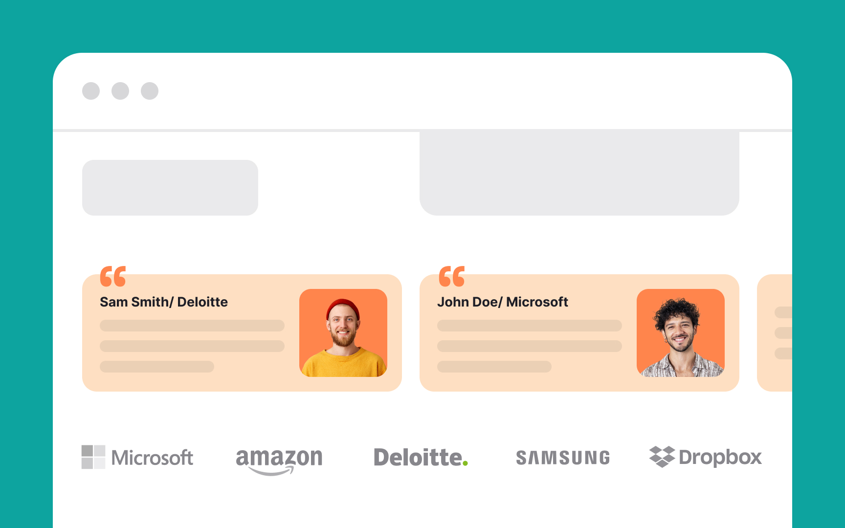
The authority principle is based on the belief that people trust and follow the advice of experts or leaders. When an expert endorses a product, people are more likely to believe it's good.
Here’s how to apply it in design:
- Expert quotes and endorsements: Share quotes from experts, celebrities, or other authority figures. For example, "Fitness guru John Doe recommends our workout gear."
- Professional credentials: Mention any relevant credentials. For example, "Developed by leading scientists.”
- Certifications and awards: Display any certifications or awards your product has received. For instance, "Winner of the Best Tech Award 2023."
- Reputable logos: Display logos of well-known and trusted organizations who endorse or use your product.
- Visuals of authority figures: Use images of doctors, scientists in lab coats, or lawyers in suits. For example, a doctor endorsing a health product.[5]
The liking principle says people are more likely to be persuaded by those they like. We tend to like people who are similar to us, give us compliments, or cooperate with us.
Here’s how to use the liking principle in design:
- Show friendly faces: Use
images of happy, relatable people. For example, use photos of friendly staff members or satisfied customers. - Highlight similarities: Connect with users by highlighting shared interests or values. For instance, “Join our community of pet lovers.”
- Use positive language: Write in a warm, friendly tone. Compliment users and make them feel good about their choices. For example, “You have great taste!”
- Build a community: Create a sense of belonging by encouraging users to join groups or forums where they can connect with others.
The commitment and consistency principle says that people like to be consistent with their past actions and promises. And once they commit to something, they are more likely to follow through.
Here’s how to use this principle in design:
- Start small: Ask users to make a small commitment first. For example, ask them to sign up for a free newsletter.
- Build gradually: Once users make a small commitment, ask for bigger actions. For example, after signing up, suggest they try a free trial of your product. Subsequently, you can propose a
subscription . - Remind them: Show users their past actions to reinforce their commitment using uplifting language. For example, “You’ve already completed 3 lessons. Keep going!”
- Consistency messages: Use phrases that reinforce their identity. For example, “As a member, you get exclusive benefits.”
The motivation, ability, and trigger principle says people take action when they have a reason (motivation), the means (ability), and a prompt (trigger).[6]
Here’s how to incorporate it into your design:
- Increase motivation: Provide reasons for users to engage. For example, "Get fit and healthy with our workout app."
- Ensure ability: Make tasks easy to complete. For example, "Quick 5-minute workout routines for beginners."
- Use effective triggers: Prompt users to act at the right time. For example, "Start your first workout now with a one-click setup."
References
- Persuasive Design: New Captology Book | Nielsen Norman Group
- The Reciprocity Principle: Give Before You Take in Web Design | Nielsen Norman Group
- Scarcity Principle in UI Design: Making Users Click RIGHT NOW or Lose Out | Nielsen Norman Group
- Persuasive Design: Using Advanced Psychology Effectively | Toptal® | Toptal Design Blog
- The Authority Principle | Nielsen Norman Group
- Persuasive Design: Using Advanced Psychology Effectively | Toptal® | Toptal Design Blog
Top contributors

Topics
From Course

Share


Similar lessons

Cognitive Biases

UX Laws
