Popover modal
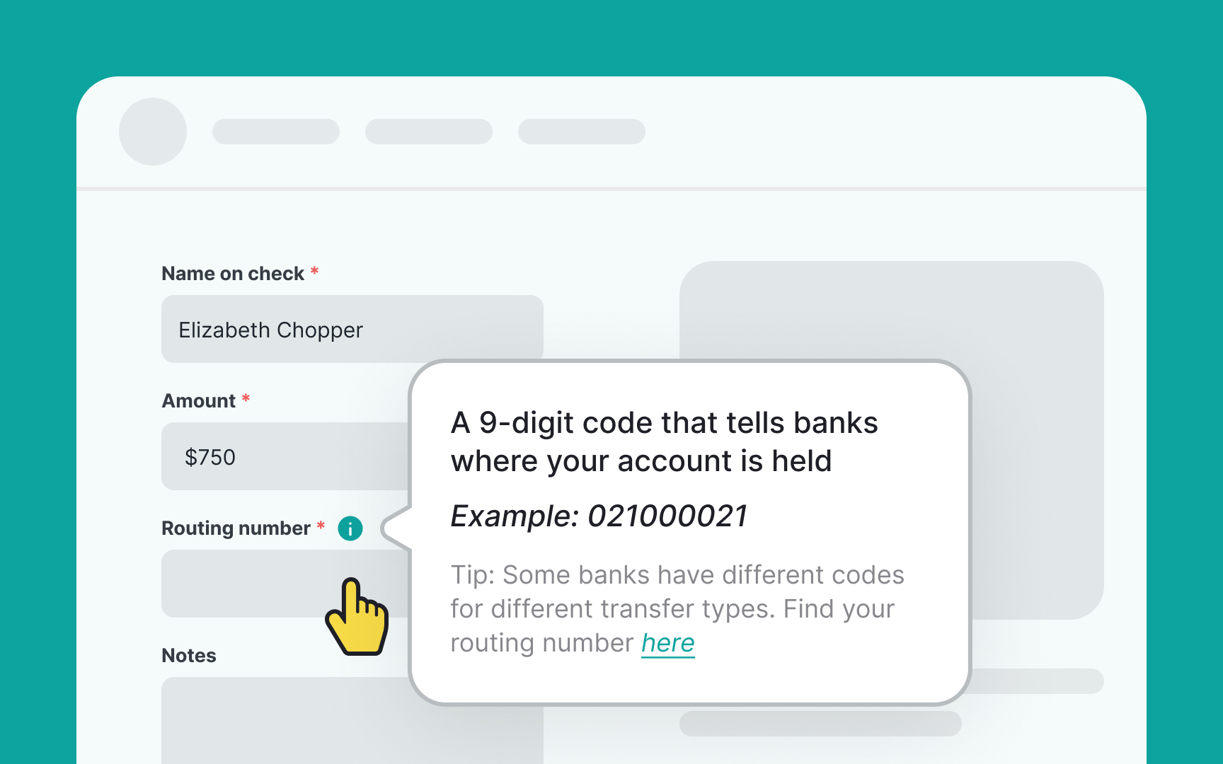
Popovers are small overlay windows that show up when users interact with specific areas on a website or app. Unlike popup modals that block the main content, popovers let users stay engaged with the primary interface. They pop up as a petite floating window and can be dismissed easily.
These mini-windows are activated by actions like hovering, clicking, or touch gestures. They're handy for sharing extra product details, offering customization options, or suggesting a next step. Popovers shine in situations where users need a bit more info or guidance without being pulled away from what they're doing. So, they offer a balance between enlightening the user and maintaining workflow.[1]
Pro Tip: Avoid using popovers to display vital information since they can be easily overlooked.
References
- Popovers | Apple Developer Documentation | Apple Developer Documentation
Top contributors