Selected state
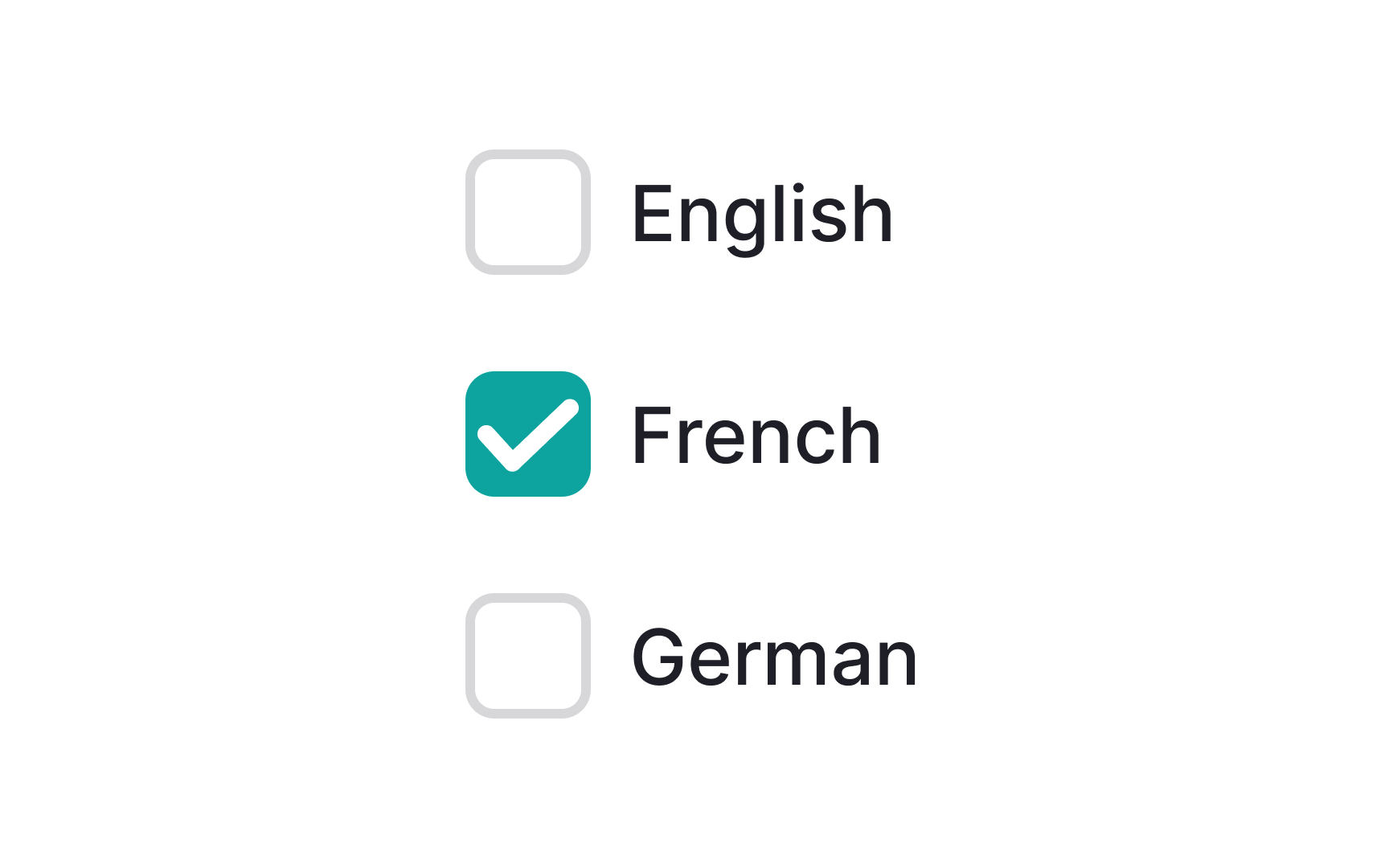
The selected state indicates a user’s choice and is most commonly seen around elements like checkboxes or radio buttons. This state appears regardless of how a user made their choice, whether it was by tapping, clicking, using their voice, or with their keyboard.
Selected states should be made clear but not too prominently. Otherwise, they can distract users from surrounding elements. A simple border or color change could be enough.
Elements such as radio buttons or checkboxes should follow standard UI patterns to show they're selected (filled with a dot or checkmark, respectively).
