Simplify label style
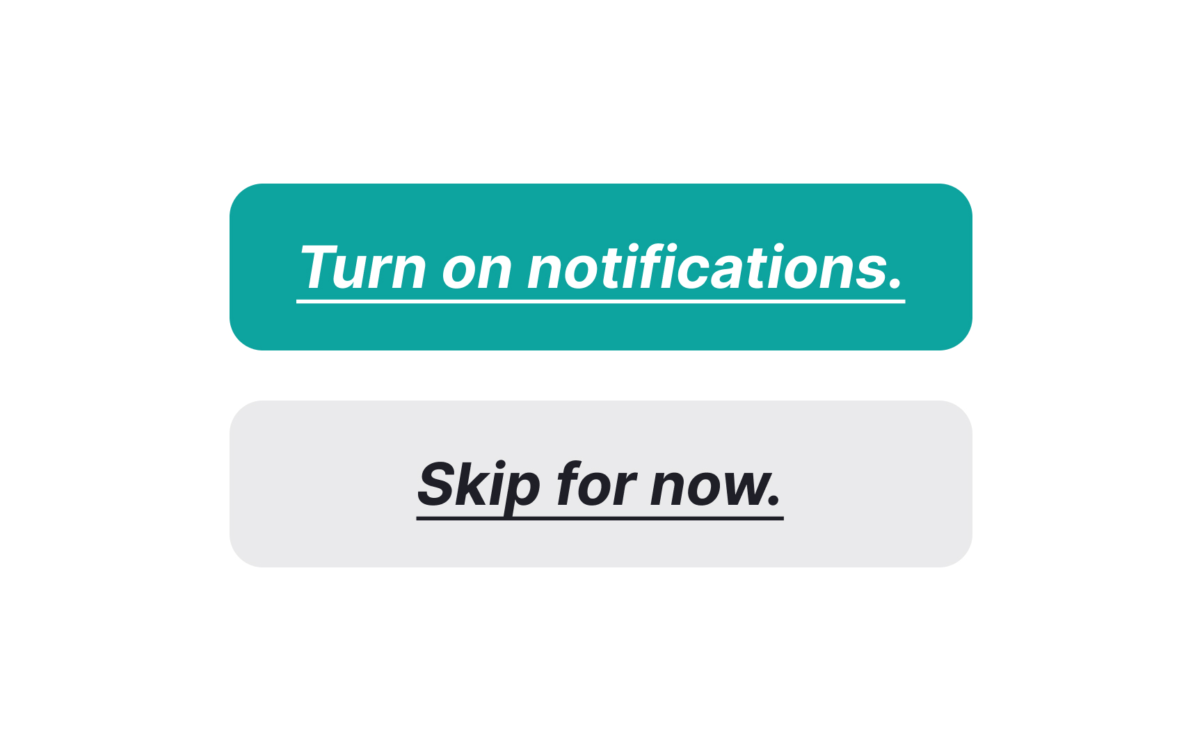
When it comes to button labels, less is often more. Italics, underlining, and other additional formatting should be avoided. Even punctuation marks like exclamation points or periods at the end of a label should be skipped, as they can create visual clutter.
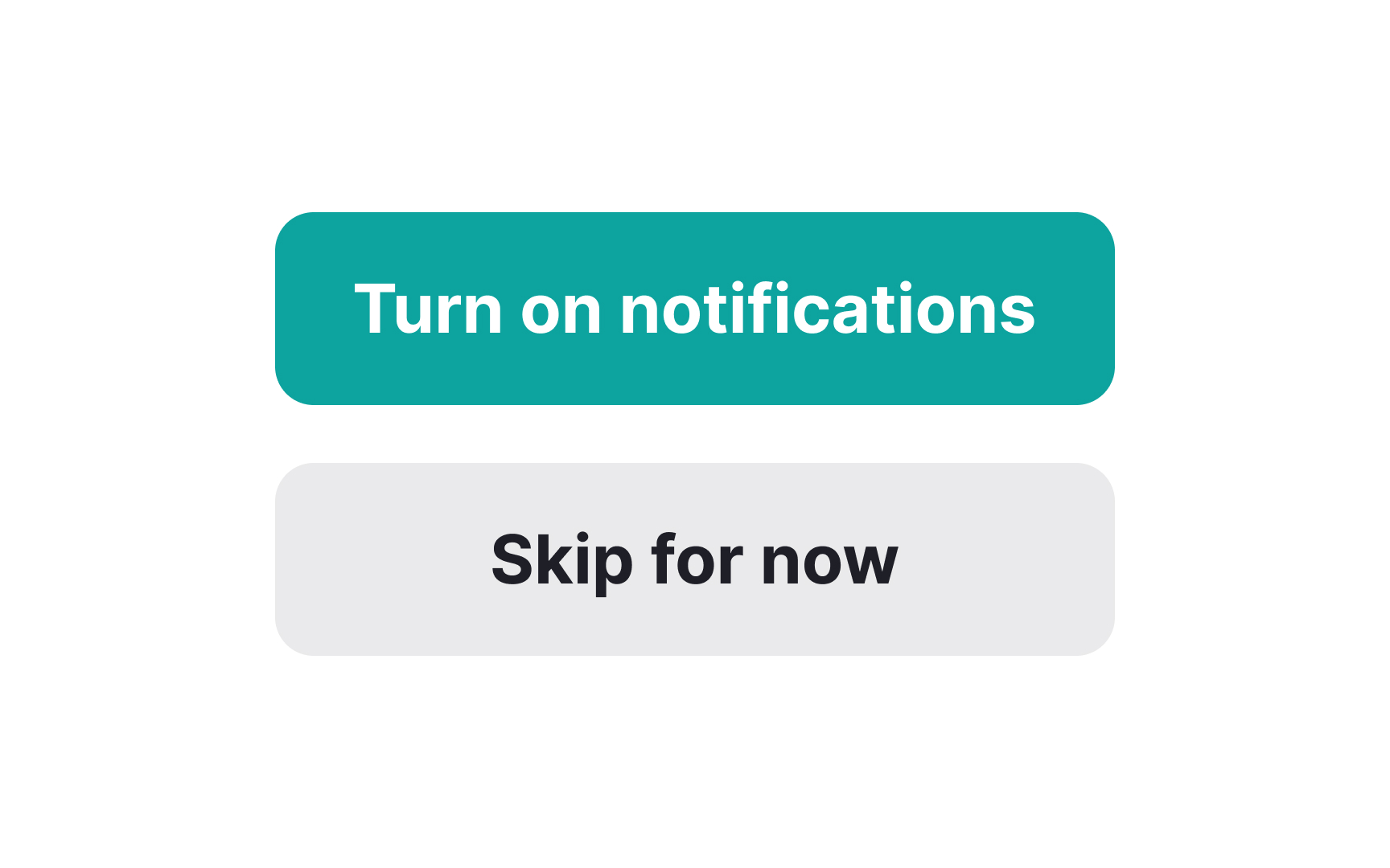
Instead, consider using a heavier text weight than your body copy to make the label stand out. The goal is to make the label's message as clear and straightforward as possible, minimizing the chance of confusing users. Keep the styling simple and the message clear, and you'll create buttons that users find easy to interact with.
