<?xml version="1.0" encoding="utf-8"?>

Slider controls are the go-to solution for adjusting settings such as volume and brightness. They take immediate effect and allow users to fine-tune the value by moving the handle. Sliders can serve the purpose pretty well, especially when precision isn't very important.

However, these controls can be confusing, hard to grab and set to the precise value. Plus, they can be pretty challenging to manipulate from the accessibility perspective.

Knowing how to create effective controls helps designers explore various solutions and step aside from predictable and boring buttons.

Exercise #1

Track

Sliders offer an intuitive way for users to select a value or a range within a preset scope. Think of the slider track as a guiding path, much like a railroad guides trains. As users drag the thumb along the track, they get visual feedback that helps them make their selection. This horizontal path is a visual cue for the range of available choices, enhancing usability. It's a straightforward interaction that also conserves valuable screen real estate.

Exercise #2

Thumb

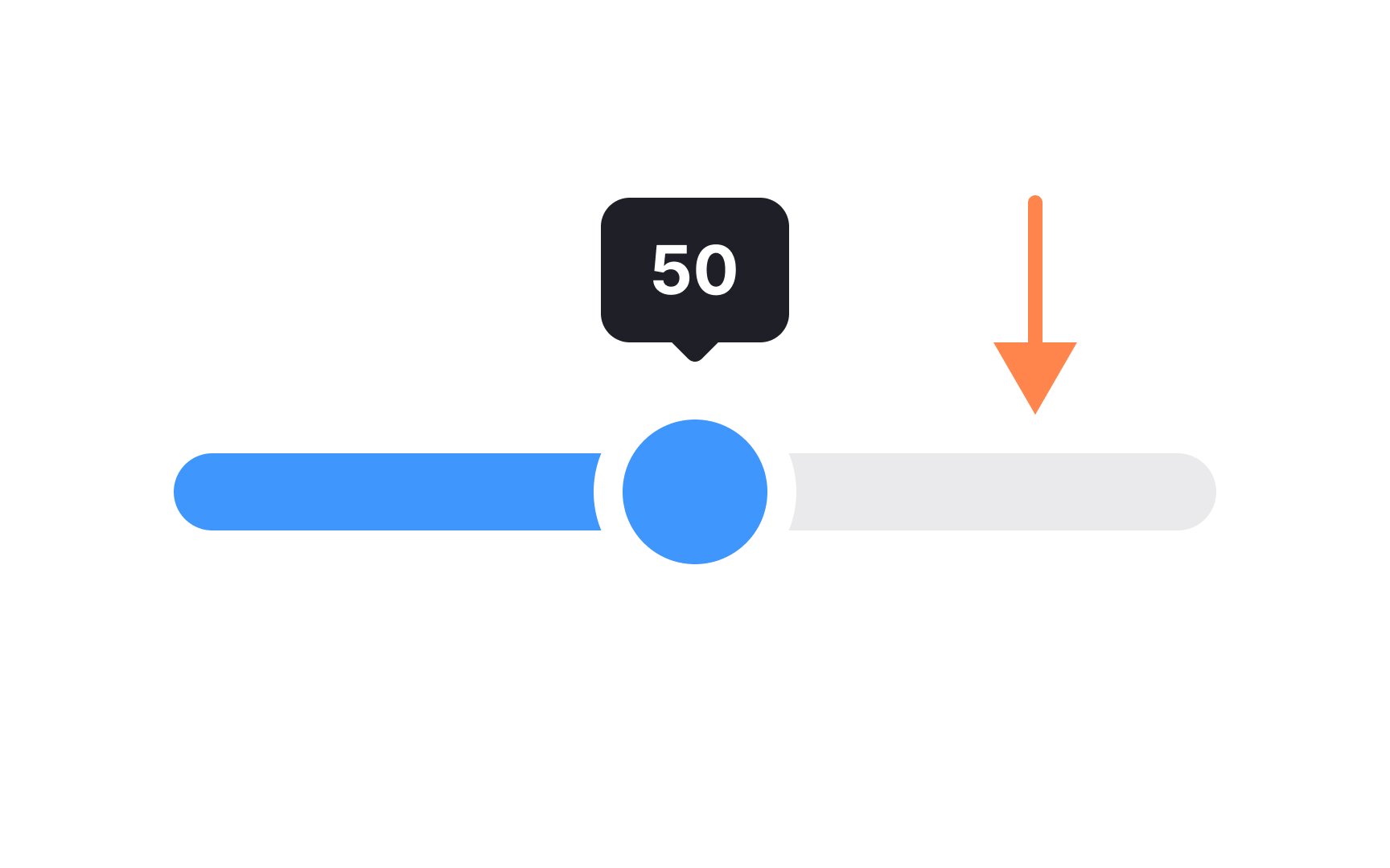
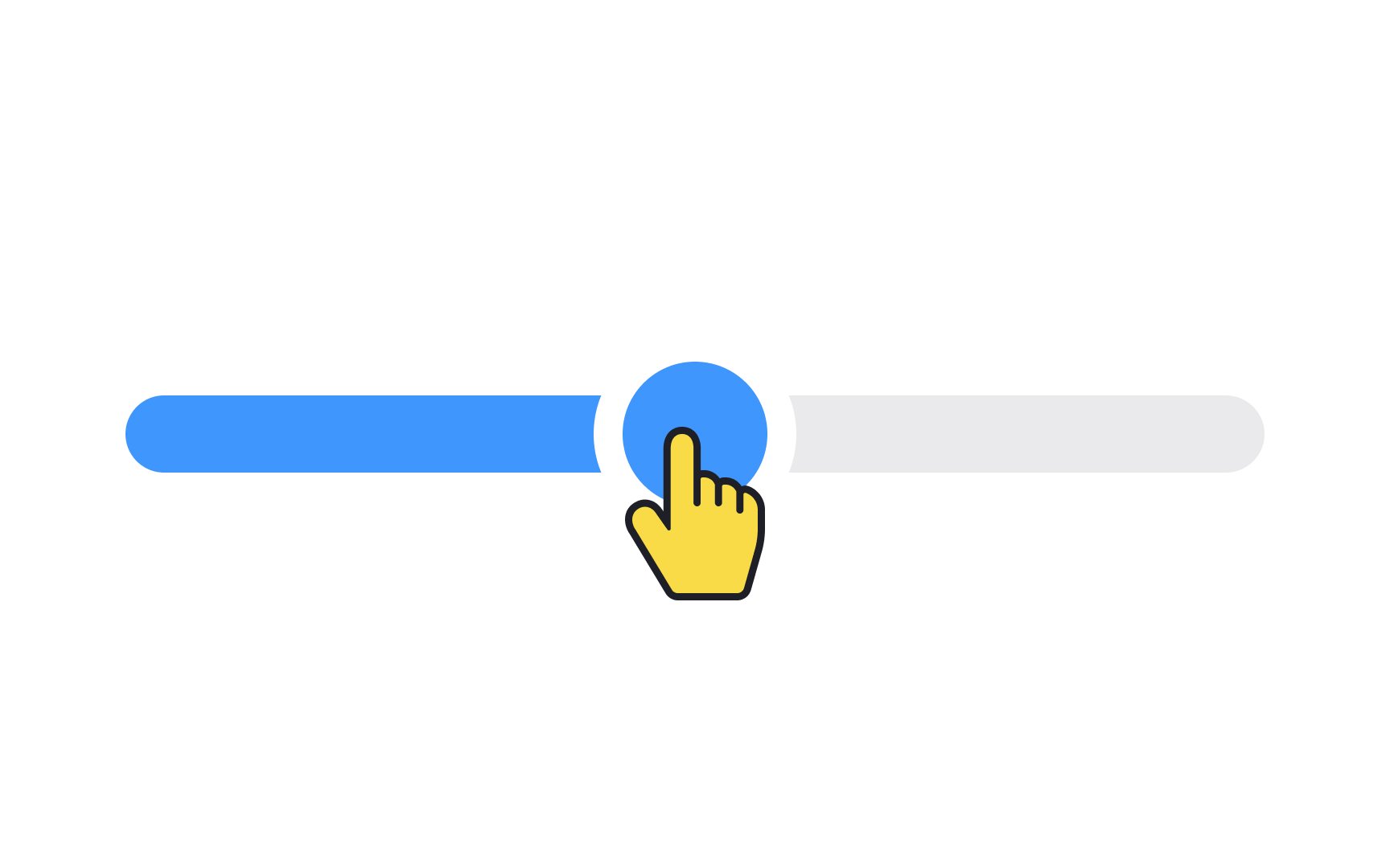
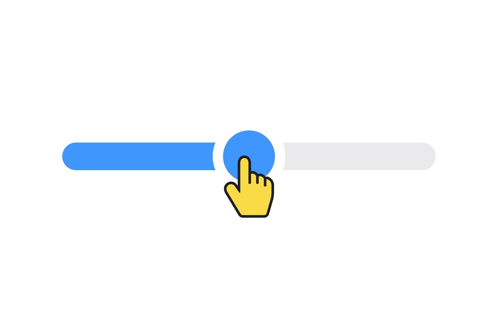
A thumb is a handle that users can drag back and forth along a track to change the slider value. Make sure the thumb's touch area is large enough on mobile devices and doesn't create difficulties for users, especially for those with motor disabilities. 

Exercise #3

Tick

A tick is a tiny stroke or dot that shows predefined positions on a track. Sometimes, a rough estimate is good enough, for example, when you're planning a vacation, looking for accommodation, and setting the approximate price.

When the exact value matters, for example, when picking several rooms or guests, ticks can be used as reliable reference points when moving the slider

Exercise #4

Value

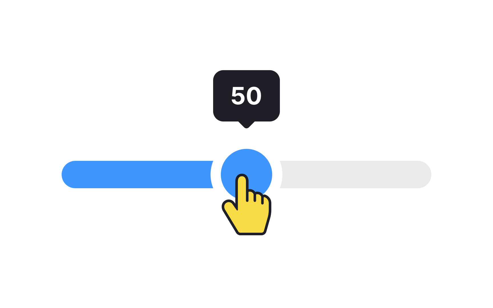
The value element comes in many shapes and sizes, and its role is to display the current value based on position. For example, when you change the speaker volume, you increase it by moving the thumb from left to right, and the value label displays the number. 

For touchscreens, ensure the value doesn't get obscured by users' fingers when manipulating the control.[1]

Exercise #5

Filled part

For left-to-right languages, as users move the thumb along the slider track, the filled area expands from the left toward the right. It visually represents the progression toward the highest value. This simple yet effective visual cue aids users in intuitively understanding how much of a specific range they've selected or how close they are to reaching the maximum allowable value.

Pro Tip: Use contrasting colors for the filled and unfilled parts of the track.

Exercise #6

Min/max value

Displaying minimum and maximum values on a slider gives users a clear understanding of the range they're working with. In left-to-right languages, you'll typically find the minimum value on the far left and the maximum value on the far right. For right-to-left languages, just flip that orientation.

Including these values is especially crucial when the slider represents a set of numbers or quantities that aren't intuitively obvious. For example, if you're adjusting settings like brightness or volume, you might not need exact numbers. But when dealing with figures like prices or time durations, showing the minimum and maximum limits helps users make more informed decisions. It's all about clarifying the user's choices and setting clear expectations.

Pro Tip: Avoid using sliders for extremely precise values as they can make simple choices unnecessarily challenging.

Exercise #7

Input value

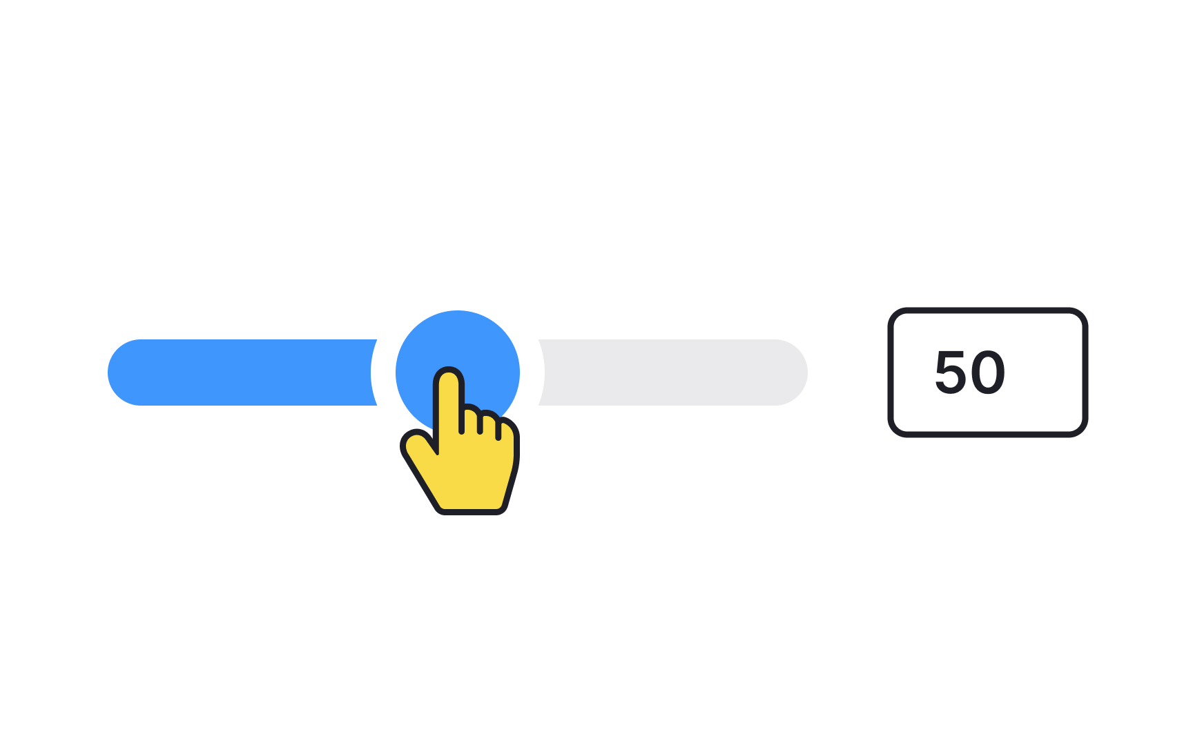
Sometimes, the charm of a slider lies in its quick, visual adjustment. However, some users crave the precision that only manual input can offer, especially for tasks that require exact numbers. To cater to both kinds of users, consider providing a text input box alongside the slider.

This box would be linked to the slider, allowing the thumb position to automatically update as users manually enter their desired value. It's a win-win: you maintain the slider's intuitive appeal while also offering a route for precision-seekers.

Exercise #8

Continuous slider

Continuous sliders, often known as linear sliders, give users the freedom to select a value along a fluid range, without the need for exact numbers. There are no value labels hovering over the thumb, making the process more intuitive and less structured. This type of slider is an excellent choice for situations where precision isn't the primary concern. Think of adjusting the volume on your music app or fine-tuning the brightness of your screen. In these instances, users generally rely on feel rather than specific numerical values, making continuous sliders a natural fit.[2]

Exercise #9

Dual slider

Dual sliders elevate the user experience by allowing users to define a range rather than just a single point. Featuring two thumbs instead of one, they are particularly useful for scenarios where setting a range is crucial. Think of adjusting price filters on e-commerce websites or selecting the departure and arrival time windows for flights.

Each thumb slides along the track, enabling users to easily specify both lower and upper limits. The dual functionality not only enhances the user's control but also provides a more dynamic and informative interaction.

References

Top contributors

Lauran Jansen
Tyson Escoto

Topics

From Course

Share

Complete this lesson and move one step closer to your course certificate