Style tables for scannability
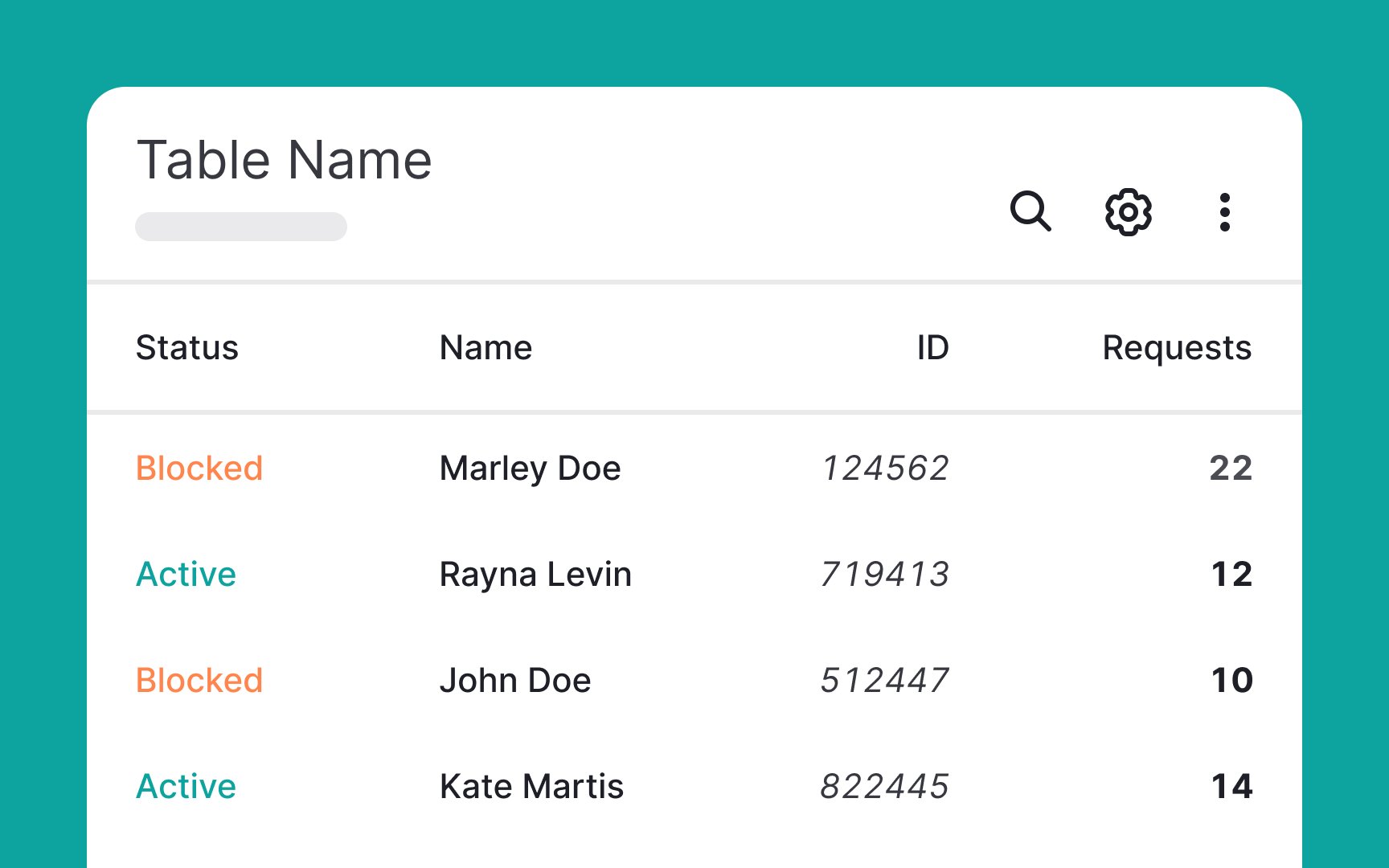
While visual appeal is crucial, it should never compromise the clarity and scannability of your table. Strive for a balance where aesthetics enhance, rather than overshadow, functionality. To achieve this balance:
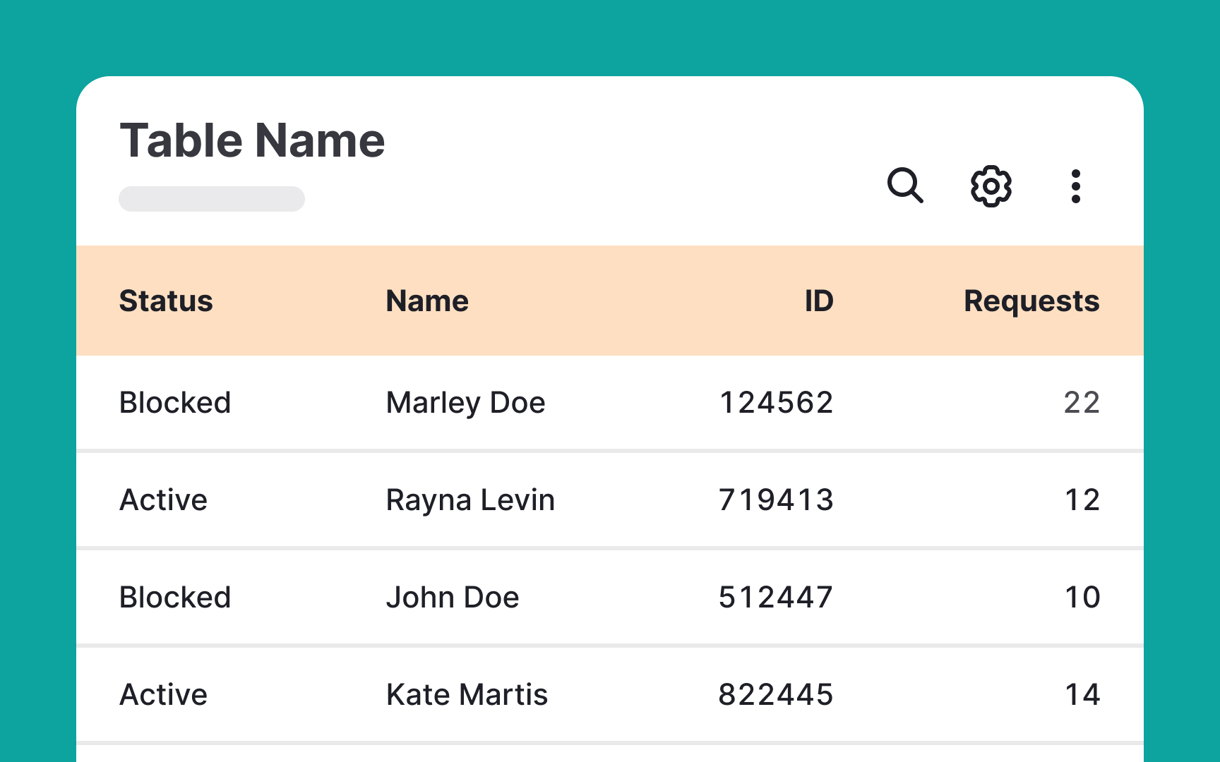
- Differentiate the header to establish an information hierarchy. This can be achieved by using a more prominent background, font weight, and color to bolster contrast and scannability.
- Consider the zebra-striped table style. Alternating row backgrounds in such tables guide users' eyes, making large data sets appear more organized and harmonious. However, exercise caution with the contrast in stripe colors — too much can add unwanted visual noise, which might hinder rather than help scannability.
- Maintain a thoughtful color hierarchy. Excessive or purposeless use of colors can lead to visual chaos, shifting focus away from the content's importance[1]
Pro Tip: For long tables, consider adding a sticky header at the top. This keeps column labels always in sight, making it much easier for users to find the information they need.
