Create information contrast
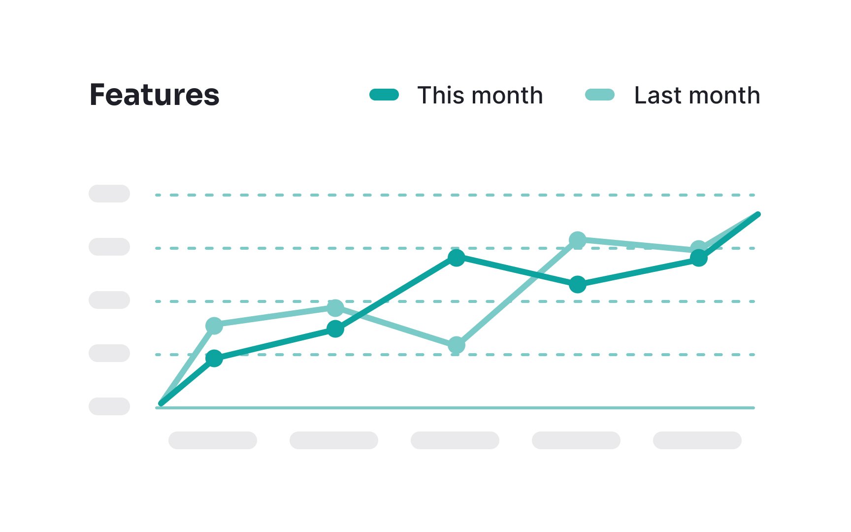
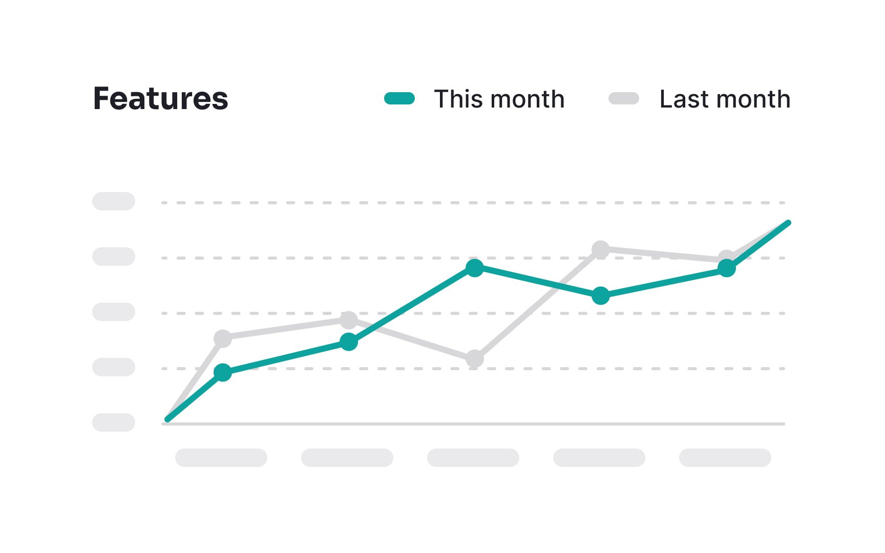
To create information contrast in multi-line charts, utilize focused and unfocused states. When users hover over a particular line, highlight it by making it brighter or thicker, drawing immediate attention to it. Simultaneously, color the other, unfocused lines in neutral or muted tones. This contrast ensures that users are naturally drawn to the important, active data, reducing visual clutter and enhancing readability.
By avoiding the use of many bright colors for all lines, you prevent unnecessary distractions, making it easier for users to analyze and interpret the data effectively and accurately.
