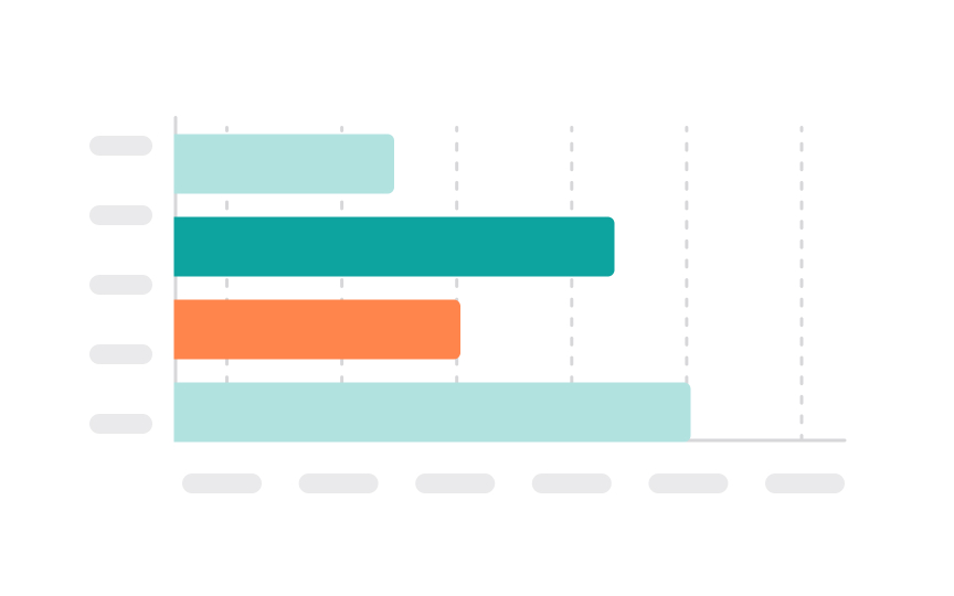
Bar chart
Bar charts represent data using rectangular bars, where the length or height of each bar is proportional to the data value it represents. They are one of the most common types of charts used in various fields due to their simplicity and ease of interpretation.
Bar charts are particularly useful for comparing discrete categories or groups. For instance, they can be used to compare the sales of different products, the population of different cities, or the scores of different groups. They can also show changes over time if the categories are different time periods.
They can be displayed horizontally or vertically. Horizontal bar charts are a good option when you have long labels — for example, feature names or task descriptions.

