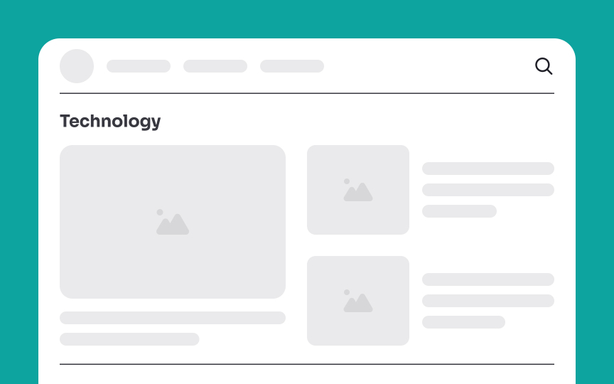
Limit the frequency of obvious dividers
When designing a user interface, using too many visual dividers can overwhelm users. Let’s consider a blog layout where each section is adorned with vibrant, bold, attention-grabbing dividers. You can imagine how this would create unnecessary visual noise, making the interface visually tiring.
Instead, strategically using negative space between posts can provide a clean separation, allowing users to navigate effortlessly. You can also use subtle, single-pixel lines in a neutral shade for essential divisions.


